
Skip to content
Winner, UK eCommerce Website of the Year, UK eCommerce Awards 2026 →
Anthony is Freelance

Shopify UX examples.The ideas a theme wouldn't give you.

Shopify UX examples from the stores I've designed. Each idea solves a problem for that brand's customers.

Shopify navigation and collection UX.Helping customers find and compare.

Product discovery comes first, because without it, users would struggle to get to the right product page.
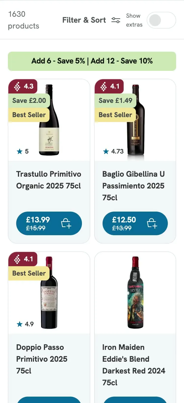
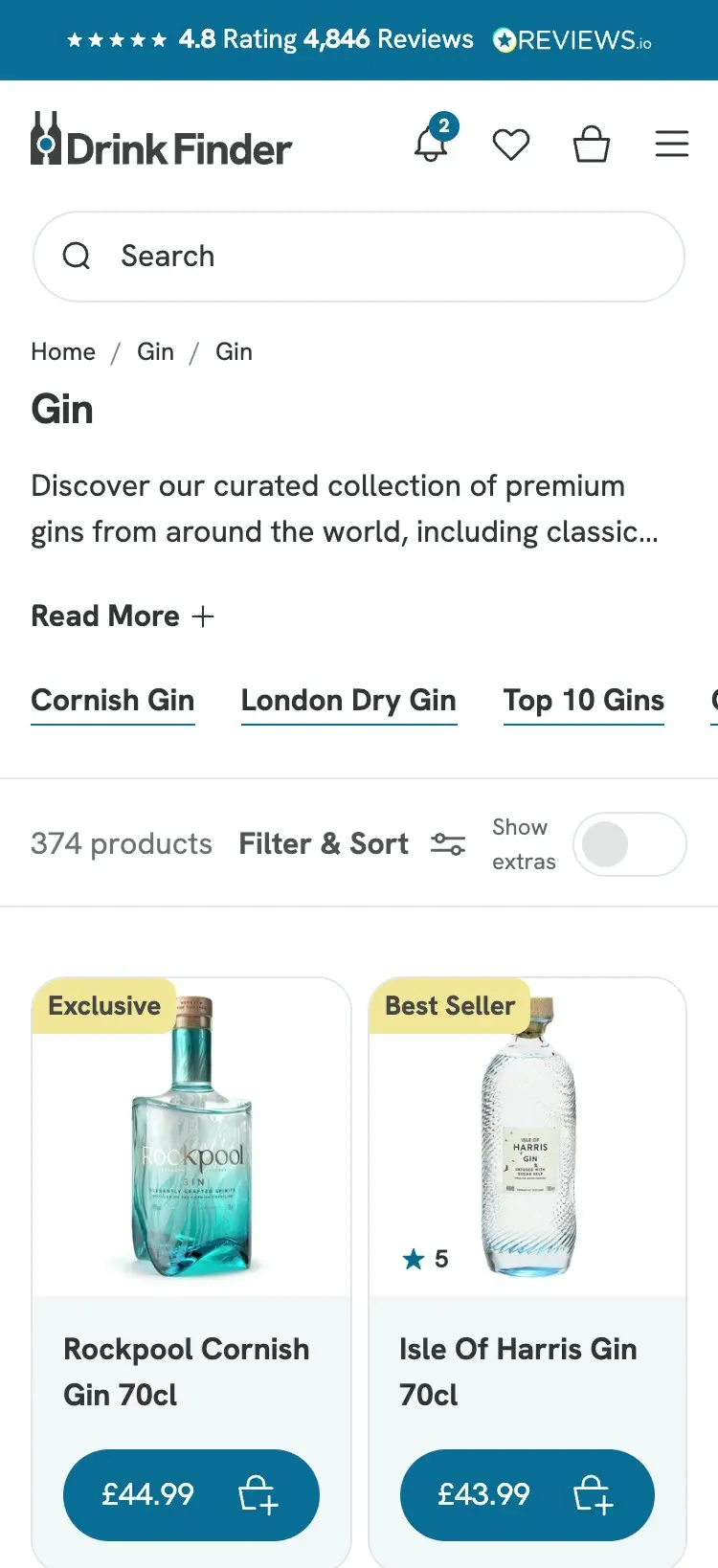
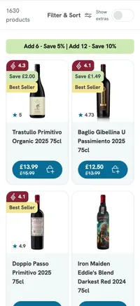
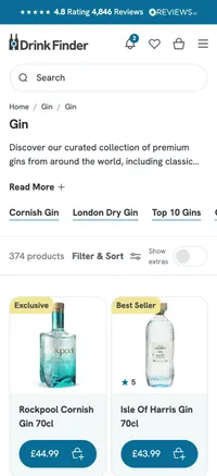
  • Drink Finder's collection page on mobile, with the Show extras toggle above the wines.
    A comparison toggle on Drink Finder's collection page.

    A comparison toggle on the collection page

    Drink Finder · 2025

    The problem
    Drink Finder stocks over 1,500 wines, and buyers compare them on country, region, vintage and style. A standard card left them opening bottle after bottle.
    How it works
    A Show extras toggle at the top of the collection adds rating, origin, region, vintage and style to every card. Leave it on to compare, or switch it off for a clean grid of bottles and prices.
    Evidence
    “Customers are now finding and buying bottles online that we used to struggle to sell.” Andrew Rowe, Constantine director, in Business Cornwall, 15 October 2026.

    Part of Bespoke store design

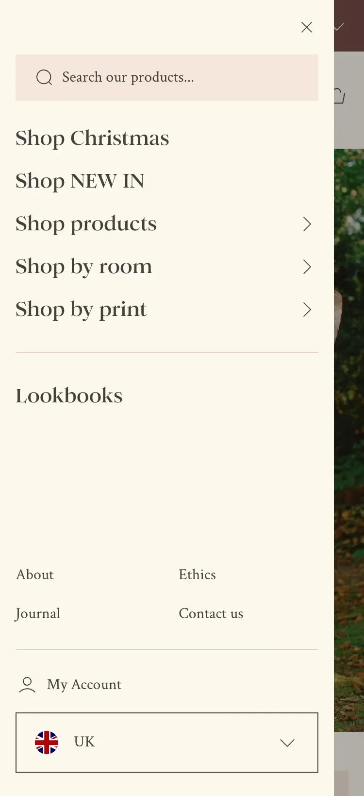
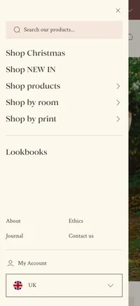
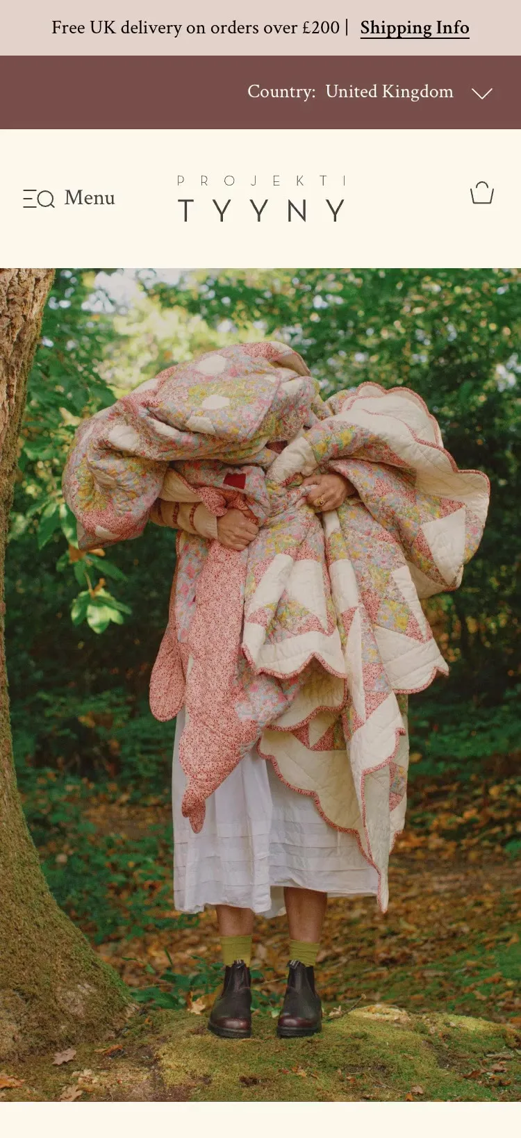
  • Projektityyny's navigation on mobile, with routes to shop by product, room or print.
    Shop by product, room or print on Projektityyny.

    Shop by product, room or print

    Projektityyny · 2026

    The problem
    Projektityyny's old store dropped customers into collections and left them to filter.
    How it works
    Three image-led routes from the navigation let people shop by product, by room or by print, which is how they think about their homes. The routes were designed for the phone first.
    Evidence
    Over 80% of Projektityyny's visitors are on mobile, from the UX review before design started.

    Part of Bespoke store design

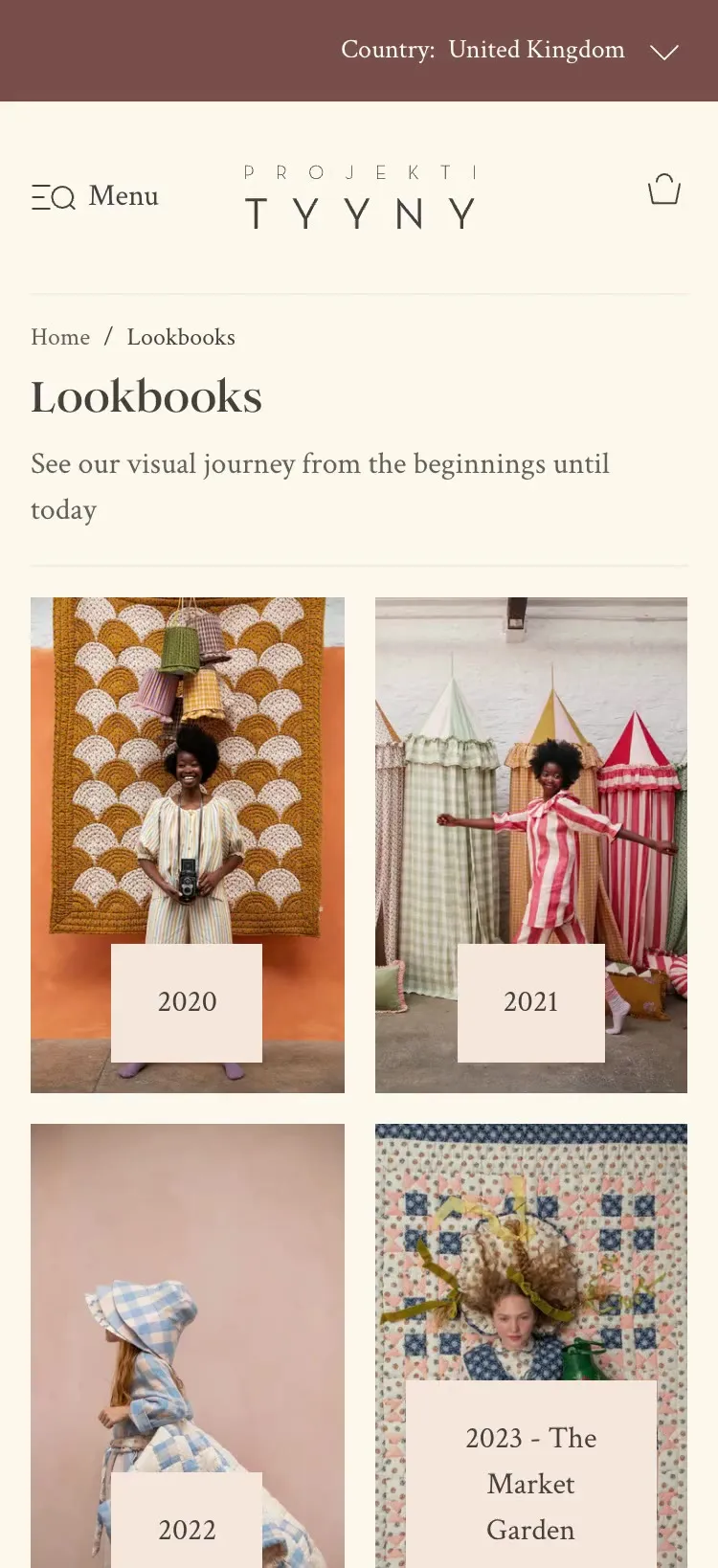
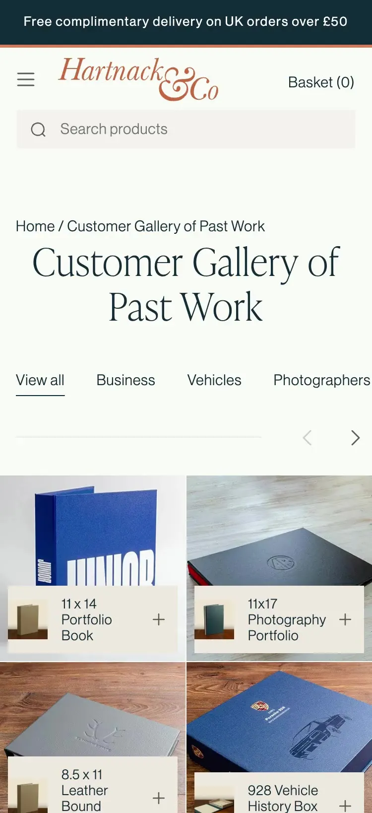
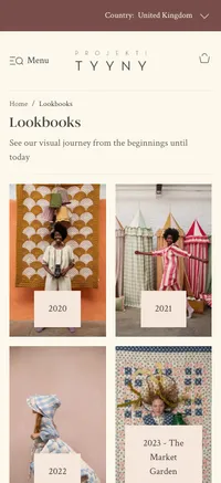
  • A past collection in Projektityyny's lookbook archive on mobile.
    Projektityyny's lookbook archive.

    A lookbook archive that keeps earning

    Projektityyny · 2026

    The problem
    When a Projektityyny collection sold out, its campaign photography disappeared with it.
    How it works
    Every past collection stays live as a shoppable lookbook, so the photography keeps bringing in search traffic long after the launch.

    Part of Bespoke store design

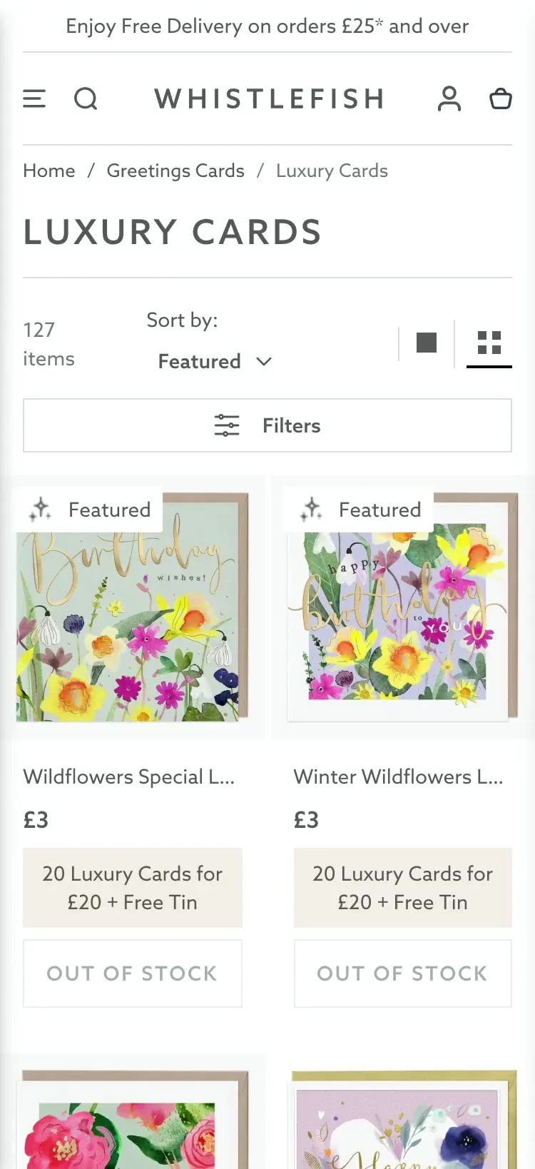
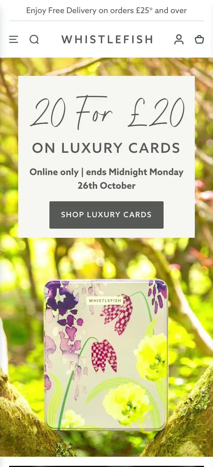
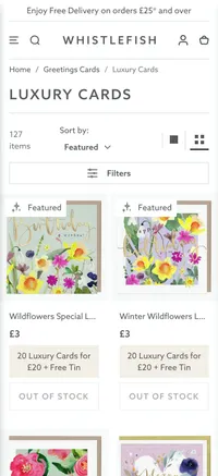
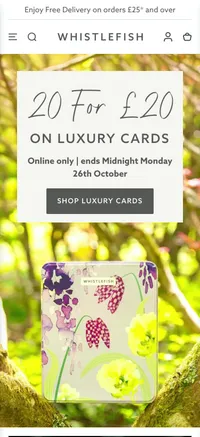
  • Whistlefish greeting cards on mobile, with one-line names, the multi-buy offer and Add buttons.
    Image-first product cards on Whistlefish.

    Image-first product cards

    Whistlefish · 2025

    The problem
    Whistlefish publishes thousands of greeting card designs, and nobody chooses a card by its name. Long names broke the grid for no benefit.
    How it works
    I cut product names to one line, so the picture leads. People often buy several cards at once, so the multi-buy offer and an Add button sit on the card, and each one goes in the bag without leaving the grid.

    Part of Shopify UX design

Shopify product UX examples.Helping customers choose with confidence.

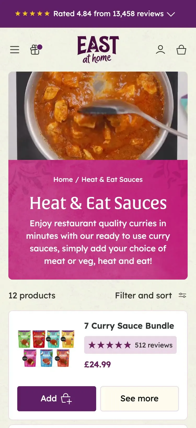
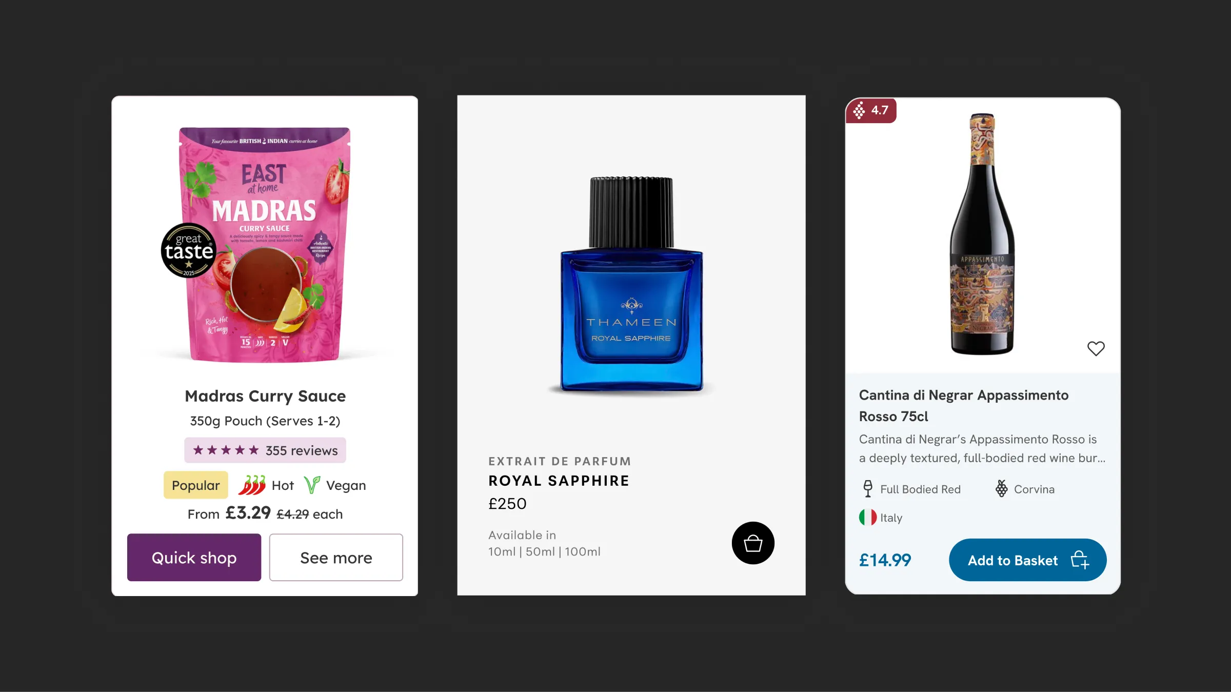
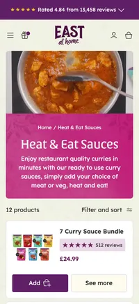
  • East at Home curry sauces as a list on mobile, each with chilli heat icons, dietary labels, reviews and price.
    Product cards that answer dinner questions on East at Home.

    Product cards that answer dinner questions

    East at Home · 2025

    The problem
    People choosing a curry sauce want four answers before they click: is it hot, is it vegan, did others like it, and what does it cost?
    How it works
    Every card shows the heat level in chilli icons, dietary information, reviews and the price, with Quick Shop to add straight from the collection. On mobile the grid becomes a list, so it all stays readable.
    Evidence
    Project result: revenue up 82%, October to June against the year before. GA4, UK sessions. East at Home won UK User Experience of the Year at the UK eCommerce Awards 2026.

    Part of Shopify UX design

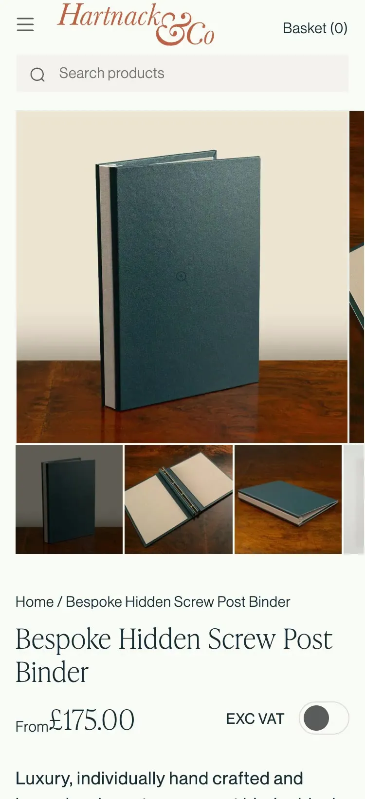
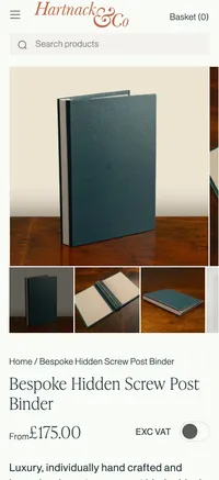
  • A step in Hartnack & Co's product builder on mobile, with a tip and the running cost.
    Hartnack & Co's step-by-step product builder.

    Step-by-step product builder

    Hartnack & Co · 2025

    The problem
    Hartnack & Co's binders and boxes come in thousands of possible variations, and the choice was overwhelming customers.
    How it works
    The builder splits the choice into guided steps, with slide-up tips, bespoke icons and a cost tracker that stays on screen.

    Part of Bespoke store design

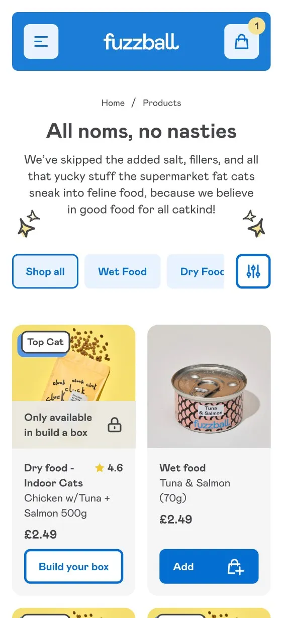
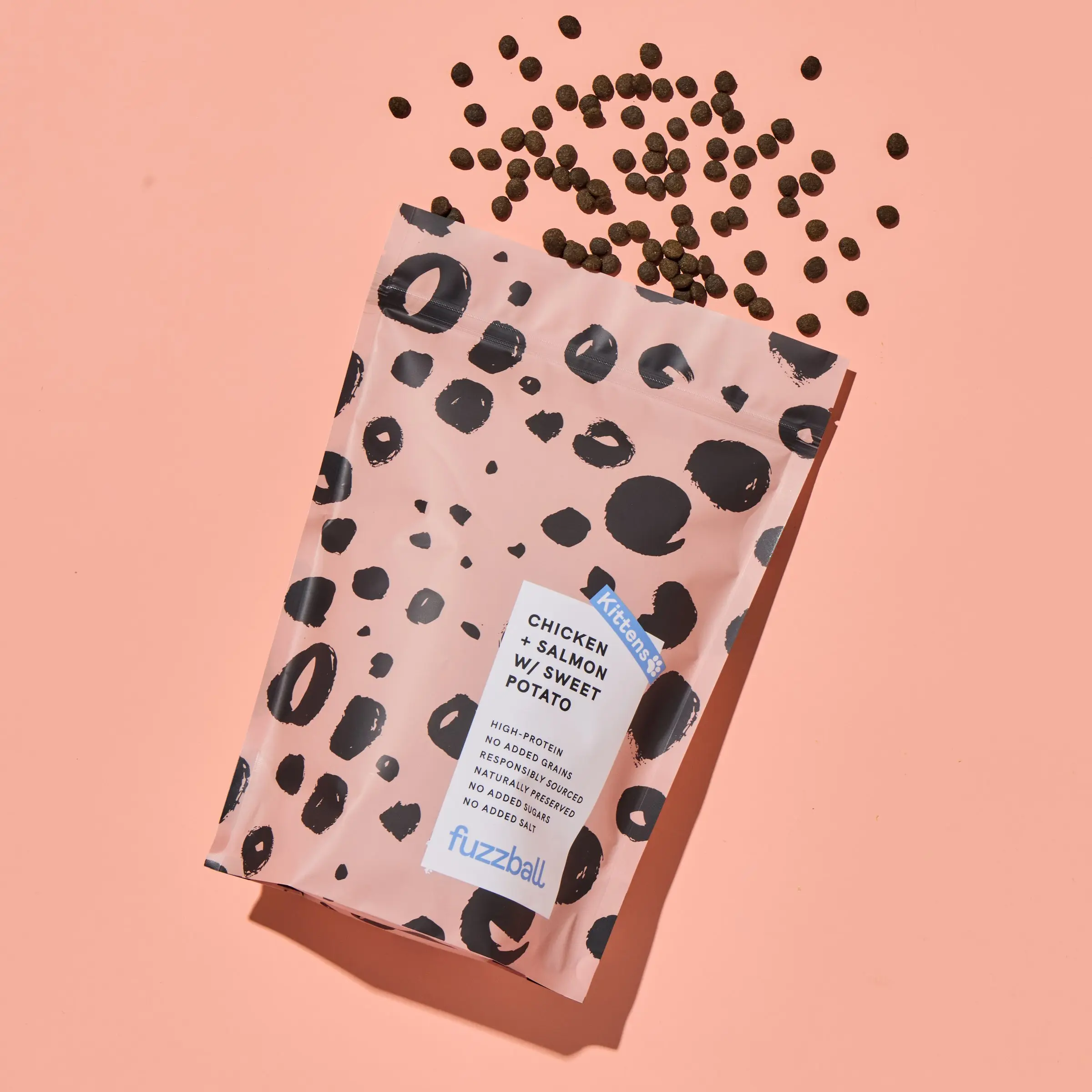
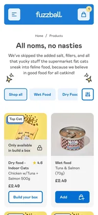
  • A Fuzzball product card with a lock icon, an Only available on subscription label and a View Product button.
    Subscription-only product cards on Fuzzball.

    Subscription-only product cards

    Fuzzball · 2025

    The problem
    Some Fuzzball products are only sold on subscription. Customers only found that out after clicking through and trying to add one.
    How it works
    The card shows a lock icon, an "Only available on subscription" label and a View Product button instead of Add to Bag, so expectations are set before the click.

    Part of Subscriptions

Shopify cart and subscription UX.Buying without the surprises.

  • Drink Finder's header on mobile, with the offers button in the navigation.
    The offers button in Drink Finder's navigation.

    An offers button instead of sticky pop-ups

    Drink Finder · 2025

    The problem
    The UX review of Drink Finder's old store found sticky sign-up buttons blocking the way to checkout.
    How it works
    Offers and events moved into a button in the navigation, which freed the announcement bar for trust messages.
    Evidence
    Found in the UX review, before any design started.

    Part of Migrations

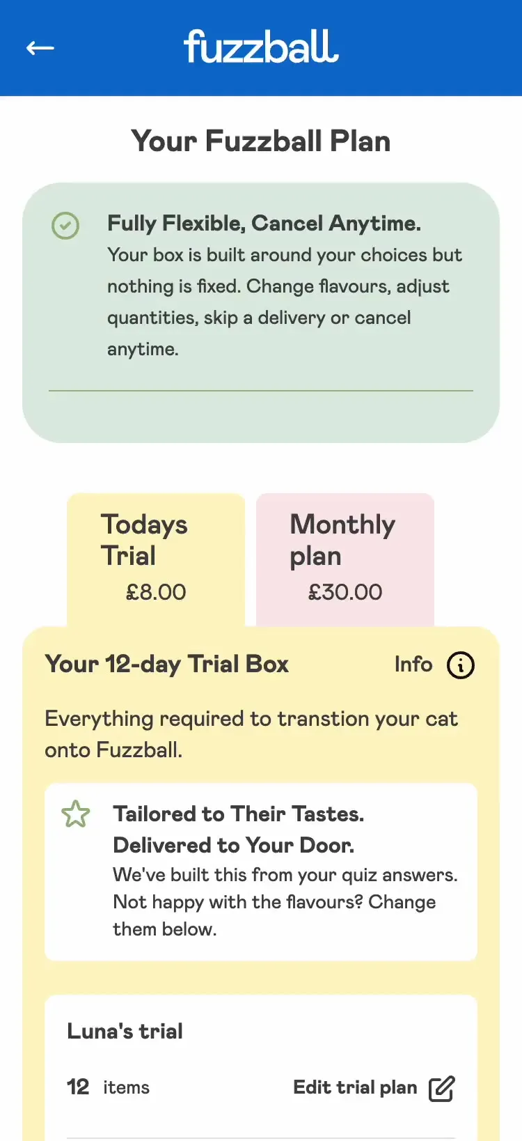
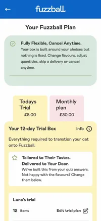
  • Fuzzball's quiz cart on mobile, with the trial and the repeating order shown separately.
    Fuzzball's quiz cart, with the trial and subscription split.

    Trial and subscription, split clearly

    Fuzzball · 2025

    The problem
    In Fuzzball's quiz cart, it wasn't clear which items were the trial and which would repeat.
    How it works
    The cart separates the trial from the repeating order, so customers see exactly what they’re signing up to and nobody subscribes by accident.

    Part of Subscriptions

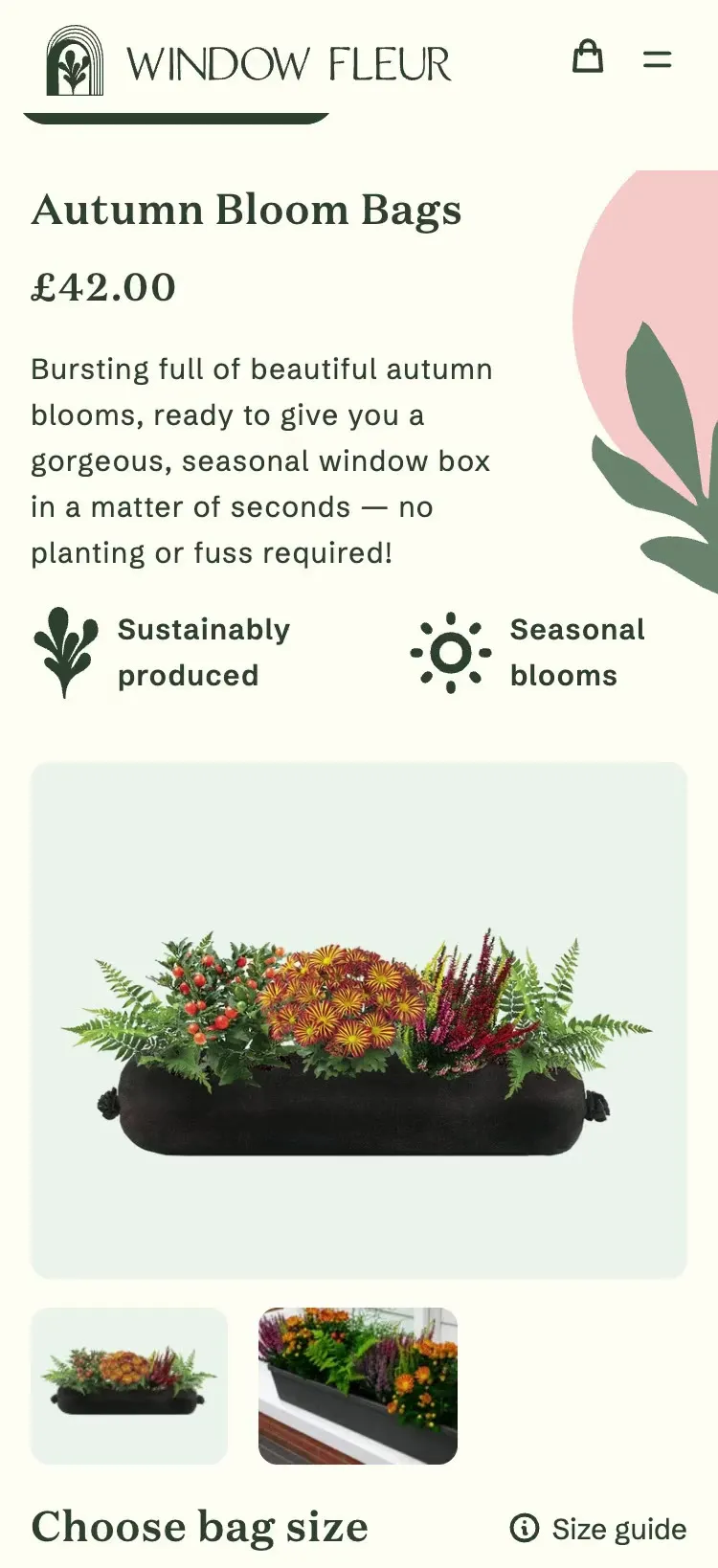
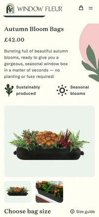
  • Window Fleur's subscription product page on mobile, with a slide-up open for the detail.
    Window Fleur's subscription journey on one screen.

    Three pages in one screen

    Window Fleur · 2024

    The problem
    Window Fleur's subscription product journey ran across three pages.
    How it works
    I rebuilt it as one mobile screen, with slide-ups for the detail, so customers set up a subscription without leaving the page.
    Evidence
    The project led to Window Fleur commissioning a full store redesign.

    Part of Subscriptions

Shopify brand design examples.Personality that still helps people shop.

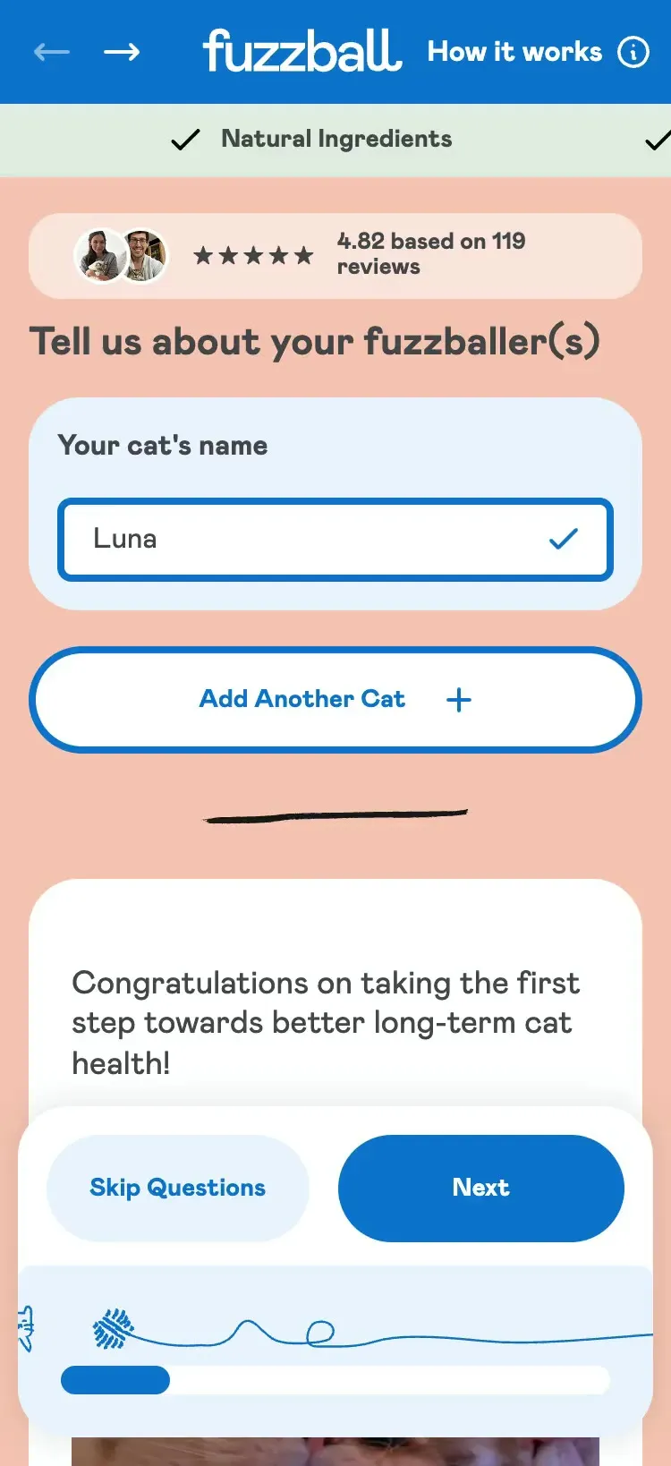
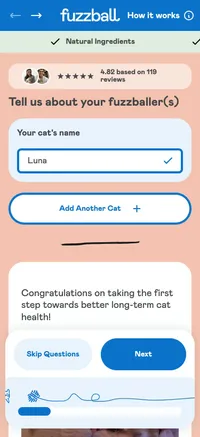
  • Fuzzball's quiz on mobile, with the cat chasing a ball along the progress bar.
    Fuzzball's quiz progress bar.

    A progress bar with character

    Fuzzball · 2025

    The problem
    A quiz is a form, and forms feel like a chore.
    How it works
    Fuzzball's cat chases a ball along the quiz progress bar, so finishing the quiz feels like part of the brand.
    Evidence
    Project result: conversion rate up 63%, August 2025 to August 2026 against the year before. GA4.

    Part of Branding

  • Whistlefish's store on mobile, moving between pages built from the design system.
    Whistlefish's design system in Figma.

    A design system the client's team runs

    Whistlefish · 2025

    The problem
    Whistlefish's own team needed to keep building pages after launch without the design drifting.
    How it works
    I set up the Figma file as a templating system, with rules for how the script and sans fonts behave in the theme editor.
    Evidence
    "We've since been able to carry that framework into our own design team." Will Manders, Whistlefish

    Part of Bespoke store design

Shopify innovation test.How an idea earns the name.

I only call an idea an innovation if it passes four tests: a theme or an app wouldn't do it out of the box, it was shaped by one brand's products or customers, I can name the problem it solved, and you can see it on the live store.

Multi-buy buttons and free delivery bars don't pass. I design them carefully, but they're standard features, not new ideas.

Shopify UX example questions.What people ask about these ideas.

Can you design something like this for my store?

Yes, though rarely the same thing, because each of these was shaped by one brand’s products and customers. Where a store is already live, I usually start with a UX review, beginning with the navigation, and the ideas come out of what it finds.

Are these Shopify apps?

No. Each one is a design decision made for one store. Some build on what the theme or a subscription app already provides, and the design decides how it’s used.

Start a Shopify UX project.What's getting in your customers' way?

Send me your store and a line about where customers get stuck. I'll reply within two working days, then we'll have a 30-minute call about the business and the project. After that you get a tailored quote along with a timeline.

Budget

I reply within two working days.

Start a project

Start a Shopify project.Tell me where your store is now.

Budget

Privacy and cookies

Loading…