
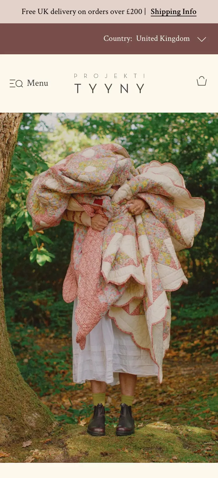
Projektityyny. A mobile-first store launch for a Nordic-inspired textiles brand


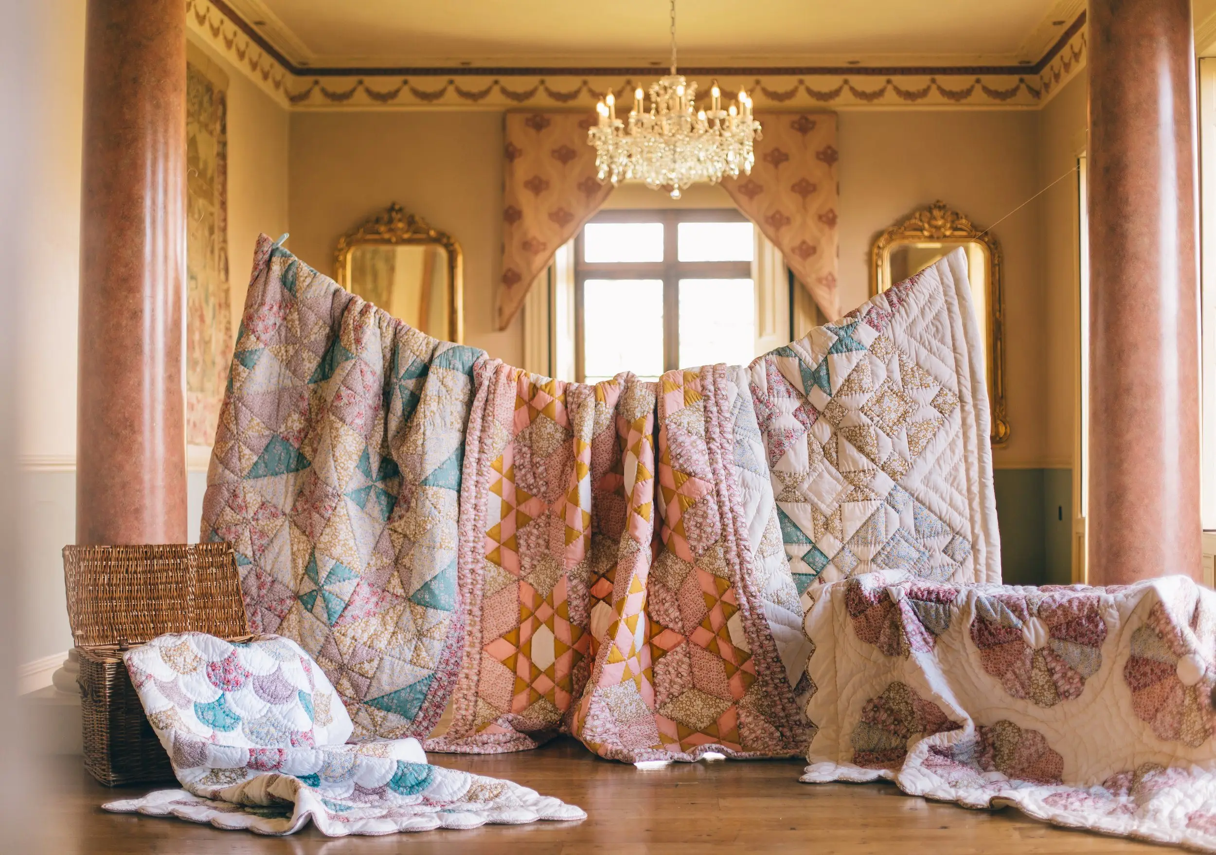
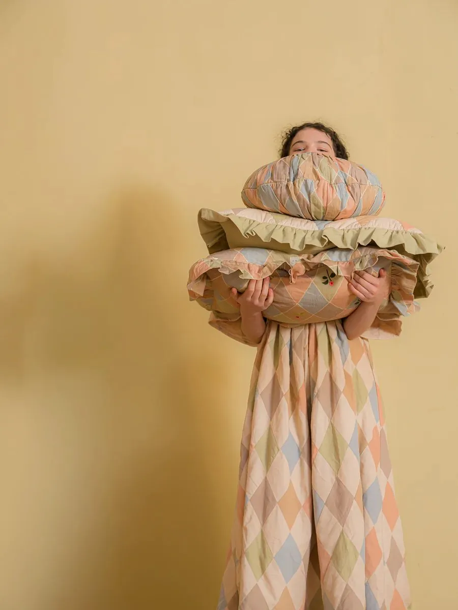
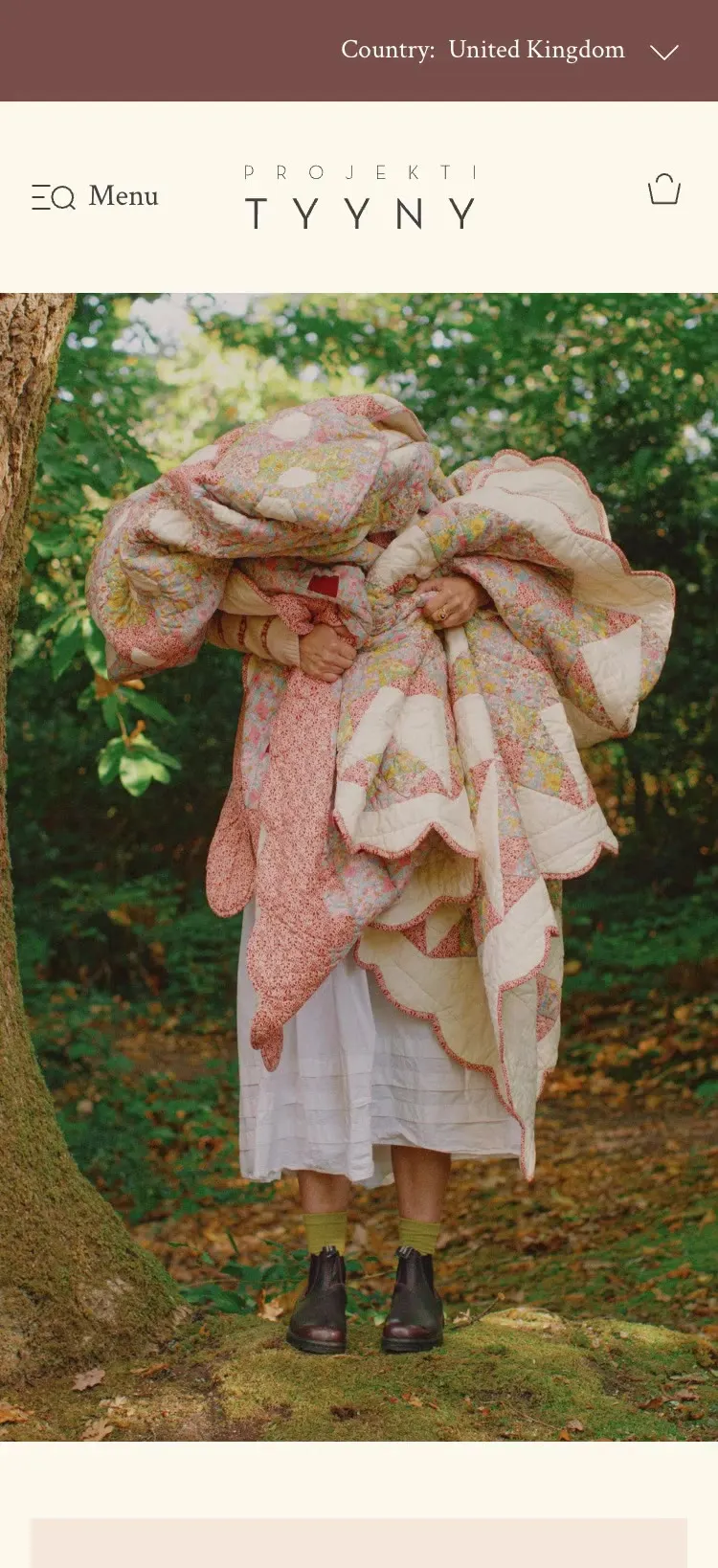
Projektityyny is a Nordic home textiles brand from West Dorset, known for its patchwork quilts, with more than 115,000 followers on Instagram and features in Vogue, Elle Decoration and House & Garden. I designed its bespoke Shopify store mobile first, with the brand’s photography leading every page.
The Projektityyny brief was a bespoke Shopify store for a brand that had outgrown its old one. The product and the photography were already beautiful. The store wasn’t keeping up.
The old site dropped customers into collections and left them to filter. The job was to open up the range, let the photography lead and give the team a system to grow with.
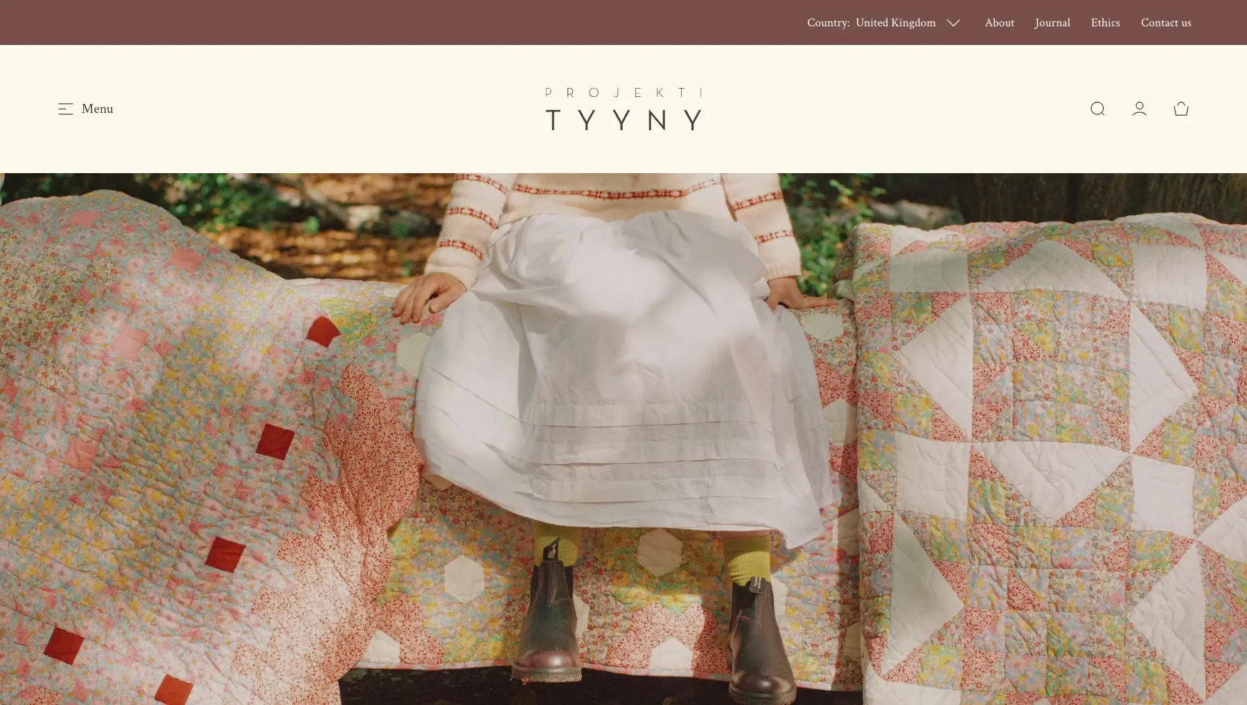
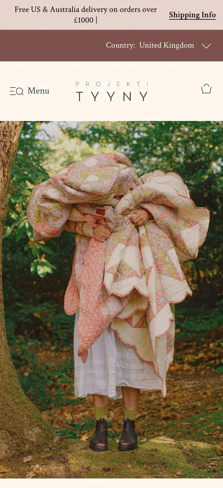
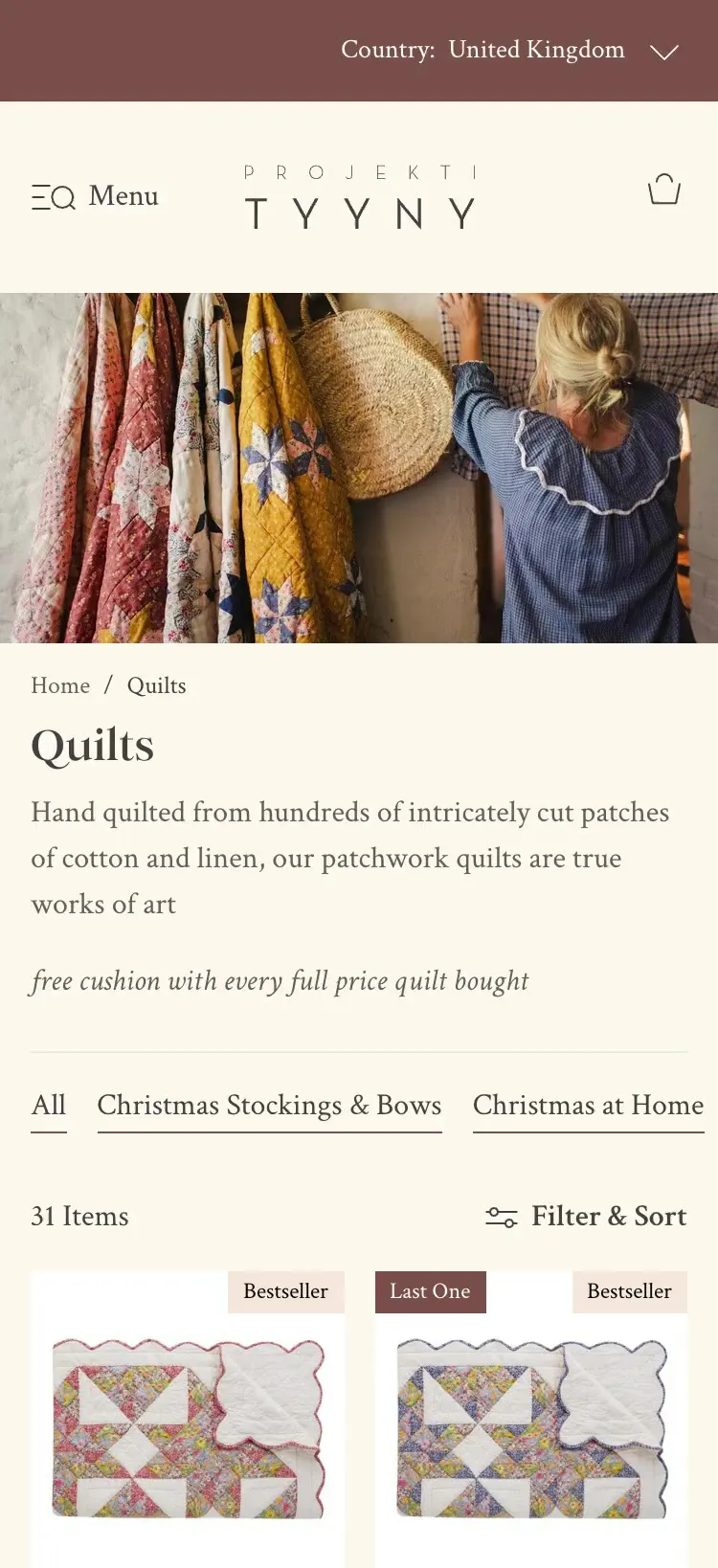
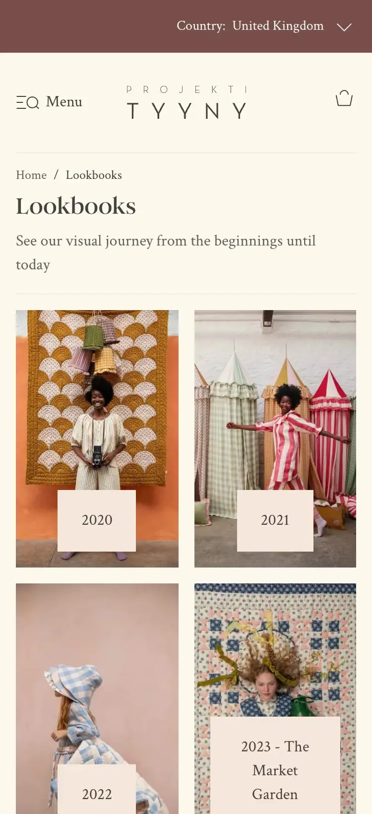
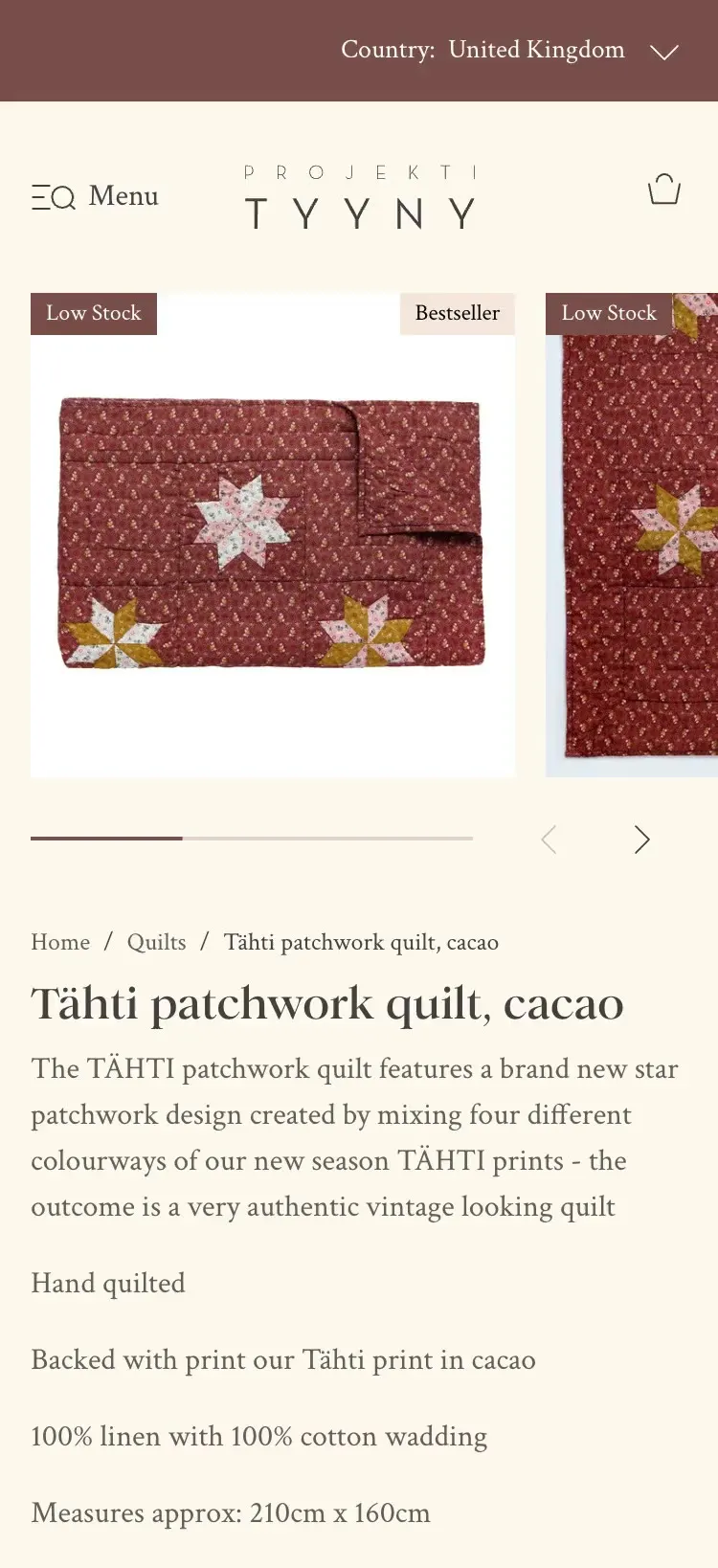
Every Projektityyny decision below starts on a phone and lets the photography do the selling.
I mapped Projektityyny’s whole purchase journey against the GA4 data. Over 80% of visitors were on a phone, so every screen was designed mobile-first, then scaled up to desktop.

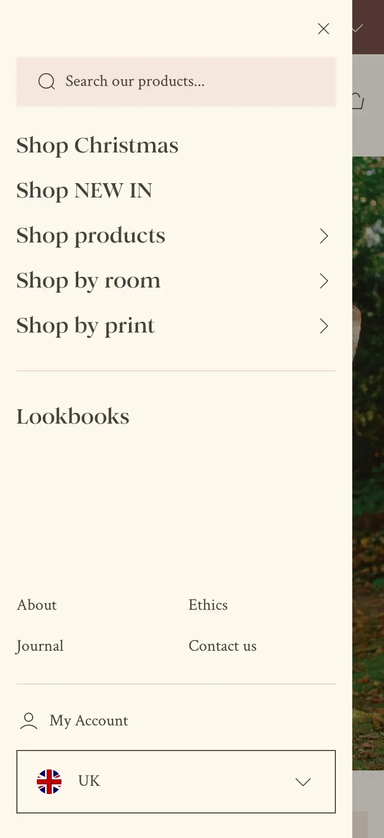
Projektityyny’s menu gives three routes in: by product, by room and by print. Each leads to its own page, so the menu becomes the start of shopping, not a list of links.
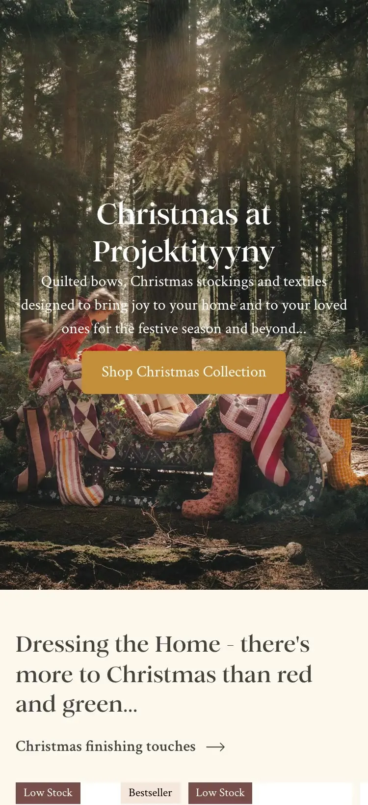
The Projektityyny homepage puts big image cards, considering pacing and generous space first. The design never competes with the prints. It frames them.
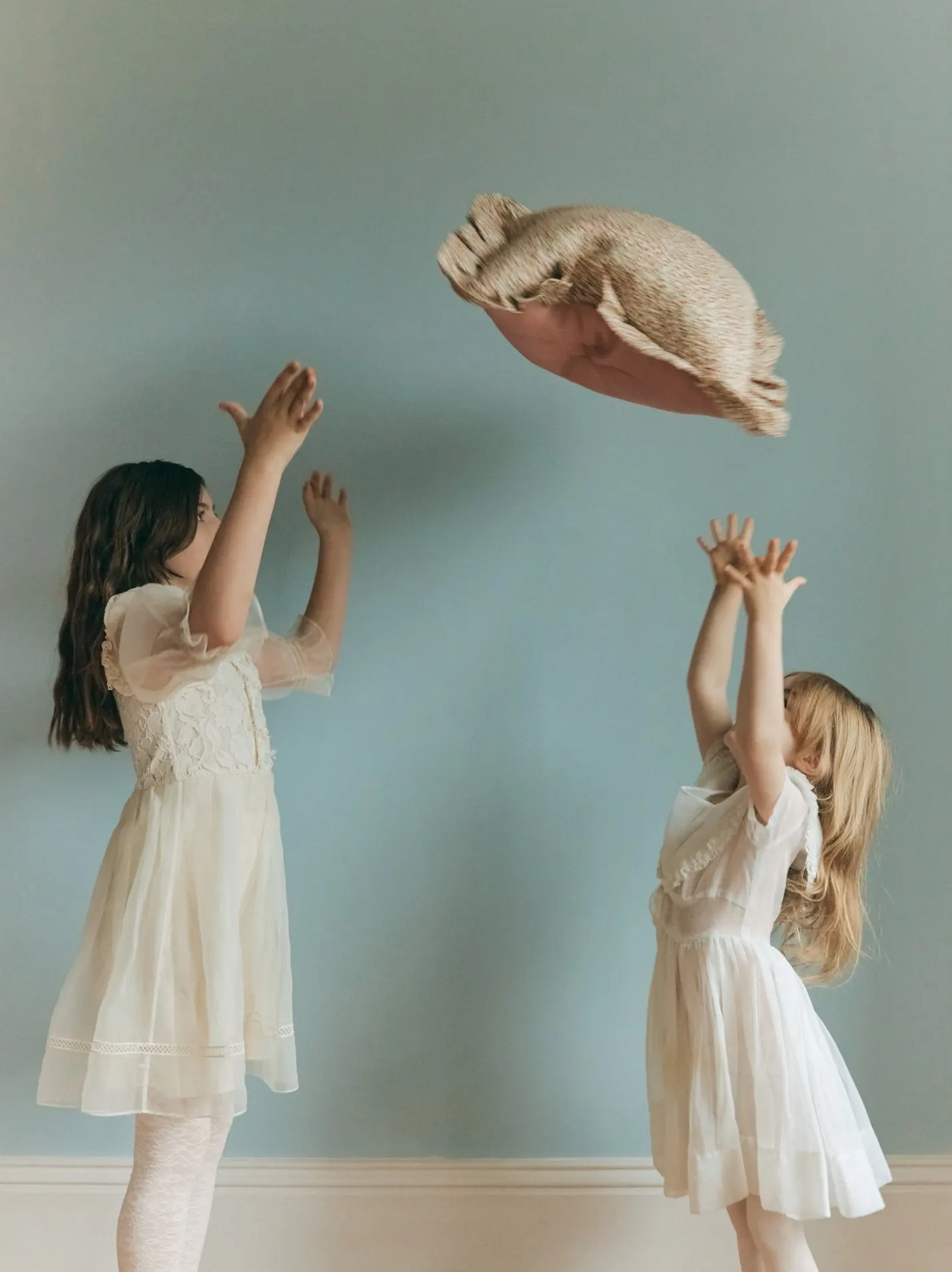
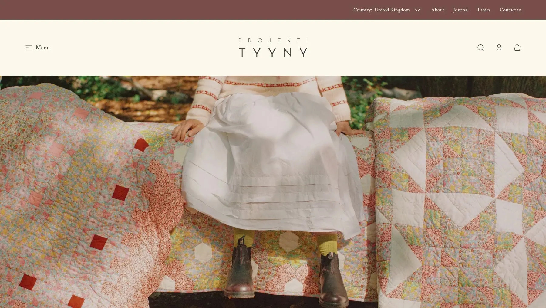
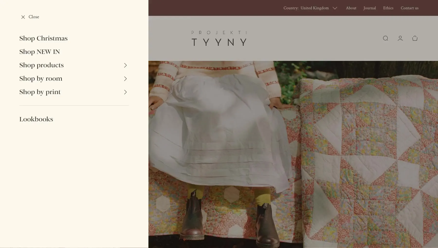
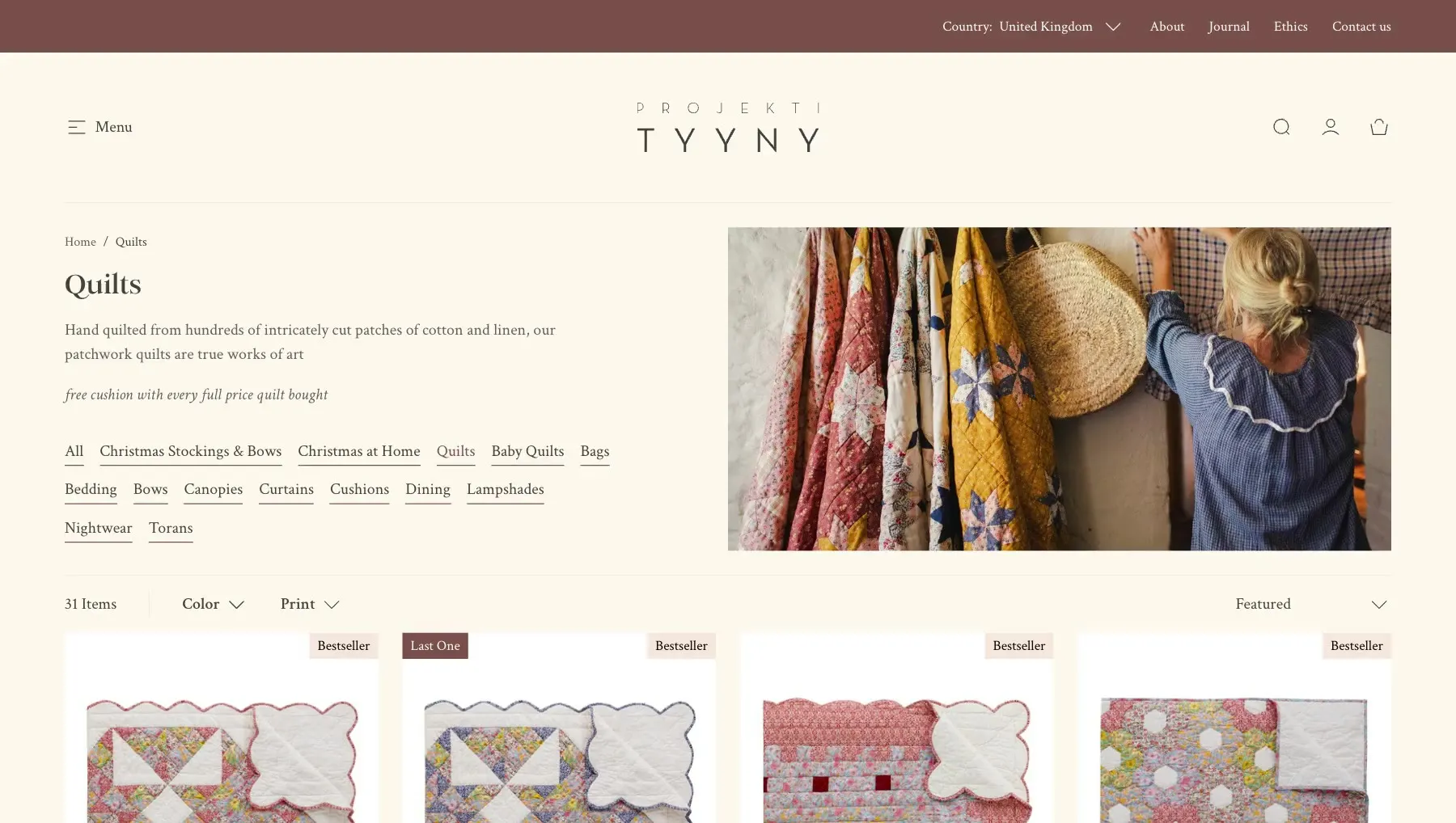
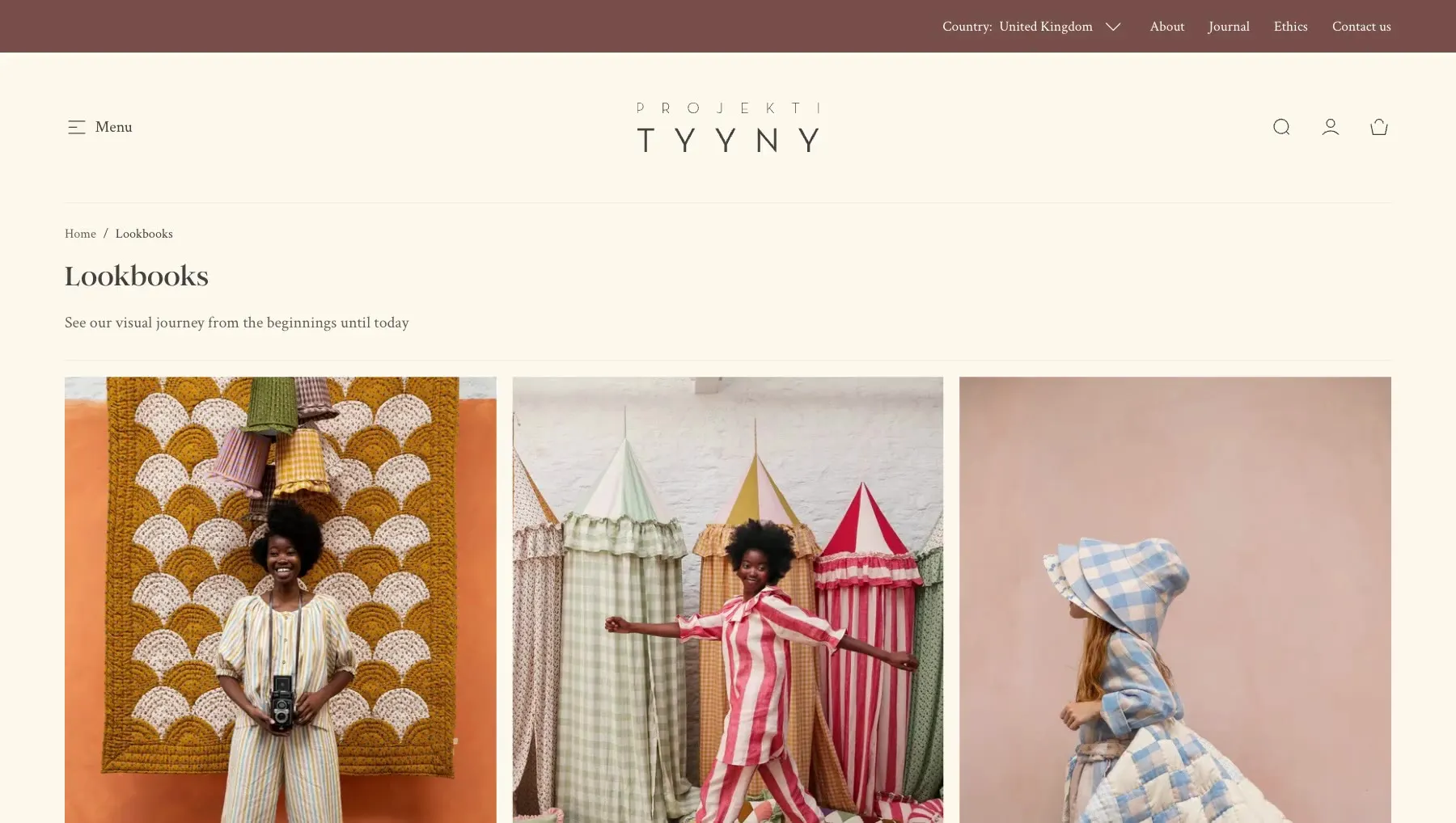
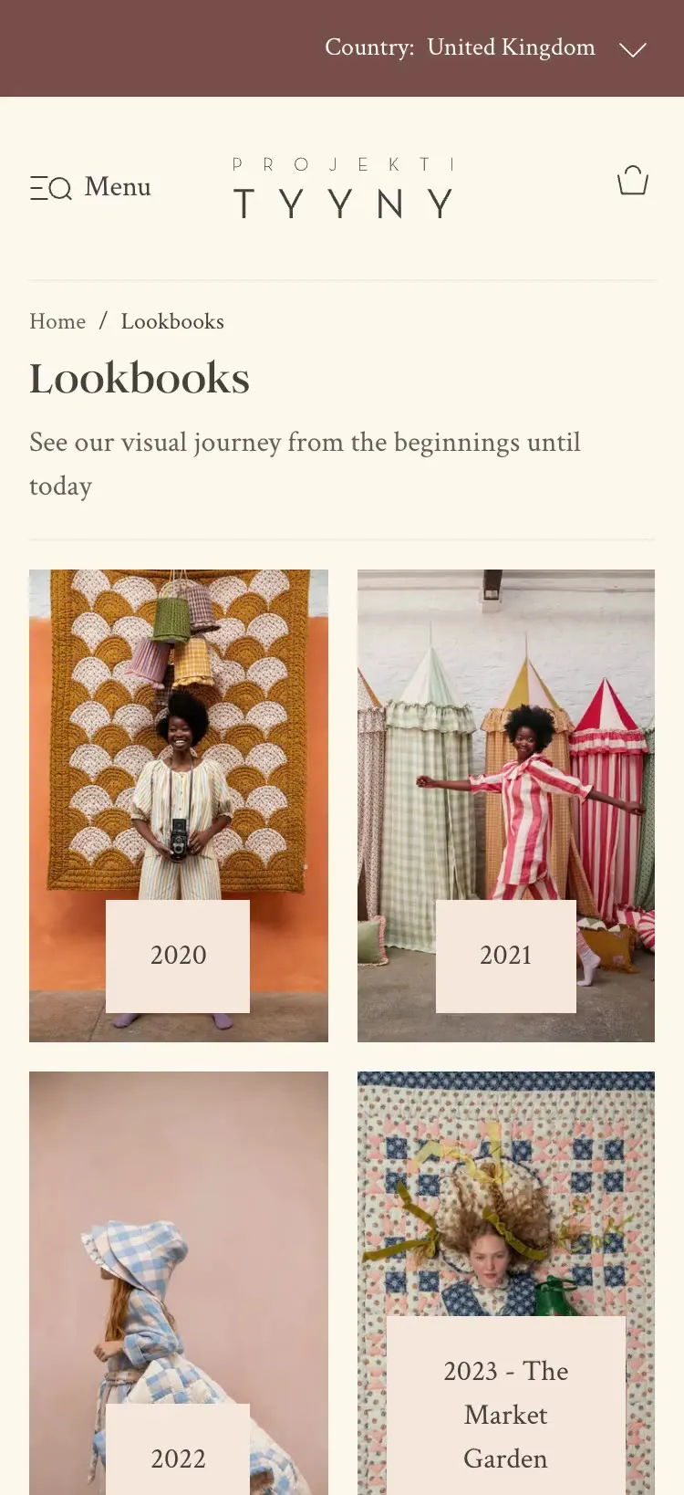
Every past Projektityyny collection stays live and shoppable in its own lookbook. As of October 2026 there are 17, going back to 2020, so the campaign photography keeps working long after the season ends.
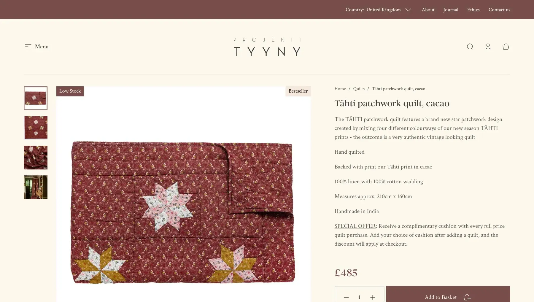
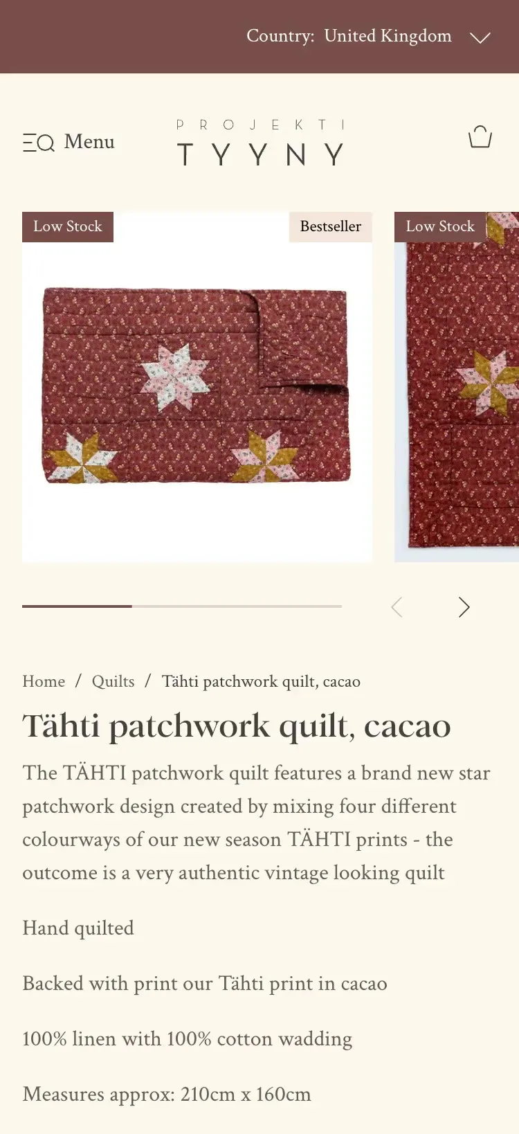
Projektityyny’s product pages show each print across the range, so a quilt leads to the matching baby quilt or bag, and the cart picks it up again. It reads like styling advice from the brand, not a sales tactic.
Projektityyny’s design system pulls back anything that competes with the product: tighter type, deliberate spacing and room to breathe. Colour contrast and type sizes were set for accessibility from the start, and every screen was handed over in Figma.

Beauty · March 2026
Stationery & gifts · April 2025
I reply within two working days.
Cookies
I use analytics cookies to see how people find and use this site. Nothing is tracked unless you accept.