Introduction
Most articles about Shopify product cards talk about layout best practice in the abstract. Show a good image. Make the price visible. Add a quick add button. All true, but it skips the more important question: what does this specific brand selling these specific products actually need this card to do?
I am Anthony, a UK Shopify expert specialising in design and conversion rate optimisation for ambitious DTC brands. My background is unusual for a Shopify designer. I spent ten years in branding, working for some of the best agencies in Bath and Bristol, before moving into digital because I loved it. I then spent three and a half years freelancing at Dyson, before moving to Cornwall and joining a leading Shopify agency as Creative Director.
After five and a half years leading design at the agency across a wide range of DTC stores, I went fully freelance three years ago, working directly with founders, brand teams and also with some of the best Shopify agencies in the UK. The work has been a celebration of getting to do exactly the kind of design I care about most, with clients who genuinely value that craft.
The seven projects featured here cover both routes I take with clients: full bespoke Shopify store builds and Shopify theme customisation projects where a well-chosen premium theme is the foundation. The right approach depends on the brief, the budget, and where the brand is in its growth. The product card matters just as much regardless of which path the project takes.
Why premium theme product cards stop working as soon as you add your products
Premium Shopify themes look fantastic in their demo stores. The cards sit on a clean grid, the imagery is consistent, the typography is balanced, and the whole thing feels considered. There is a reason for that. The demo content is designed to make the theme look its best.
The dummy products in a theme demo are typically chosen with three things in mind. They have similar image treatments, often shot on the same background. They have similar name lengths, so nothing breaks the grid. And they have a small enough range that you never see the theme handle 500 products from the same brand. None of those things are true of a real store.
As soon as you load your real products into a premium theme, the cards almost always start to underperform. Long product names break the grid. Inconsistent imagery makes the page feel chaotic. The information your customers actually need to make a decision is missing or buried. The card that flattered the theme stops flattering your products.
This is not an argument against premium themes. Premium themes can be excellent foundations, with strong layout systems, performance, and structural decisions that would take significant time and money to recreate from scratch. The point is that the default product card is rarely the part of the theme worth keeping as-is. It was designed for dummy products, not yours.
Why the product card is the highest-leverage component to redesign
Whether the project is a full bespoke build or a theme customisation, the product card is consistently one of the most important areas to invest design thinking. Three reasons why.
Frequency. Every customer browsing a collection sees the product card, often dozens of times in a single visit. No other component is encountered as often. Improving it compounds across every collection page, every campaign, and every marketing landing page on the site.
Conversion impact. The card is the bridge between browsing and considering. A card that surfaces the right information removes friction and reduces unnecessary clicks. A card that hides important details forces customers into a navigate-and-back-out pattern that hurts conversion rate, particularly on mobile.
Brand perception. Customers spend more time looking at product cards than they do looking at the homepage. A redesigned product card on a customised theme can completely change the feeling of the site. The same theme with default product cards looks like the demo. The same theme with redesigned product cards looks like your brand. On a bespoke build, the same logic applies — the product card is where the design language gets stress-tested at scale.
The seven examples that follow show what that thinking looks like in practice. They span both bespoke builds and theme customisation, and you will see that the principles are the same regardless of which approach the project took. Where the approaches differ is in what each one allows you to do, which is worth flagging on each example.
Seven Shopify product card designs from real projects
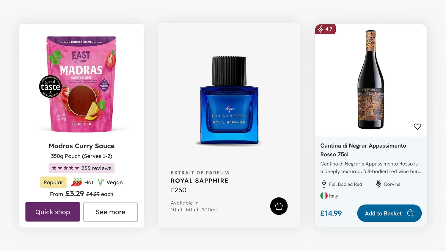
1. Thameen London. Luxury fragrance, editorial restraint
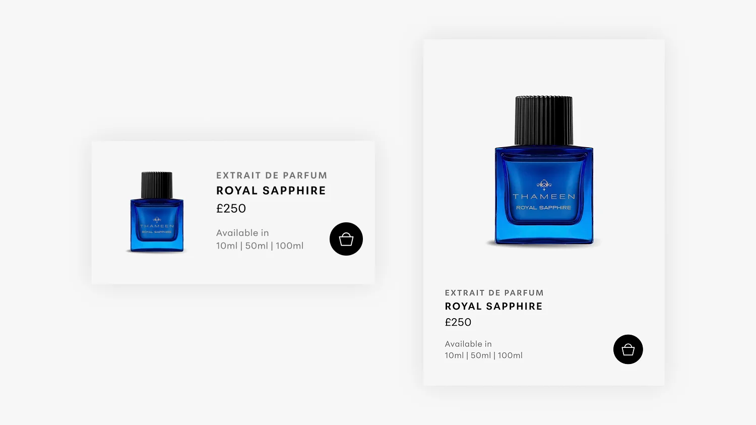
Thameen is a British luxury fragrance house with a focused range of high-end perfumes, stocked in Harrods and boutiques worldwide. The brand sits in the £200 to £400 price bracket, where the buying journey is slower and more considered. The Thameen London case study covers the wider project, but the product card design was a critical part of getting the collection experience right.
Thameen is the standout example in this article of what Shopify theme customisation can achieve when the right theme is paired with carefully redesigned product cards. The Sleek theme provided strong foundations for an editorial luxury brand, and the budget went into making everything that mattered to Thameen specifically feel completely bespoke. The product card was the most important of those areas.
The brand has a relatively tight product range, which presented an opportunity. With fewer products to display, I could afford generous spacing and a full-width grid that put each bottle front and centre. The cards lean into the editorial feel of the brand, with considered use of white space and typography that mirrors the print and packaging.
Two specific decisions matter here. First, I kept the theme’s built-in add to bag functionality on the card itself. For a luxury site, you might assume customers always want to drill into the product detail page first. The data did not support that. Letting customers add directly from the collection page kept the journey smooth, which on a luxury site matters as much as on a fast-moving consumer brand.
Second, the mobile experience was rebuilt as a list view rather than a downsized grid. Phone screens are tall and narrow. A two-column mobile grid forces small cards that lose the editorial feel. A single-column list view gives each product the breathing room it needs and lets customers scroll comfortably without the cards taking up the whole screen at once.
2. East at Home. When the customer needs answers before they click
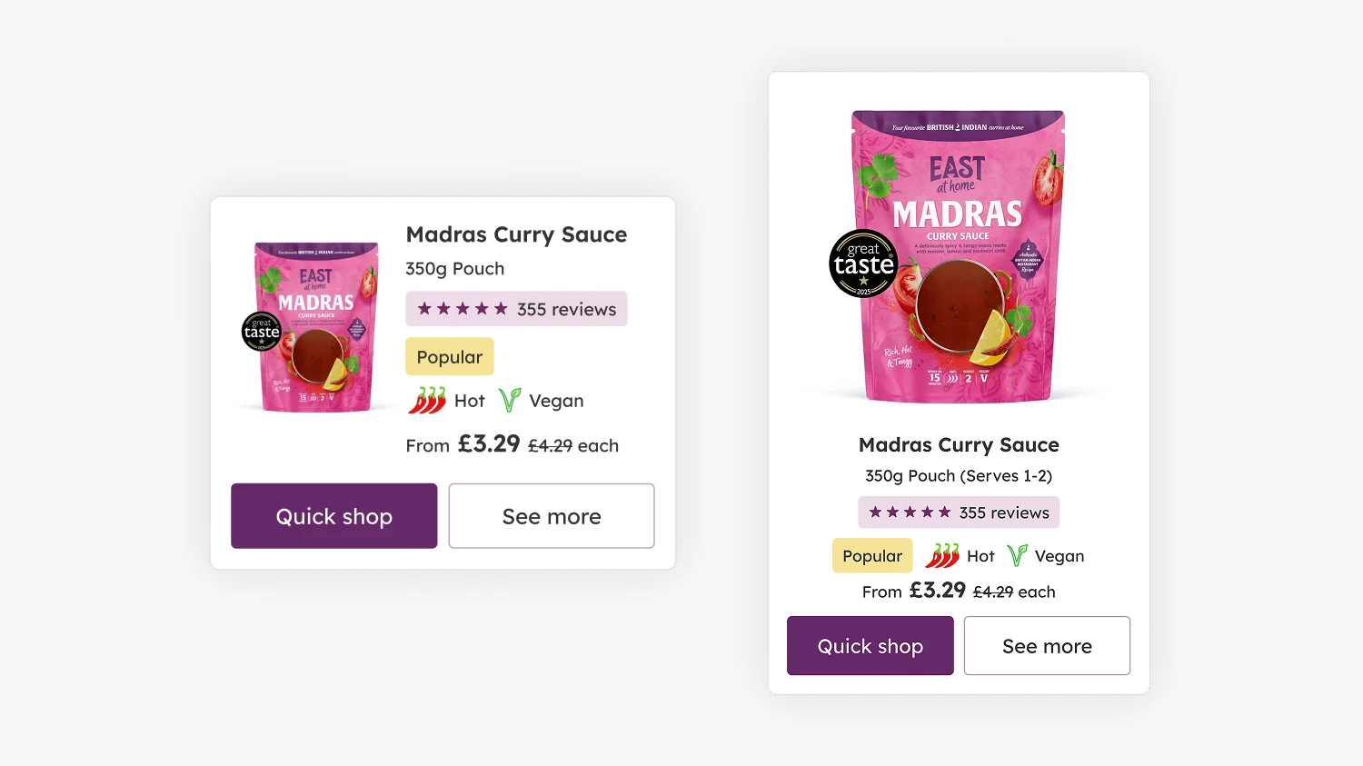
East at Home sells British Indian curry sauces. Where Thameen’s customer is patient and considered, East at Home’s customer is making a quicker, more practical decision. They are deciding what to cook for dinner. The East at Home case study goes into the wider project, but the product card had to do a lot of work very quickly.
The card carries the Great Taste 2025 award badge, the customer review count and star rating, dietary information (vegan), heat level (chilli icons), the price with any discount, and a Quick Shop button alongside a See more button. That is a lot of information, but every element is there because customers actually want it before they click.
The Quick Shop button matters most for conversion. For a curry sauce, customers do not always need to read the full product detail page before adding to basket. They know what jalfrezi is. They want to know if it is hot, if it is vegan, if other people liked it, and how much it costs. Once those questions are answered on the card, the click into the product page is optional. Removing that friction directly affects conversion rate.
The mobile version is again a list view, with the product image on the left and all the same information laid out cleanly to the right. Same content, structured for the device the customer is actually using.
3. Drink Finder. Over 500 wines and a customer who needs to compare
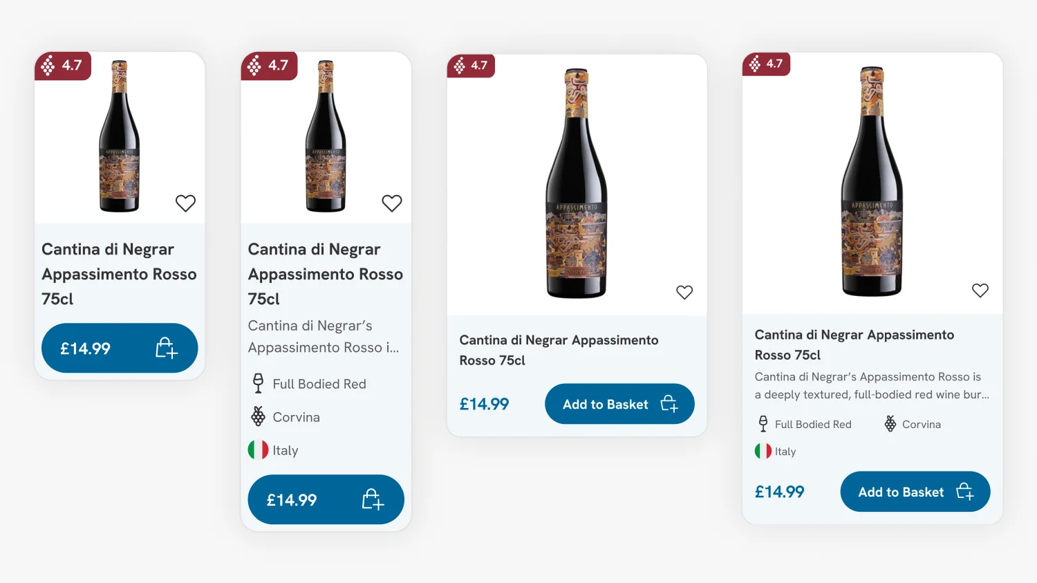
Drink Finder stocks over 1,500 wines and 5,000 products in total. When customers browse a collection like white wine, they are not picking by image alone. They want to compare on country, region, vintage, style, and price. The Drink Finder case study covers the migration and design strategy. The complexity of what the product card needed to do was one of the reasons a full bespoke build was the right call.
Each card carries the wine’s rating, country flag, region, vintage year, and style descriptor (Crisp Dry White, for example), along with the price and an add-to-basket button. That is a lot of information, but every element is there because wine buyers compare on those exact attributes.
The clever decision was a Show extras toggle at the top of the collection page. Power users browsing for a specific occasion can leave it on and see all the comparison data inline. Casual browsers who just want to see bottles and prices can toggle it off and get a cleaner grid. One design, two modes, controlled by the customer rather than the designer.
This kind of thinking sits squarely in Shopify CRO territory. The card is not just displaying information, it is reducing the number of clicks customers need to make to reach a confident buying decision. On a 1,500-product collection, that compounds quickly. I have written more about this approach in my article on product comparisons for Shopify stores.
4. Fuzzball. Gating subscription products on the card itself
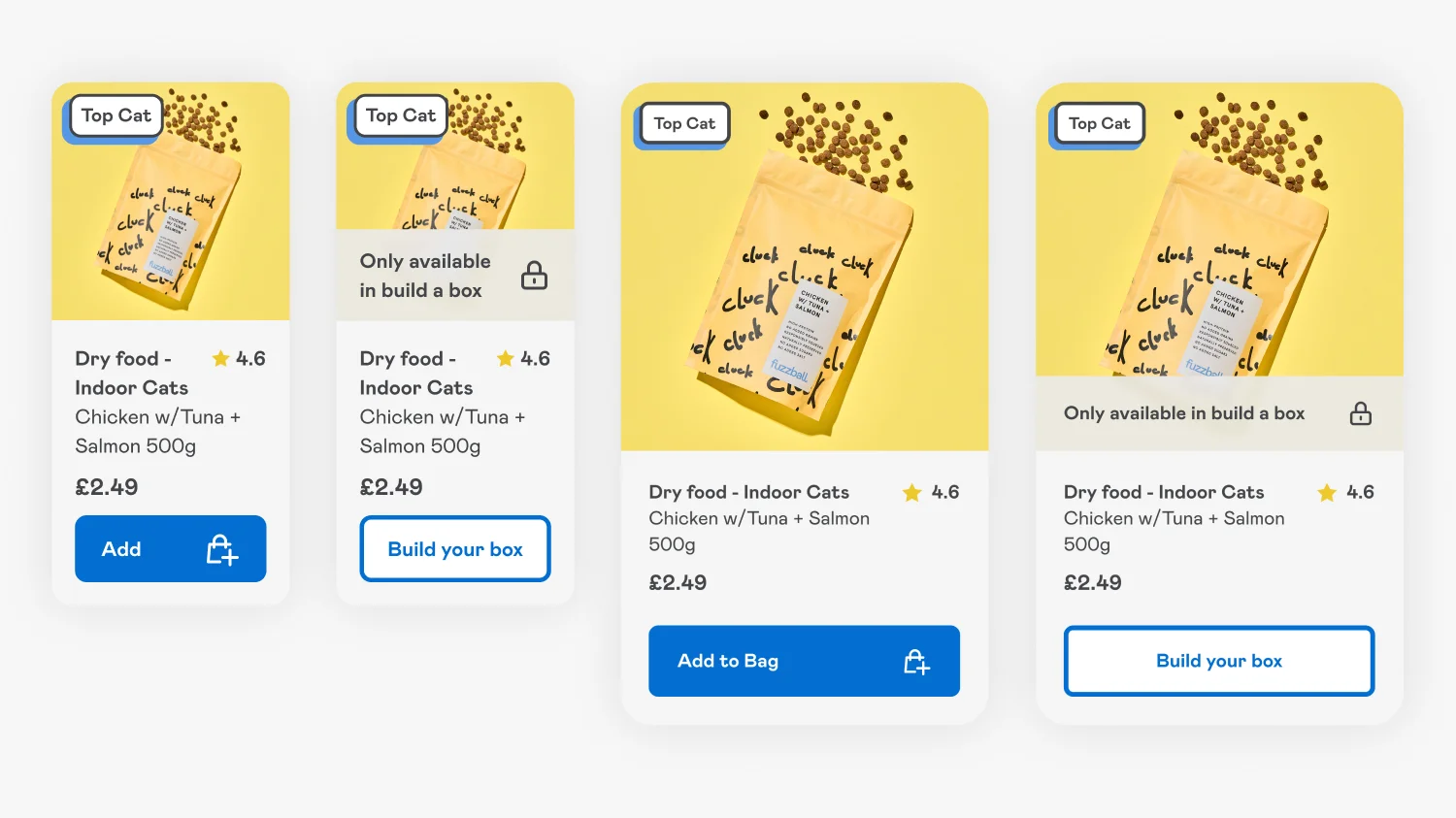
Fuzzball is a premium pet food brand built around subscription. The Fuzzball case study covers the wider subscription UX, but one specific product card decision is worth pulling out.
Some Fuzzball products are only available on subscription rather than as one-off purchases. On a standard product card, that distinction would only become clear once the customer clicked through and tried to add to basket. By the time they discovered it was subscription-only, they would have already invested time, and any friction at that point hurts conversion.
The solution was to design a gated product card variant. The card visually communicates the subscription-only status before the customer clicks. A lock icon, a clear Only available on subscription label, and a View Product button rather than an Add to Bag. The customer’s expectations are set on the collection page, not after the click.
This pattern has uses well beyond pet food subscriptions. The same approach works for products only available to logged-in customers, products gated behind newsletter sign-up, or members-only product lines. Once the gating logic is part of the card design, it becomes a reusable tool rather than a one-off.
5. Whistlefish. When the image is the entire decision
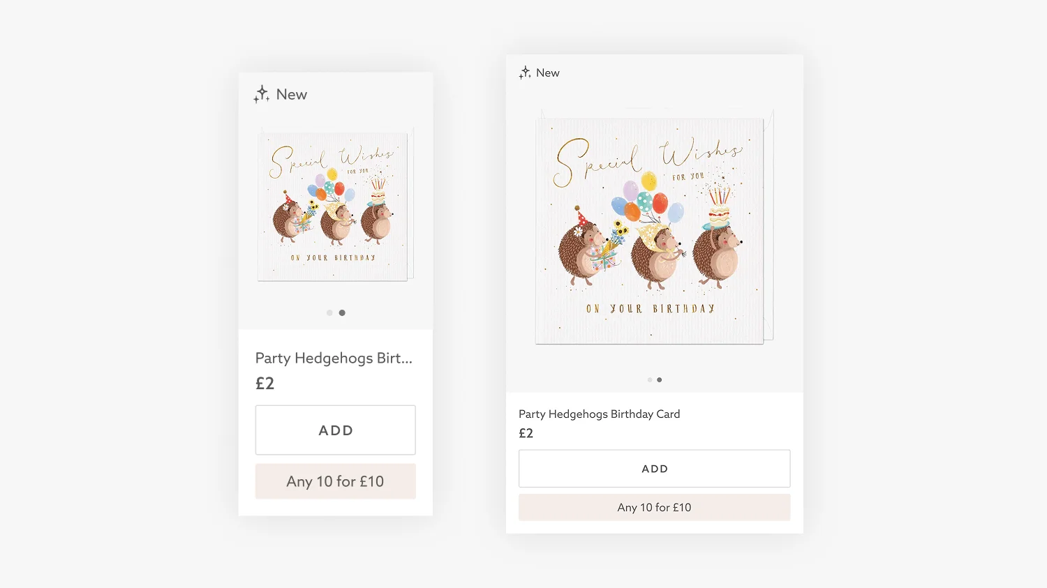
Whistlefish is a Cornish greeting card publisher with thousands of designs. The Whistlefish 2.0 case study covers the wider redesign, but the product card had to make a particular decision that goes against most general best practice.
On a greeting card website, customers do not read the product names. Nobody decides to buy a card called Be-Gin Birthday Card based on the name. They decide based on the visual. The image is the whole decision.
Knowing this, I made the deliberate choice to truncate product names at one line on the card. Most articles would tell you to make sure the full name is visible. On Whistlefish, that would have allowed long names to break the grid for no benefit, because customers were never reading them anyway. A clean visual grid serves the actual buying behaviour better than full-length names ever would.
The card also houses the multi-buy offer (10 for £12) and an Add button directly on the card. For greeting cards, where customers often buy several at once, that direct-add pattern matters even more than usual. The card is doing the entire job of the product detail page for a category where a product detail page click is often unnecessary.
6. Wide Fit Shoes. Variant information that has to be on the card
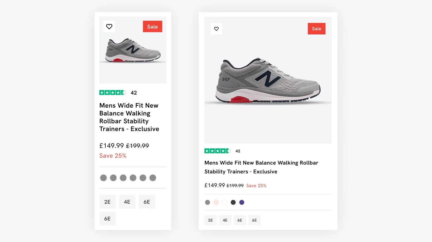
Wide Fit Shoes is a specialist footwear retailer for customers who need wider fit shoes. The Wide Fit Shoes case study covers the wider project, but the product card had to communicate something specific that most footwear cards ignore.
For a regular shoe brand, customers can usually assume their normal size will work and decide based on the image. For a wide-fit specialist, customers cannot. They need to know which width their shoe is available in (2E, 4E, 6E), and they need to know which colours are stocked, before they invest the time to click through to a product they cannot actually buy in their size.
The card carries the colour swatches as small dots and the available width sizes as labelled buttons. Both are visible at a glance. Both prevent the worst kind of ecommerce frustration, which is investing attention in a product that turns out not to be available. This is a card that respects the customer’s time.
The same principle applies to any product with significant variants. Apparel with sizes, beauty with shades, electronics with capacities. If the customer’s first decision happens at variant level, the variant information has to be on the card.
7. Hartnack & Co. Comparison cards for products that look the same
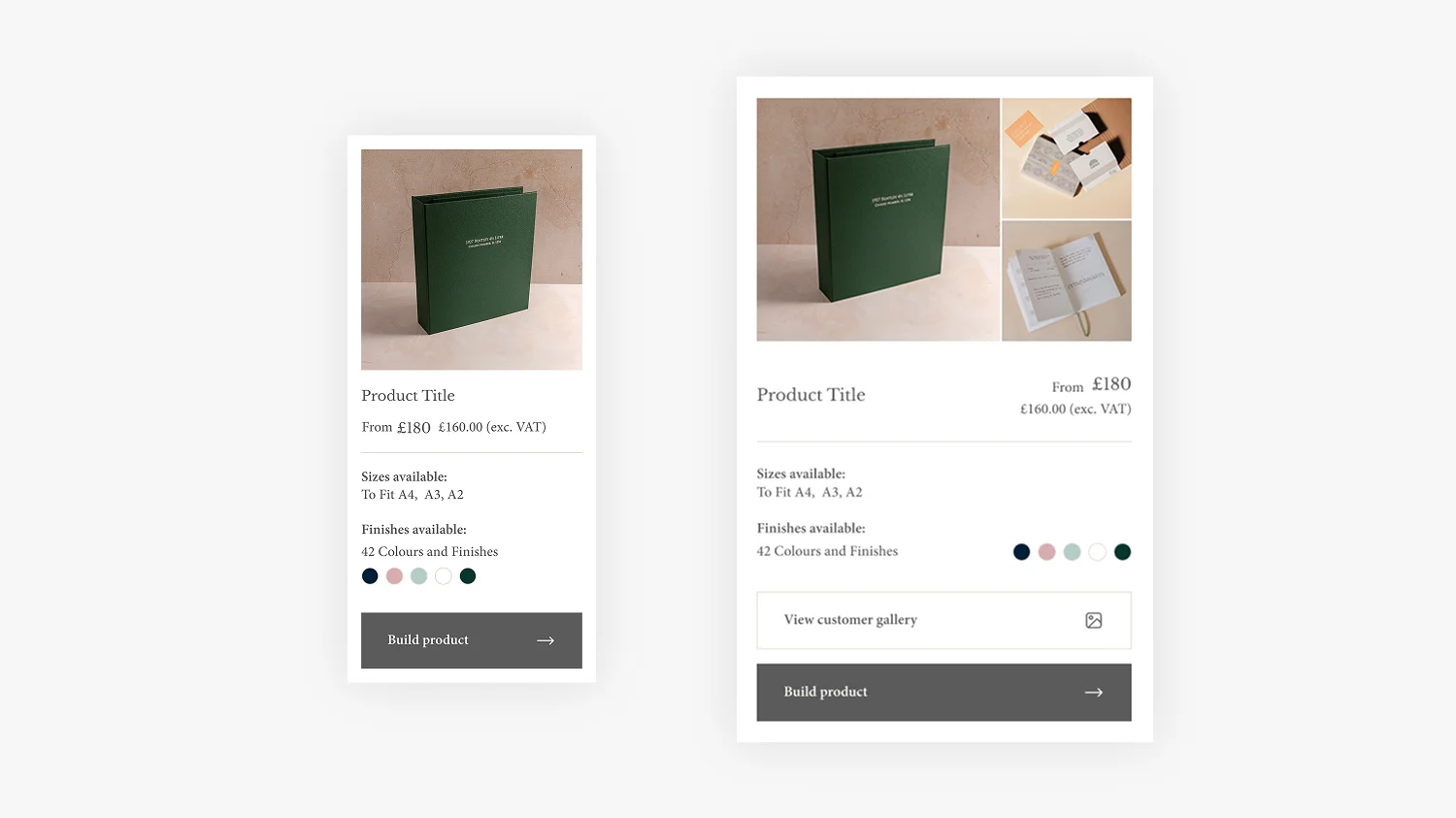
Hartnack & Co are bespoke bookbinders making library boxes, portfolios, and binders. Their products often look very similar to each other in photographs. A library buckram drop-back box and a leather-covered drop-back box look comparable in an image, but the materials, sizes available, and price all differ significantly. The Hartnack & Co case study covers the wider project.
A standard product card would force customers to click into each product page just to learn what was available, then click back, then click into the next one. For a brand where the considered purchase often involves comparing five or six similar products, that adds up to a lot of friction.
The solution was a card that displays the key comparison data inline. Sizes available (in both international and American formats), Format (portrait, landscape, both), Cover materials available, and where applicable a small swatch of cover colours. The customer can see at a glance what each product offers and only clicks into the ones that match their requirements.
This is also why the cards look denser than the others in this article. The customer’s research process is heavier, the price points are higher, and the willingness to read more information per card is genuinely there. A clean image-led card would have been worse design here, not better. The card has to match the customer’s actual buying behaviour, even if that means it looks busier than a typical ecommerce card.
The pattern across all seven cards
Looking across the seven examples, none of them follow the same template. Thameen has minimal information per card and leans into editorial restraint. Hartnack carries dense comparison data and is denser by design. East at Home strips the friction with Quick Shop. Whistlefish truncates information that does not matter to its customers. Drink Finder lets customers toggle complexity on and off.
What every card has in common is the question it answers before it answers any other. What does this customer, looking at this product, need to know before they decide whether to click? Once that question is answered honestly, the design follows.
The other thing worth noting across the seven examples is that the choice between bespoke build and theme customisation came down to the brief, not the ambition. Thameen achieved a fully editorial luxury feel through theme customisation because the Sleek theme provided the right foundation and the budget could go into making the components that mattered (the product card most of all) feel completely tailored. The other six benefited from full bespoke builds because their requirements (large product catalogues, gated subscription logic, multi-attribute comparison, complex variants) needed flexibility no theme would offer out of the box. Both approaches are capable of producing exceptional work. The right answer depends on what the project needs.
This is the work I find most satisfying as a designer. It is also where Shopify design for DTC brands earns its keep commercially, regardless of whether the project is a bespoke build or a theme customisation. The product card is one of the highest-traffic, highest-impact components on any ecommerce site. Getting it right pays back across every collection page, every campaign, and every customer who lands on the site.
How to think about your own product cards
If you are looking at your own collection pages and feeling like the cards are not pulling their weight, three questions are worth working through before redesigning anything.
What is the first question your customer asks about a product? If it is not the product name, do not let the product name dominate the card. If it is something specific (heat level, country, width, available materials), that information needs to be on the card itself.
What level of friction does your customer have for clicking through? High-frequency low-consideration purchases (curry sauce, greeting cards) want low click friction and Quick Shop buttons. High-consideration luxury purchases want a calmer, more editorial card and a slower journey. Match the card to the buying behaviour, not the other way round.
Where does the theme stop fitting your products? Look at the cards now. Are long product names breaking the grid? Is information missing that customers actually need? Are inconsistent product images making the page feel chaotic? Those are the points where the theme is no longer doing its job, and where customisation starts to earn its return on investment.
Designing your Shopify product cards
If your collection pages are not converting as well as they should, or if you are about to invest in a new Shopify build and want to make sure the product card is doing its job from launch, this is the kind of work I do. The right approach depends on the brief, the budget, and the complexity of what your products and customers need from the experience.
For brands where a well-chosen premium theme provides the right foundation, Shopify theme customisation is often the smarter starting point. Thameen is the standout example in this article of what that approach can deliver when the product card and other key components get the design attention they deserve.
For brands with greater complexity, larger product catalogues, gated subscription logic, multi-attribute comparison, or any specific functionality that no theme will support natively, a bespoke Shopify store build is the right answer. Drink Finder, Fuzzball, Whistlefish, Wide Fit Shoes, East at Home, and Hartnack & Co all needed that level of flexibility, and the product cards alone show why.
Either way, the product card is where the most transformative thinking goes. You can find more on my Shopify website design services page, or get in touch directly to talk through your collection pages. I am always happy to take a quick look and share thoughts before any commitment.
Frequently Asked Questions
A good Shopify product card answers the questions your customer asks before they click. That always includes a clear product image, name, and price, but the rest depends on your products and customers. A wine retailer needs origin and vintage. A food brand needs dietary information and reviews. A bespoke product needs sizes and materials. The best product cards are designed around the actual buying decision, not borrowed from a theme template.
Yes, the product card is one of the single most transformative components to redesign on a premium Shopify theme. Customers spend more time looking at product cards than any other component on the site, so a redesigned card changes how the whole store feels and performs. Combined with brand-led typography, colour, and spacing, customising the product card alone can make a premium theme feel completely bespoke without the cost of a full custom build.
Not necessarily, but most stores benefit from at least some product card customisation. Smaller catalogues with very visual products can sometimes work well on premium theme defaults. Customised product cards earn their keep when the theme default is missing information your customers need, when product names break the grid, when variant information matters at the collection-page level, or when the buying journey would benefit from features like quick add, gated subscription products, or comparison views.
Yes, theme customisation is typically more affordable than a fully bespoke build because the structural foundations of the theme do not need to be designed and developed from scratch. The right premium theme provides layout systems, performance, and content architecture, leaving the budget to focus on brand-specific design work and the components that need to be customised. The right approach depends on the brief — theme customisation suits brands where a premium theme provides the right foundation, while bespoke builds suit brands with greater complexity or specific functionality the theme cannot support.
The product card is one of the highest-impact components for conversion rate because every customer browsing a collection sees it, often dozens of times in one visit. Reducing friction (clear pricing, quick add, visible variants), answering buying-decision questions inline, and matching the design to the actual buying behaviour can all improve collection-page conversion. The compounding effect across every collection page on the site makes it one of the highest-ROI areas of design work.
Often yes. Mobile screens are tall and narrow, which suits a list view layout better than a downsized grid in many cases. A list view gives each product more breathing room, makes information easier to read, and reduces the cluttered feel of a two-column grid on a small screen. The exception is highly visual products like greeting cards or art prints, where a grid view still serves the customer better even on mobile.

This article was written by Anthony Bliss, a Shopify Expert & Freelance Shopify Designer specialising in UX and UI design for DTC brands. With 20+ years of design experience and 6+ years focused exclusively on Shopify, Anthony helps brands create stores that convert.
Let’s create your Shopify success story
Shopify Success Stories

Shopify Migration with Custom & Conversion focussed UX
Drink Finder

Headless to Shopify Migration with a Luxury Premium Theme Build
Thameen London

Bespoke Store Design with Key AOV Results and Rise in Revenue
East At Home
More Shopify Articles
What Is a Shopify UX Review (And Why It’s Where Every Project Should Start)
A Shopify UX review is where every project should start, and yet most agencies skip it in favour of made-up personas and assumptions. This article…
Benefits of Shopify Plus: Should You Upgrade in 2026?
If you are already running a Shopify store and weighing up whether to move to Plus, this article is for you. Most guides on the topic are written by…
What Is Generative Engine Optimisation (GEO) and Why Every Shopify Brand Needs It in 2026
Getting found online used to mean one thing: ranking on Google. That is still important. But a growing share of product discovery is now happening…
Shopify Expert
Ready to elevate your store? Start your Shopify transformation today
Shopify expert who can help elevate your store to the next level
20 years of agency and direct client experience, without the high price tag
Network of the best developers, Klaviyo experts & SEO experts perfect for big projects
This site is protected by reCAPTCHA and the Google Privacy Policy and Terms of Service apply.
Get in touch
Registered in England & Wales No. 10575474. Based in Falmouth, Cornwall, UK.