

Projektityyny. A mobile-first store launch for a Nordic-inspired textiles brand

Shopify UX design helps decide how customers find, compare and buy your products before anything is styled. I start with a UX review of your live store: your GA4 data first, to see who shops and where they drop off, then the entire purchase journey mapped on a Miro board, screen by screen. Then I design the fixes in Figma, with wireframes first, when it is needed. UX design is built into every theme customisation and bespoke store, and a UX review of your live store on its own starts from £800 + VAT. East at Home won UK User Experience of the Year 2026.




Food & drink · October 2025
October to June vs the same months a year earlier. GA4, UK sessions.

Stationery & gifts · April 2025
"We've since been able to carry that framework into our own design team." Will Manders

Food & drink · August 2025
September to February vs the same months a year earlier. EPoS till data, marketplaces excluded.
If the journey already works, a refresh on a premium theme is quicker.
Go straight to fixing and measuring that step.
When customers find what they want but the store doesn't feel like you, it's a brand job.
No two UX projects run the same way. Inside a theme or bespoke project, the review shapes everything I design. On its own, it gives you a prioritised list of fixes, some you can make yourself, so the budget goes where it counts. Either way, I ask one question throughout: would I buy this?
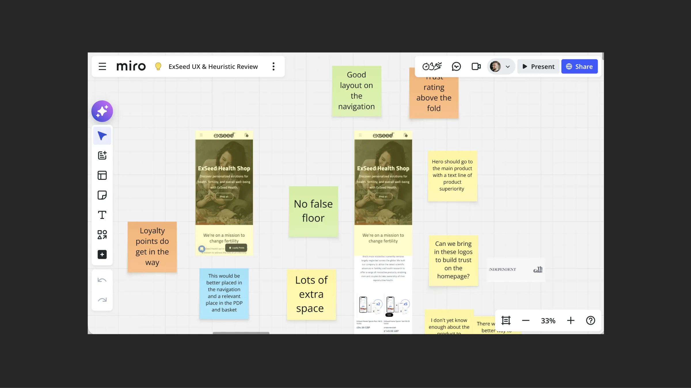
A call, a tailored quote, then a UX review of the analytics and then the purchase journey mapped out on a Miro board.
We create a document of fixes and tweaks, some you can do yourself. Some will need design time. We can work through a priority order to suit your budget.
The work feeds a theme customisation, a bespoke design or your developer's list, and I check it before launch.
I check conversion rate and average order value at one, three and seven days after launch.
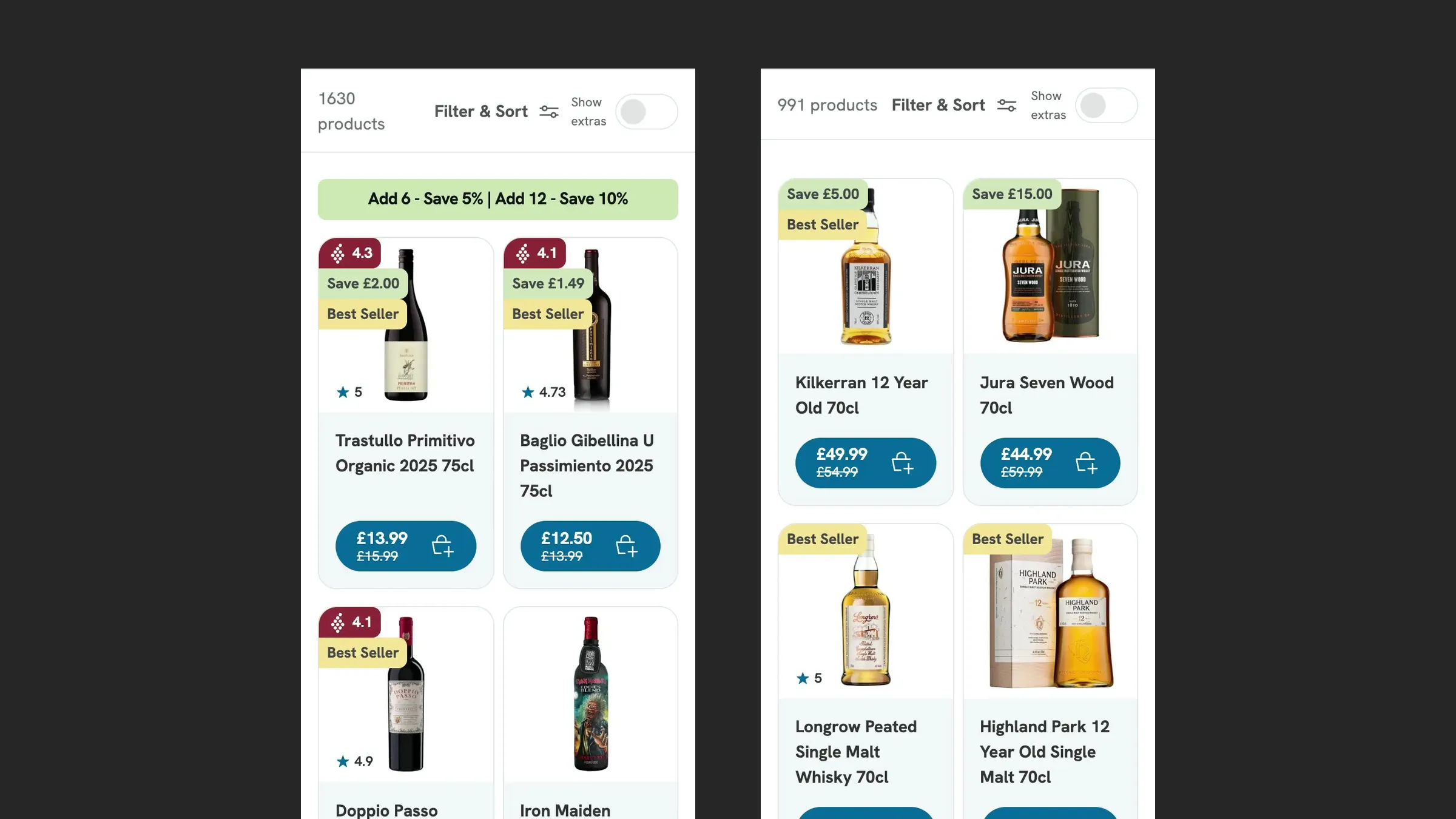
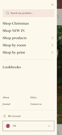
Most of these start in the navigation, because that's where customers go first.
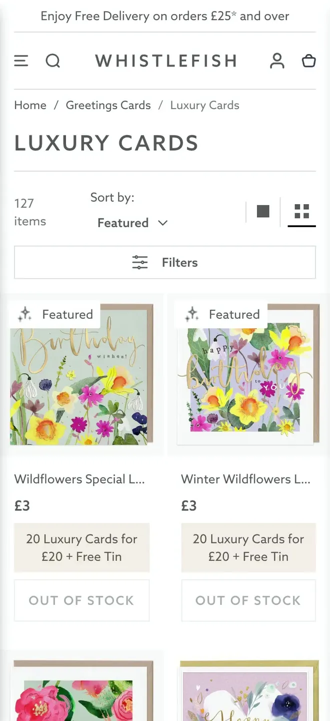
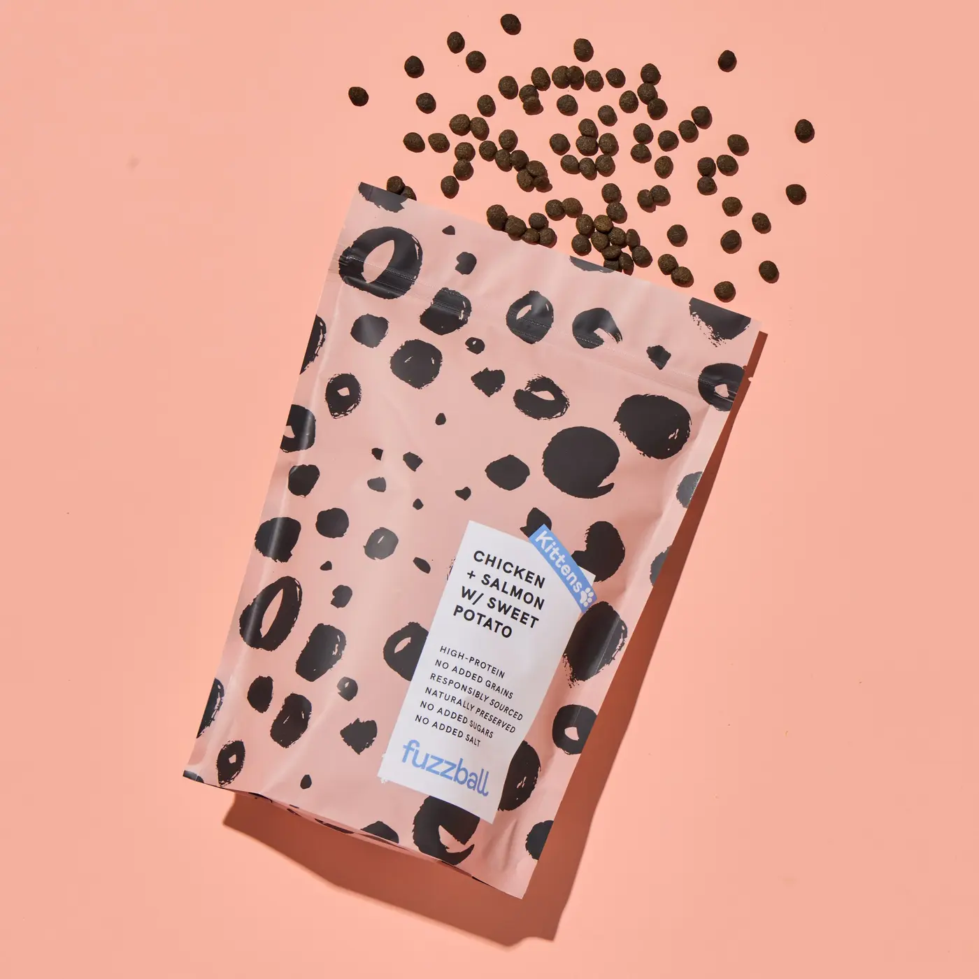
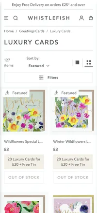
Product names truncated on purpose, because nobody buys a greeting card for its name.

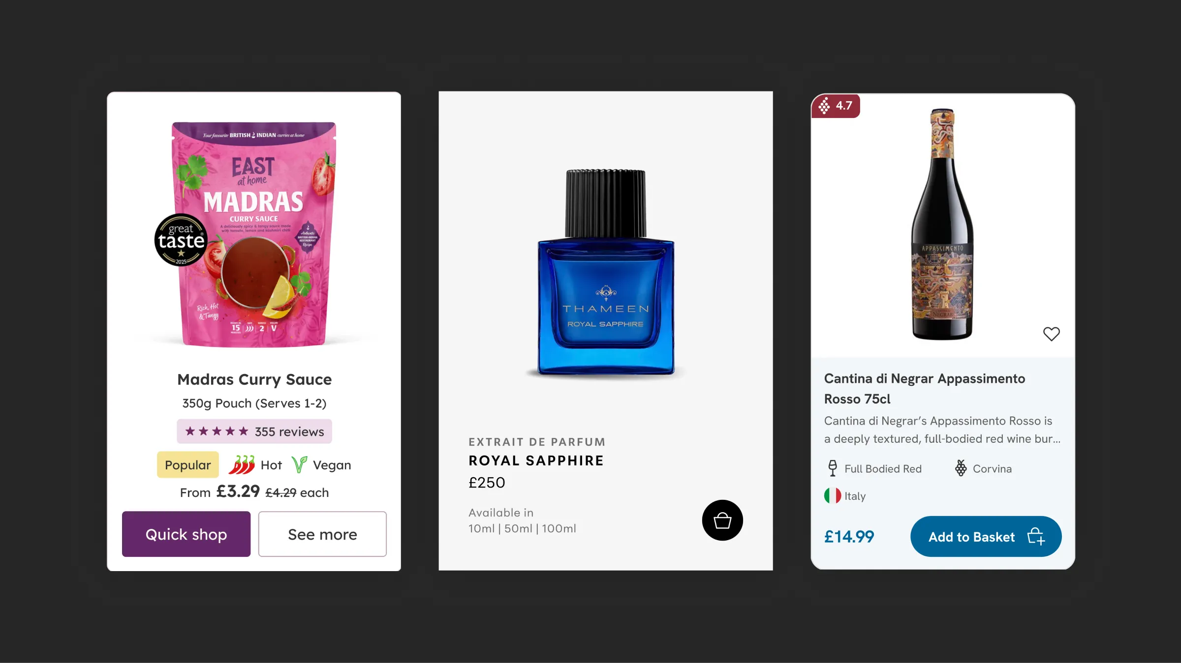
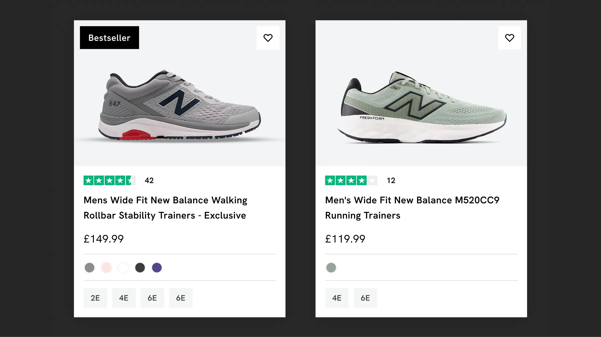
Every card shows spice level, dietary needs and flavour, in a list built for comparing on mobile.
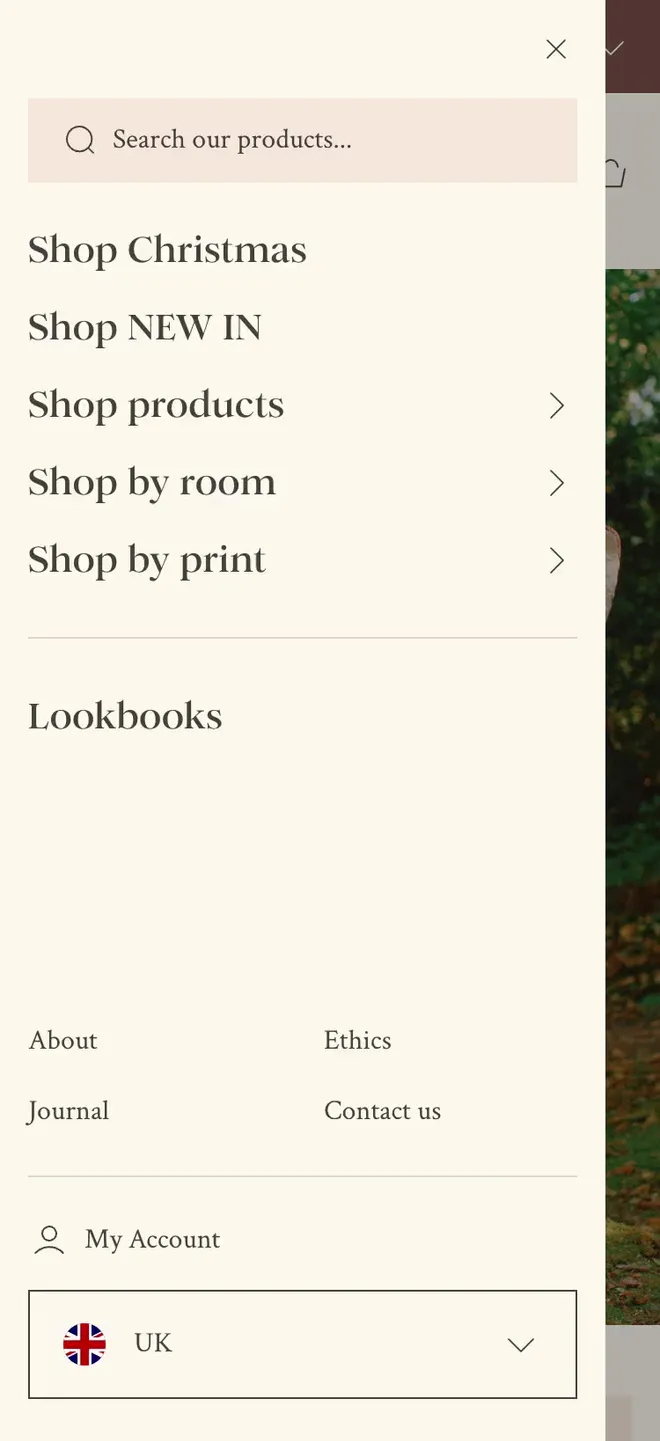
Three image-led routes in from the navigation match how people think about their homes.
“The new UX and UI were exceptional — customers could find products and complete purchases effortlessly, while the clean, professional design made browsing intuitive and trustworthy. Using Figma as a templating system meant all of our building blocks worked seamlessly together, and we've since been able to carry that framework into our own design team, making adjustments easily while staying true to the original vision.”
 Will Manders, Head of Ecommerce, Whistlefish
Prices checked November 2026. Every project is quoted individually once the brief is defined.
| Shopify UX design | |
|---|---|
| Starting price | Included in theme customisations and bespoke stores. A UX review on its own from £800 + VAT |
| Design time | Two to three weeks from review to design. |
| Build time | Depends on where the work goes: a theme customisation, a bespoke design or your developer's priority list. |
| What you get | A UX review on a Miro board, then the fixes designed in Figma |
| Who builds it | Cartmasters or Tom Blanchard, the Shopify developers who've built all 13 of my launches since 2023. Or your own team or agency |
| UX review on its own (you're here) | UX in a design project | |
|---|---|---|
| Price | From £800 + VAT | Included in theme customisations, from £5,000 + VAT, and bespoke stores, from £10,000 + VAT |
| What you get | An annotated Miro board of your store and a prioritised list of fixes | The fixes designed into the new store in Figma |
| Who makes the fixes | You, your team or your developer, in priority order, some without any design time | The developer builds from the design, and I check it before launch |
| Best when | You want to know what's wrong before committing a bigger budget | You're ready to redesign, and want the evidence behind every decision |
Get a quote | UX in a design project |


Less than most people think. Both are about the shopping experience, and most fixes from a UX review lift conversion too. The difference is focus: CRO measures the steps that lose sales in conversion rate and order value, while UX looks at the whole journey, including finding products, joining the email list and coming back later. A customer who doesn't buy today but remembers you is still a win, which is why I avoid stressful, time-pressured tactics.
I start from your real data instead: analytics, reviews and how customers actually move through the store. Invented personas are guesses, and a review built on guesses tends to confirm them.
The small things carry the store. I iterate a single button many times before it goes into the design system, and product cards get more time than any hero. For a timber merchant, I swapped the shopping basket icon for a flatbed trolley, because nobody puts a length of oak in a basket. It's those little touches that can make all the difference.
I reply within two working days.
Cookies
I use analytics cookies to see how people find and use this site. Nothing is tracked unless you accept.