
Top tips for your online Homeware & Lifestyle store
1. Perfect branding and design
What to do
- Clean & clear aesthetics & messaging.
- Have consistent imagery.
- Highlight what makes your company unique to help get new customers buy-in and separate you from the competition.
Why it is important
A beautiful website design will gain trust amongst customers and boost their confidence in the quality of your products. Whilst also making it clearer and easier to use. After all, if you are selling products that imply design and beauty and your design isn’t up to scratch then it’s likely your customers won’t trust what the brand is selling.
First impressions are massive in eccommerce, when a potential customer is shopping around on multiple sites you need to stand out. The conversion could be done solely on price point, however trust in the brand also plays a huge part.
Examples
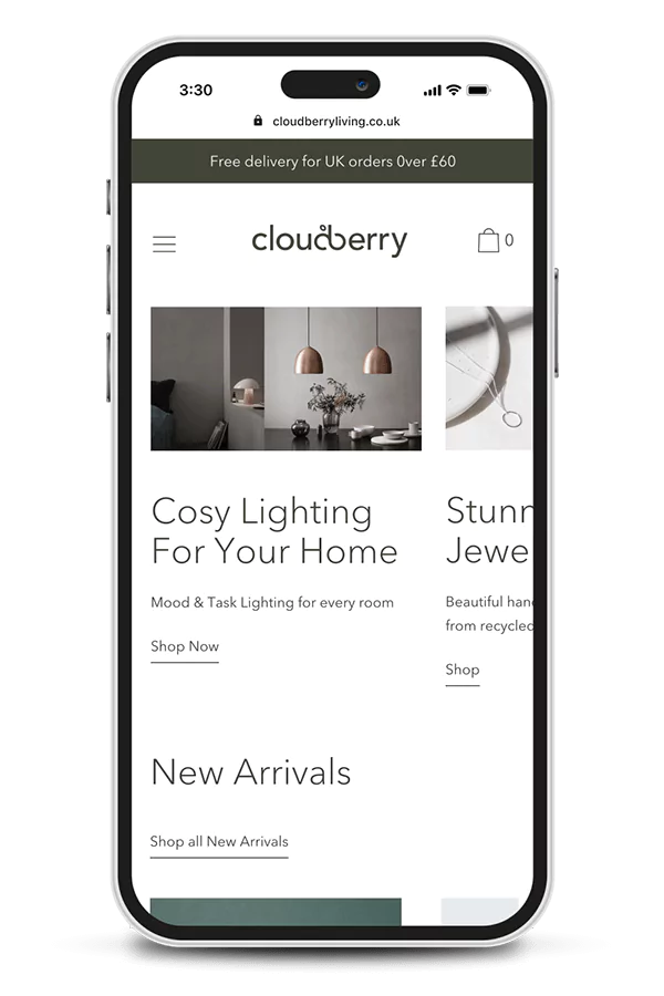
In this example Cloudberry Living who sell Scandinavian Scandinavian design gifts and homeware accessories, have a clean and modern design that fits with the products they sell.
More of this project can be seen on my Cloudberry portfolio page

2. Clear Navigation & User Journeys
What to do
- Multiple routes into collection pages and product pages. Some users may want to shop by a room, some may want to shop by a specific styling that they are looking for.
- Well thought out landing pages with clear sub pages and filtering.
- Search with recommended products.
Why it is important
Not all users have the same needs. Some users will land on your site from a search engine. Some know exactly what they want and want it fast. Whereas some users may be engaged in the brand and only want to see what your latest products are.
So how do you make your website usable for researchers and impulse buyers?
It’s all down to a clear hierarchy. Separating different journey methods and making them easy to find. There has been a recent trend of bringing key collections out of the burger menu so they are clear and upfront on every page of your store. This works great as the user doesn’t have to open a menu and look around, saving time and clicks.
You can also visually separate them in the menu. This could be done by color, spacers or content. You could also have imagery or icons for some links and text links for others, this method works great when you have some collections that need sub pages in the menu, which creates a clear visual hierarchy.
Examples
The new La radoute site brings some of their key collections and landing pages out of the burger menu. They even draw the eye and highlight the top offers by using their brand colour. This approach means there are less clicks for a user to get to a collection page and start shopping.

3. Curate meaningful landing pages of your collections and products
What to do
- Utilise your your skills and group products and collections for rooms and trends
- This will help your customers find products they might not be looking for but ina well throughout way
- ‘Get/shop the look’ on Collection and product pages
Why it is important
Chances are you have a lot of products. Use your knowledge and expertise to curate bestseller collections. Group colours, finishing, stylings and trends to make it easy for users to find associated products that would otherwise lay in a separate collection. Enable users to add to the basket from the landing page for the win!
Examples
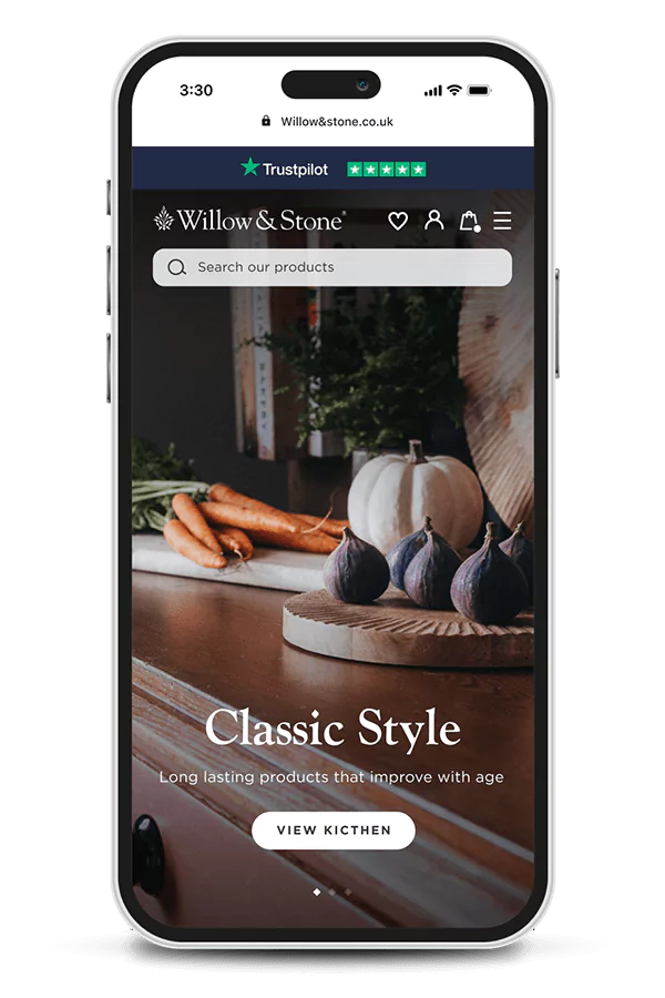
Willow & Stone have done a great job of creating ‘shop by room’ landing pages and curating products within. For example the boot room landing page has a well thought out structure of curated collections, shop the look, bestsellers and then related blog articles.
Check out more of this project and my UX ideas on the Willow & Stone Case Study.

4. Collect and showcase User-Generated Content (UGC)
What to do
- Create a section on the product page EG ‘As seen on Instagram’ so customers can see your products in real environments from happy customers.
- Encourage customers to share content. This could be through Socials or email marketing and you could offer a reward/gift to entice more content.
Why it is important
Lots of brands struggle to generate images and videos that stand out from their competitors. Prioritising UGC can help because;
- More relatable to customers and helps build trust seeing real products in real places with real people.
- More of an authentic way to ensure diversity, rather than handpicking models/influencers.
- Minimises costs.
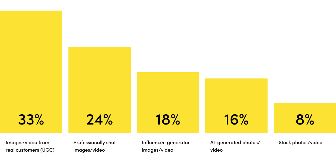
Source: Noso, 2023
Creating a community feel is a great way of getting customers to buy into your brand and go onto the next step in the journey. That might be revisiting the website, signing up to socials or signing up to your newsletter. Having engaged customers in turn helps new users to convert in customers.
This approach also helps you to create great unique content which is great for SEO and helps visibility on SERPs (search engine result pages).
Taking the user-generated content a step further you could utilise a customer gallery and link products to the images. This can be seen in the Willow and Stone case study
Reference: https://www.nosto.com/blog/new-research-brands-prefer-ugc-for-diversity/
Examples
The Ikea Customer Gallery is a section which is used through the site on the homepage, collections and product pages. It allows user generated content to be linked with products, so the user can purchase all the products used in that single UGC image.

5. Build Trust indicators
What to do
- Hero your reviews and start gathering reviews with customer photos to help build trust.
- Show Third-party endorsements.
- Make Returns & Guarantees easy to find.
- Think if Trustpilot is right for you.
Why it is important
Genuine reviews and product ratings build trust in your products and your brand. Customers are more likely to trust what their peers say over marketing claims.
But trust doesn’t end with customer reviews. Endorsements from known organisations can help with your brand’s credibility. Also enabling Trustpilot widgets is a great way to gain trust without having to say anything.
Lastly, trust and peace of mind about a purchase can play a huge part in converting a user to a customer. Letting users know the policies on delivery and returns can play a huge part in converting potential customers. Try to not hide these bits of information. Having icons near the add to cart button or price has always worked well as the user doesn’t have to go searching, it is always in a predominant part and helps with scan readers.
Examples
Nkuku bring in their review rating into the stick add to cart on mobile which is a great touch, this is even clickable which anchors links to the review section.

6. Treat your product pages as landing pages
What to do
- Put your trust indicators high up on every page. Not just on the homepage
- Focus on benefits over features
- Upsell and link related products and blog content
Why it is important
Not every user will come from the homepage, some organic users will arrive to a product page via a search engine result page (SERP’s). And may miss out on important messaging or trust indicators that could help convert.
On product pages when you focus on benefits, you’re informing potential customers how your product or can make their lives better. This is much more compelling than just simply listing features.
Examples
Rockett St George do a great job of having their product pages as content rich landing pages. Nothing is hidden and the information is easy to find for scan readers.

Looking to elevate your Shopify Store with an expert Shopify Website Designer?
Having worked on lots of Shopify stores both directly with clients and collaborating with agencies, I am in a fabulous place to offer my expertise. I can help elevate your store to the next level and by undertaking my trusted Brand & UX/UI design process.
Shopify success stories
Rebrand & Design of new Shopify Store
Cloudberry
Bespoke Shopify Store Design
Whistlefish
UX & UI onto a new Shopify Theme
Willow & Stone