Wide Fit Shoes Shopify Website Design Case Study

Wide Fit Shoes operates Shopify websites in both the US and the UK and required a modern design based on their existing Shopify theme. I outlined the Shopify 2.0 sections and improved the user experience for navigation and search. Following that, I integrated the design into a new Design System. Now, all the designs are organised within their own Figma file, making it easier to create new page designs and facilitating any future conversion rate optimisation (CRO) work for Shopify.
Client: Wide Fit ShoesServices: UX & UI Design, ShopifyRole: Shopify Design Expert
Looking at the data and defining the users
Using Google Analytics GA4, I extracted all user data and categorised it into different user personas. This analysis revealed a wide range of age demographics using the website. As a result, I focused on creating a design that would appeal to all age groups, ensuring the site didn’t feel too young or too old. Inclusivity became a key factor guiding our design decisions.

An advanced design system utilising Shopify 2.0 sections
We chose the Inpulse Shopify theme for this project since both the .com and .co.uk websites were already using it. I then mapped out all the components and sections available in Shopify 2.0 and built all the elements out into a new modern and refined design system.
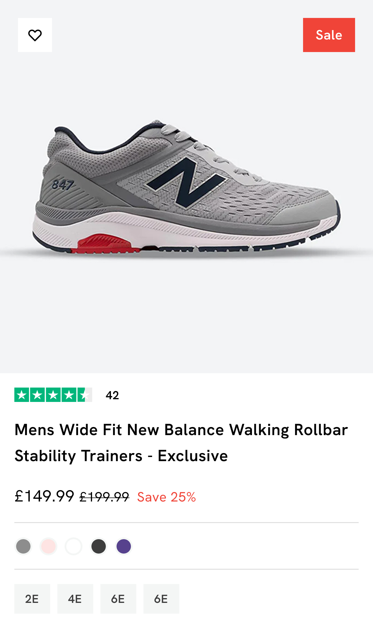
New product cards
Product cards are probably the most fundamental component to an ecommerce website. A good product card informs the user about the product and lets them make an educated decision on whether to click through to the product page or not. Historically that has always been just the image but in the case of Wide Fit Shoes the user needed to know the colour variants available and also what special wide fit the shoe available in.
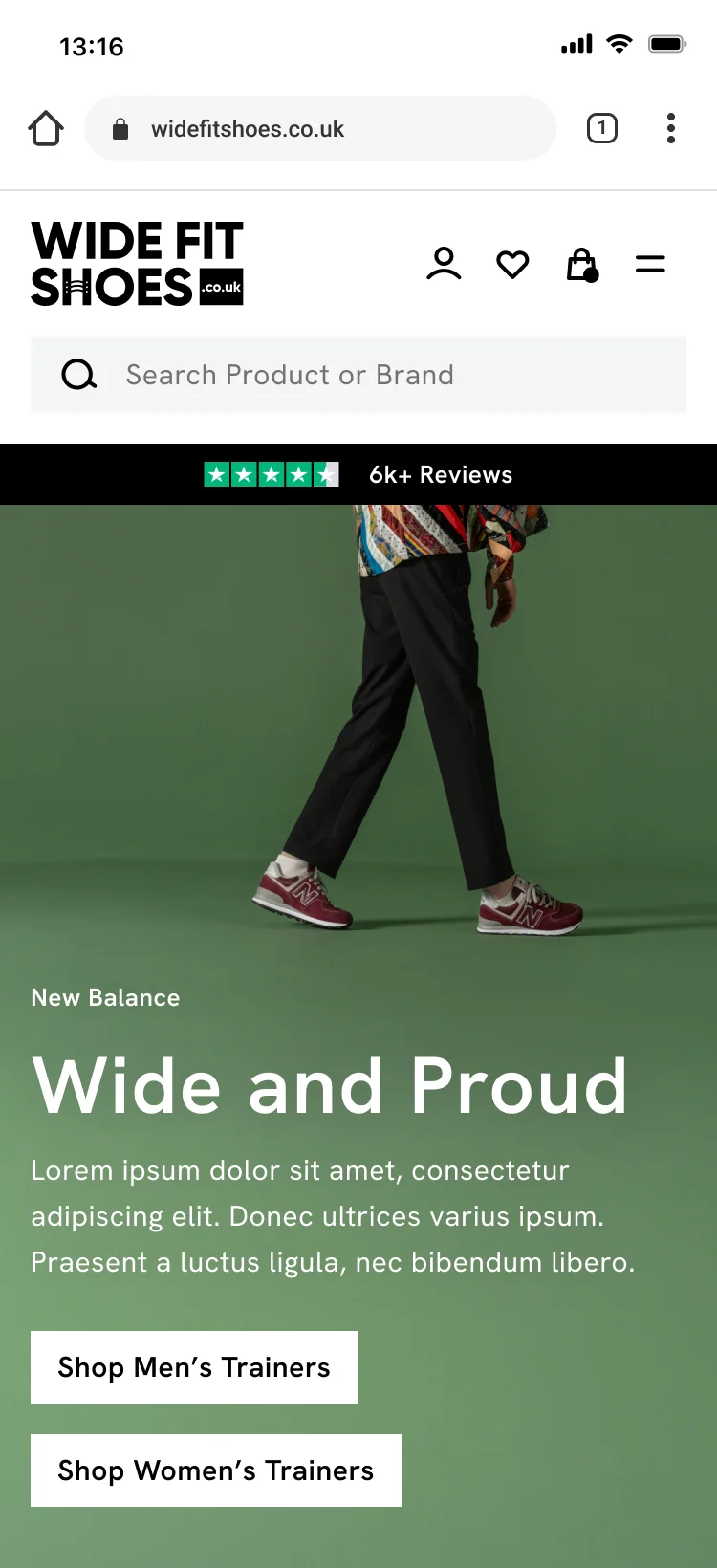
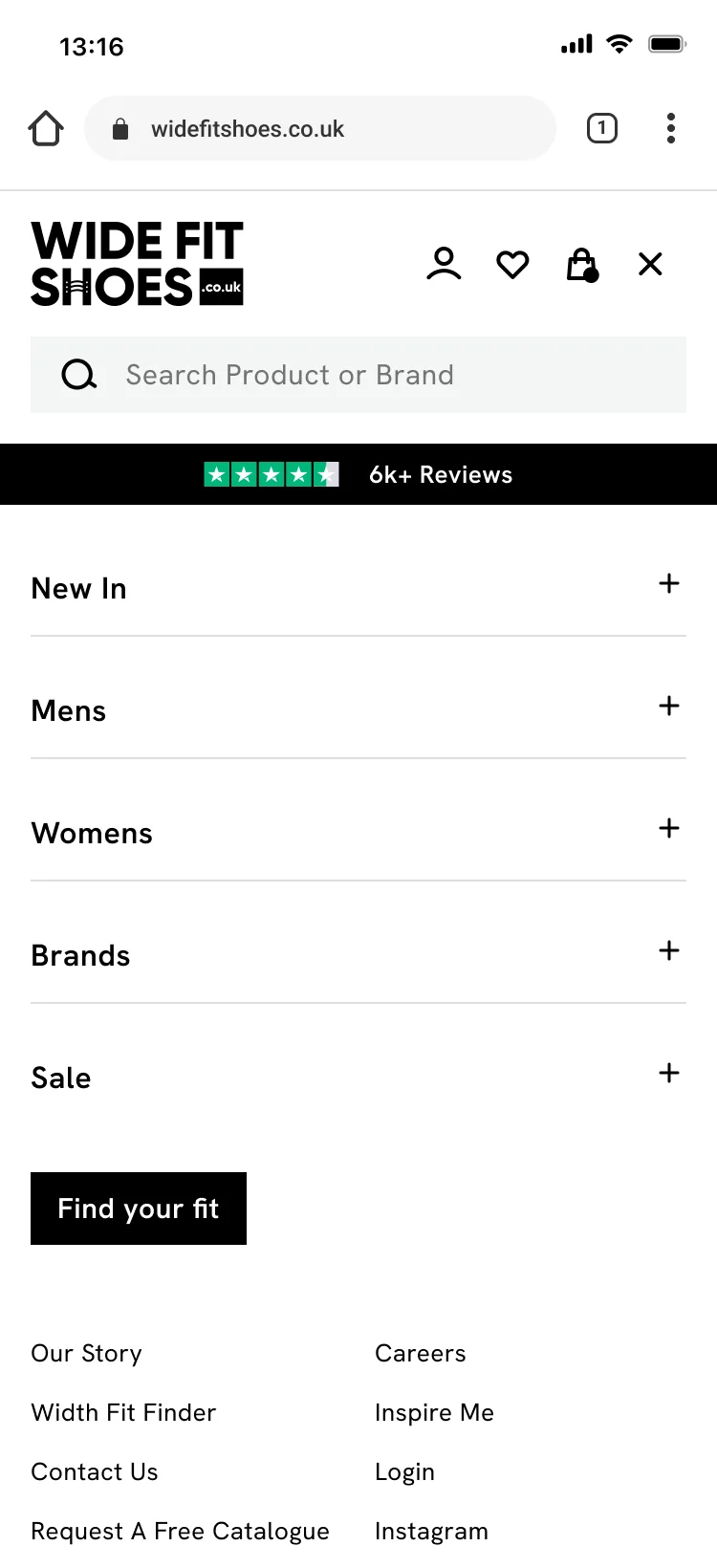
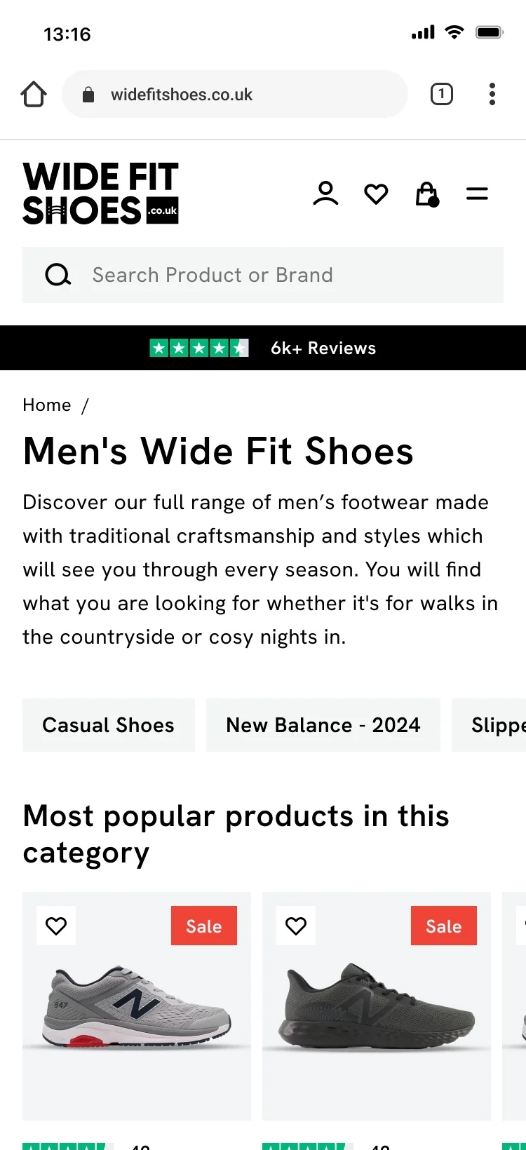
Mobile user interface screens
Key screens of the purchase journey. Utilising a neutral colour palette allowed the website to meet AAA compliance standards. Modern, neat, accessible and legible. Letting the products do the talking.


Desktop UI design
Clean and clear shopping experience, with easy signposts and routes into sub-collections. Nothing is overwhelming for the user as here are no snazzy hover effects or any clutter, just a clear and calming journey.

New conversion focused product pages
The new Product Detail Page (PDP) has undergone a complete overhaul and reorganisation, focusing on a clear hierarchy of content. The variants are now represented with images instead of plain colour swatches. Additionally, all buttons and variations have been thoroughly mapped out, ensuring a seamless transition from design to development.

Easy landing pages with UX at the core
Investing in the Figma design system means it saves time and money in the future when it comes to building out new pages. The key to a good landing page is where you send the user next onto their journey. Shopify is amazing for so many reasons, but how easy it is to create collections is one of my favourites. This enables us to create collections for different different gifting price brackets and a nice touch for the Christmas landing page was to create a signpost and collection specifically for the party season.

More Shopify Success Stories

Bespoke and refined design system complete with all new Shopify 2.0 sections
Dr Lipp
WooCommerce to Shopify Migration with a Unique Design
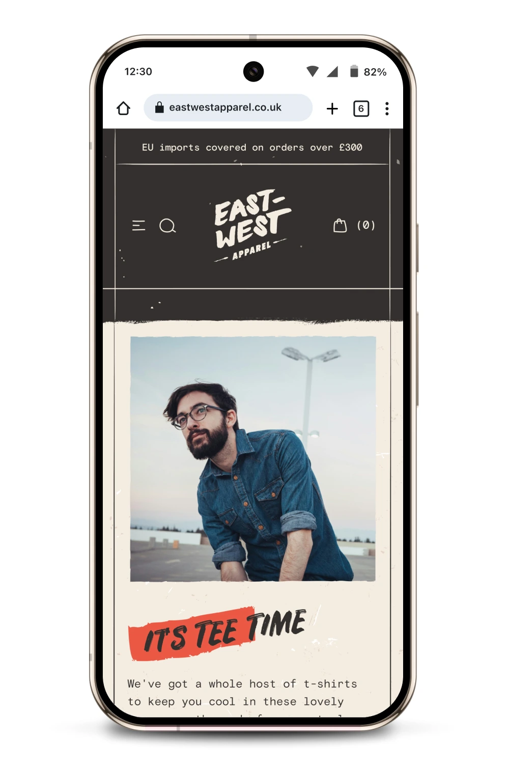
East West Apparel

A fresh mobile-first design system and bespoke product page UX
Window Fleur
Shopify expert
Ready to elevate your store? Start your Shopify transformation today
Shopify expert who can help elevate your store to the next level
20 years of agency and direct client experience, without the high price tag
Network of the best developers, Klaviyo experts & SEO experts perfect for big projects
This site is protected by reCAPTCHA and the Google Privacy Policy and Terms of Service apply.
Get in touch
Registered in England & Wales No. 10575474. Based in Falmouth, Cornwall, UK.