Introduction
If you have ever hired a designer or an agency for a Shopify project, you have probably been through a discovery phase. For many agencies, that involves filling out a brief, building user personas, and running a workshop or two before the design work starts. The output is a deck of imagined customers with names like Sarah the busy mum and assumed shopping habits that nobody has ever actually validated.
I do it differently. Every Shopify project I take on starts with a UX review based on real data and the live store as it actually exists, not assumptions about who the customers might be or what they might want. This article walks through what that looks like, why it matters, and what comes out the other end.
I am Anthony, a UK Shopify expert specialising in design and Shopify CRO for ambitious DTC brands. The UX review process I am about to describe is the one I have refined over years of agency work and freelance projects. It is how every engagement begins.
What is a Shopify UX review?
A Shopify UX review is a structured analysis of how customers actually use a live Shopify store, combining real analytics data with a designer’s expert eye to identify where the experience is helping conversion and where it is hurting it. It covers the full purchase journey from landing on the site to completing checkout, flags both what is working and what is not, and produces a clear set of recommendations for what to change first.
Three things distinguish a good UX review from a generic ecommerce audit:
- Real data, not assumptions. Real users in GA4, not invented personas. Real device and screen size data, not generic best practice.
- Designer judgement on top of the numbers. The data tells you what is happening. A designer’s eye tells you why and what to do about it. Neither alone is enough.
- Balance between good and bad. A good UX review flags what is working as well as what is not. This is not a hatchet job. It is a clear-eyed assessment of an existing store from someone who wants the project to succeed.
Real devices, real time, real expertise
A proper UX review is not done in a browser window with the device emulator turned on. The review has to be done on the actual devices customers are using. I go through the store on real phones, real tablets, and real desktops, in the same way customers do. Browser emulators are useful for quick checks but they miss the real-world friction. The way a button responds to an actual thumb on an actual phone is different to how it looks in DevTools. The way text wraps on a real Samsung is different to how Chrome renders it. The way an iOS form keyboard behaves over the page is different to what the emulator shows.
Time matters too. A UX review done properly takes days, not hours. The GA4 analysis alone is a serious piece of work, the Miro purchase journey mapping has to be done screen by screen at the right viewport sizes, and the heuristic review needs to be unhurried so that nothing gets missed. There is no shortcut to this. Anyone offering a comprehensive UX review in an hour is not doing the work.
And expertise matters most of all. The reason I can do this work is not because I own a Miro account and have access to GA4. Those tools are public, anyone can use them. What makes the review valuable is 20+ years of design experience, six years of that focused exclusively on Shopify, and the judgement that comes from having designed for fragrance brands, food brands, wine retailers, pet food subscriptions, greeting card publishers, footwear, and bespoke bookbinders. The tools help me put the review together. The thinking behind it is what makes it useful.
Why a paid UX review is different to a free site audit
Most Shopify agencies offer free site audits as a way to start a sales conversation. These are not the same thing as a UX review and should not be confused with one. A free audit is typically a 15-minute skim through the site, often run through automated tools, producing a generic checklist of issues that look serious on a slide but are usually surface-level. Page speed, missing meta tags, generic mobile responsiveness flags. The same audit could be produced for any Shopify store. There is no time invested, no real data behind it, and no design judgement applied.
That is fine for what it is — a lead generation tactic. It is not what I do. A paid UX review is days of work, grounded in your store’s real users, mapped against your store’s real purchase journey, applied to your store’s specific products and customers. The deliverables are real working documents that inform months of design and development decisions, not a slide deck designed to make you sign a contract. The difference is not subtle, and the value is not comparable.
Why made-up personas are a worse way to start a project
Personas are a discovery-phase staple for many agencies. The team gets together in a room, looks at the client’s brief, and builds a few imagined customers. Sarah the busy mum, James the gadget enthusiast, Priya the considered shopper. Each persona gets a fictional age, location, set of pain points, and shopping behaviours.
The problem with this approach is that it is entirely made up. None of those people exist. None of their pain points have been validated against real customer behaviour. The team has spent half a day inventing assumptions, which are then presented to the client as insight, and the design work that follows is built on those assumptions rather than on anything real.
I am not saying personas have no place in the design world. For brand-new products with no customers yet, they can be a starting point because there is no real data to work from. But for an established Shopify store with real customers, real analytics, and a real purchase journey already running, choosing imagined users over real ones is a strange decision. The data is already there. The customers are already there. Looking at imagined ones first is throwing away the most valuable input the project has.
Looking back at some of the persona-led discovery work I have been involved in over my career, I have come to think of it as a comfort blanket for agencies. It produces a tidy deliverable, it fills a chargeable phase of the project, and it gives the design team the feeling that they understand the user. But the understanding is fictional. The customers in the persona deck have never set foot on the client’s site. The real customers have. Why would you start with the wrong group?
Stage one: the GA4 data analysis
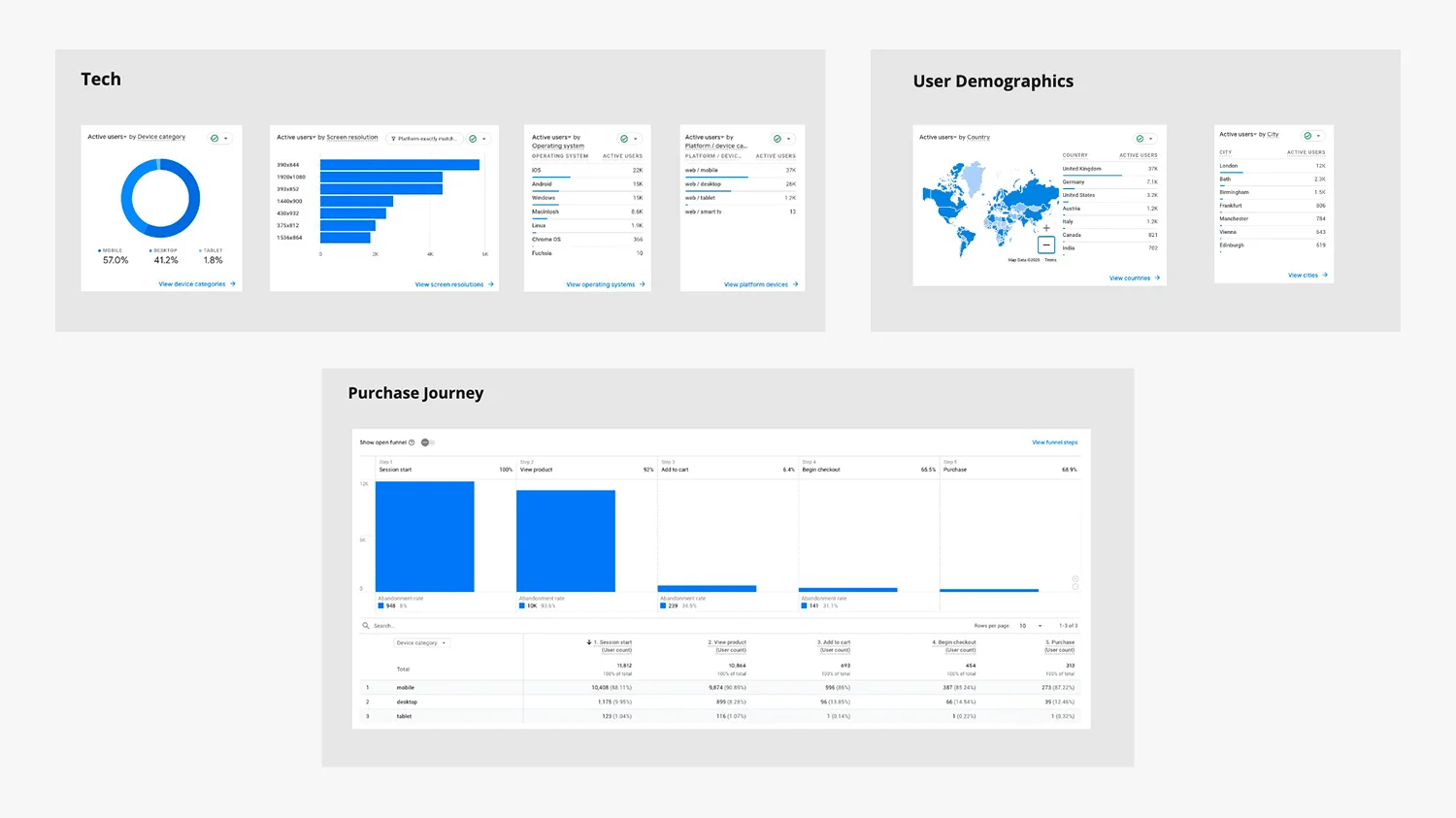
The first stage of every UX review is a topline analytics review using GA4. The goal at this stage is not to dive into every metric or replicate the work of an SEO specialist. The goal is to understand who is using the store, on what devices, on which pages, and where they drop out of the purchase journey. That information then shapes what comes next.
The standard reports I look at for every Shopify UX review include:
- Traffic Acquisition and Channel. Where is traffic coming from? Organic search, paid, email, direct, referral. The mix tells me what kind of customer is landing on the site and what their intent likely is.
- Landing pages. Which pages are people entering on? The homepage rarely dominates as much as clients expect. Product pages and collection pages often get more entry traffic, which changes which pages matter most in the redesign.
- Pages and Screens. Which pages get the most engagement, and how long do visitors spend on each? Patterns here often surface unexpected priorities.
- Organic Search queries and pages. What are customers actually searching for to find the site, and which pages do they land on? This often exposes intent that the existing site is not serving well.
- User Demographics. Country, language, age where available. UK-focused brands sometimes find significant overseas traffic they have not designed for.
- Tech (device, OS, browser). The mobile / desktop / tablet split is the headline number, but the breakdown across operating systems and browsers matters too. A brand with heavy iOS traffic needs to design for Safari quirks. A brand with significant older-Android usage needs to design for slower devices.
- Resolution by revenue. Which screen sizes actually drive sales? This often differs from which screen sizes get the most traffic. It tells me which mobile viewport widths to design for first.
- Purchase Journey. The full funnel from product view to add to cart to checkout to purchase. The drop-off between each step is where the design work needs to focus.
- Ecommerce purchases and conversion rate. The baseline. The number we want to improve, broken down by device, by traffic source, and by product where useful.
This stage produces a topline picture of the store. It is not a deep analytics dive — that is a separate piece of work, and there are SEO and CRO specialists who go far deeper into the data than I do. The goal at this point is to know enough about the real users to design properly for them. That means knowing what devices to design for, which pages matter most, and where in the funnel customers are dropping out.
It also surfaces anomalies. Every store has them. A page that gets unexpectedly high traffic, a device split that is heavier mobile than the client realised, a conversion rate that drops off a cliff on a specific viewport. Anomalies are some of the most valuable starting points for a project, and they almost always lead to a useful conversation with the client about what is going on and why.
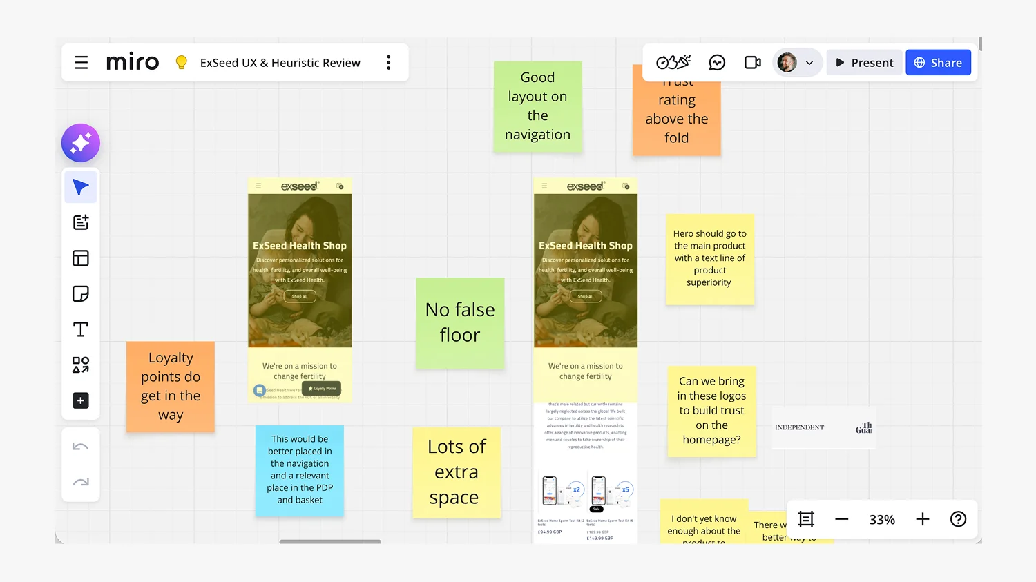
Stage two: the Miro purchase journey mapping

Once I have the data picture, I take the most important screens of the actual purchase journey and map them in Miro. Homepage. Collection page. Product page. Cart. Checkout. Plus any specific pages flagged by the data, like a high-traffic blog article or an unexpected landing page.
Each screen is mapped at the actual screen sizes that the data has told me matter most, and reviewed on the actual devices customers are using. A brand with heavy mobile revenue gets the mobile journey mapped first, walked through on real phones. A B2B brand with desktop-heavy traffic gets desktop. The point is to look at the experience the real customers are actually seeing, not a generic representative screenshot.
Every screen is then annotated with colour-coded post-it notes:
- Green — Good. What is working on this screen. Trust signals, clear hierarchy, strong product imagery, smooth interactions. These get flagged because they are worth keeping and worth understanding before redesigning anything.
- Yellow — Note. Observations that are neither obviously good nor bad. Things worth flagging for discussion with the client, or patterns that need more context before a recommendation can be made.
- Orange — Bad. Problems and roadblocks. UI conflicts, broken hierarchy, missing trust signals, friction points, accessibility issues, anything actively hurting the customer experience.
- Blue — Suggestion or Solution. Where I propose what to do about a problem, either tactically (move this button up here) or strategically (this whole section needs a new layout).
There is also a fold line on each mobile screen, showing where the content drops below the visible area on common viewports. This often surfaces issues clients had not noticed, because the design team and the client always look at the full page on a desktop monitor. The actual customer on a phone might never see what is below the fold.

The key principle is balance. The board flags good as well as bad. Most UX audits I have seen only mark the problems, which produces a demoralising deliverable and gives the client the impression their site is a complete write-off. It rarely is. Every Shopify store has elements that are working, and identifying them is just as important as finding the things that are not. Keep what works, improve what does not. That is the brief in five words.
Stage three: the heuristic design review
The third stage is the bit that data alone cannot do. It is design judgement applied to the live store. Things like:
- Whether the brand is being expressed properly across the site, or whether it falls apart on collection and product pages
- Whether the typography hierarchy is doing its job at every viewport
- Whether the product imagery is consistent, on-brand, and doing the work it needs to
- Whether the buttons, forms, and interactive elements feel as considered as the rest of the design
- Whether the mobile experience feels like an afterthought or a first-class design
- Whether the brand has earned the customer’s trust by the time they reach the checkout
This is where 20+ years of design experience does its work. The GA4 data tells me what is happening, the Miro board tells me where in the journey it is happening, and the heuristic review tells me why and what should be done about it. None of those three stages alone is enough. Together they produce a UX review that is grounded in real users, mapped against the real journey, and informed by real design judgement.
What comes out of a Shopify UX review
There are two deliverables at the end of a UX review.
1. The Miro board
The first is the Miro board itself. It is shared with the client and they keep it. Once the review is complete, the board becomes a working document the team can refer back to throughout the project. Every design decision that follows can be traced back to a flagged issue on the board, which keeps everyone honest about what the work is supposed to fix.
Because the board is shared, the client also has the option of making some adjustments themselves in the Shopify theme customiser before the design work begins. Small fixes — copy tweaks, settings adjustments, content reorganisation — can often be done in the customiser without any design or development work, and ticking those off early means the design budget can focus on the bigger structural changes. It is a practical, generous way to start a project rather than an artificial bottleneck where nothing happens until everything is signed off.
2. The to-do list with design and development time allocations
The second deliverable is a clear to-do list, usually as a Word or Excel document, that turns the Miro board’s findings into a structured list of actions. Each item has a column for the design time it would take, and a separate column for the development time. Some items are design-only changes the customiser can handle without development. Others are design changes that need development to implement. A few are pure development tasks that do not need fresh design work. The to-do list makes all of that transparent.
This gives the client real control over what gets done first. They can look at the full list, see the time investment behind each item, and tell me which areas to prioritise based on their budget and their commercial priorities. Some clients want to focus on the highest-conversion-impact items first. Others want to start with the lowest-hanging fruit to show momentum to their team. The to-do list lets us have that conversation properly, with the numbers in front of us, rather than guessing.
It also makes the project scope honest. The client knows exactly what they are paying for, exactly how long each piece will take, and exactly what is and is not in scope. Surprises late in the project are usually a sign of bad scoping at the beginning, and the to-do list eliminates most of the room for that.
From there, the project moves into design proper, whether that is Shopify theme customisation for brands where the right premium theme provides a strong foundation, or full bespoke Shopify store builds for brands where the complexity of what they need cannot be served by a theme. Either way, the UX review is the foundation. The design that follows is grounded in evidence rather than assumption.
What a Shopify UX review typically surfaces
Every store is different, so every UX review surfaces its own set of findings. But there are common patterns I see often enough to be worth flagging:
- Mobile-desktop design mismatch. Sites that work well on desktop but collapse on mobile, often because the design was built desktop-first and mobile was retrofitted.
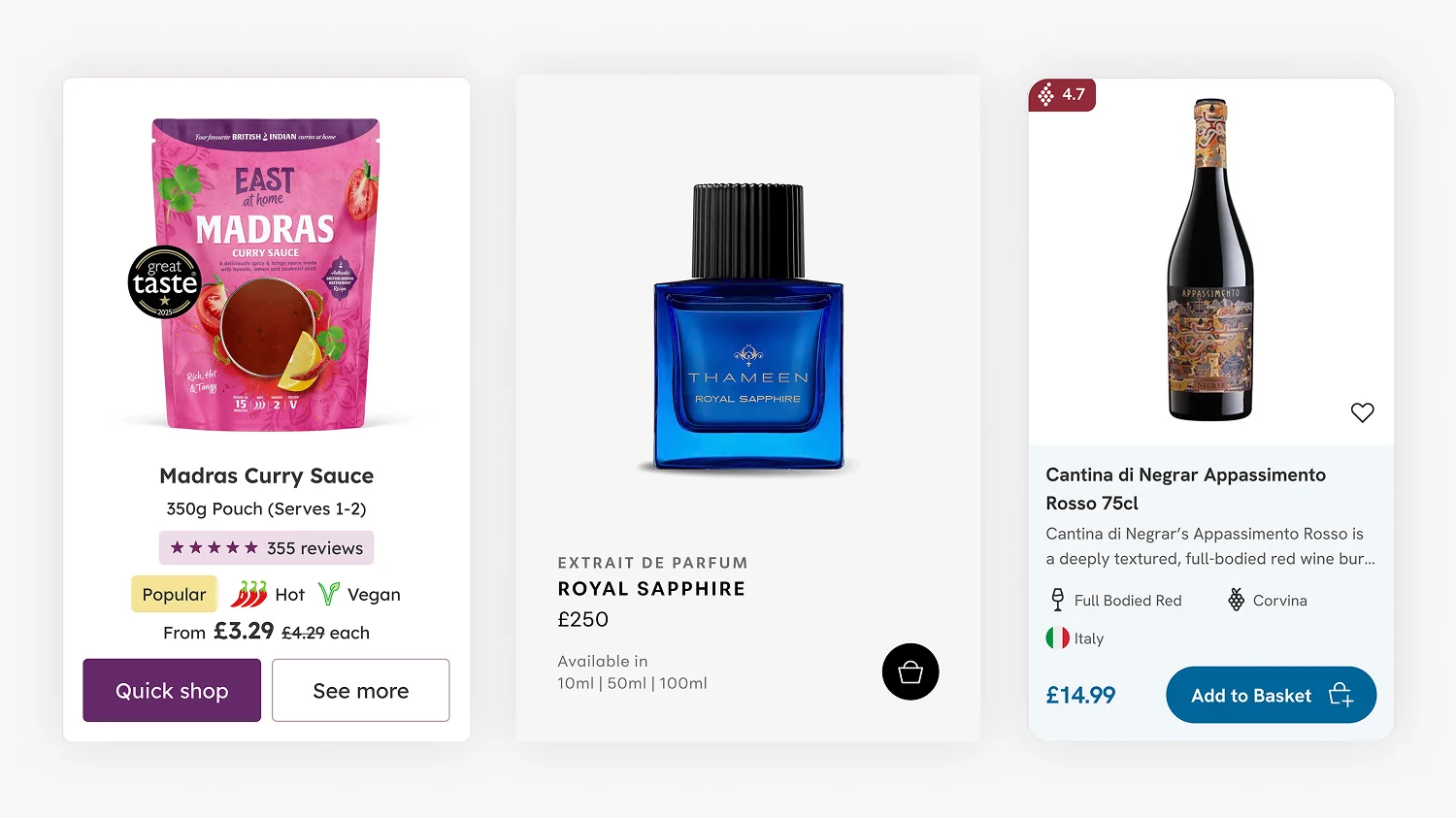
- Product cards that hide important information. One of the highest-impact components on any ecommerce site, and one of the most frequent culprits. I have written more about this in my article on Shopify product card design.
- Checkout flows where customers cannot tell what step they are on, or where the call-to-action is buried below other content that distracts from the next step.
- Homepages that bury the most-clicked content below the fold, because the team prioritised brand storytelling over what customers actually want to do on the site.
- Trust signals missing from the moments they matter most, especially at the product page and the checkout, where customers are deciding whether to commit.
- Inconsistent design language across the site, where the homepage feels considered but the collection page or the cart looks like a different brand designed it.
- Mobile fold issues, where critical content or CTAs sit below the fold on common phone viewports and customers never scroll to find them.
The case studies I have published show what happens after these findings get addressed. The Drink Finder case study, Fuzzball case study, Hartnack & Co case study, and Thameen London case study all started with the same UX review process described above. The design work that followed was grounded in what the review surfaced, and the conversion uplift each project achieved is the evidence that this way of working actually pays back.
Why this matters for your project
If you are about to start a Shopify project with a designer or an agency, the question to ask is simple. How are you going to start? If the answer involves personas, brand workshops, and discovery sessions before anyone has looked at the analytics, you are paying for a comfort blanket rather than a foundation.
A UX review grounded in real data is not just a better starting point. It is also a faster one. By the time the design work begins, the priorities are clear, the evidence is documented, and every decision that follows has a reason behind it that goes beyond personal preference. That clarity protects the project from the worst kind of design work — the kind where someone redesigns something because they think it should look different, with no evidence that it was a problem in the first place.
It also makes the work I do measurable. Every Shopify CRO change I recommend can be tied back to a specific finding on the Miro board. Every design decision has a real-user justification. The client gets a clear story for why each change is being made, and the team has a clear yardstick for whether the change worked once the new site is live.
How the UX review fits into a Shopify project
To be clear, the UX review is not a standalone deliverable I sell on its own. It is how I start every project. Whether the engagement is a Shopify theme customisation, a bespoke Shopify store build, a Shopify migration, or Shopify design for DTC brands more broadly, the UX review is the foundation everything else is built on.
This matters commercially because it means the review is in your project budget by default, not an additional cost on top. It also means I do not have an incentive to identify problems that justify selling a separate review service. The work is the work. The review is part of it because it produces better design outcomes, not because it inflates the invoice.
Real users beat invented ones every time
The persona approach is comfortable. It produces a tidy slide deck, it fills a discovery phase, and it gives everyone in the room a sense that they understand the user. But the understanding is invented. The real customers, the ones who matter, are already on the live site. Their behaviour is already in the analytics. Their journey is already mappable. Looking at imagined users first, and pretending the real ones do not exist until later, is the wrong way round.
Every Shopify project I take on starts with a UX review because the alternative is starting with assumptions. Real users, real journeys, real data, real design judgment applied to a real store. That is the foundation. Everything else follows from there. If you want to talk through what that looks like for your project, you can find more on my Shopify website design services page or get in touch directly.
Frequently Asked Questions
A Shopify UX review is a structured analysis of how customers actually use a live Shopify store, combining real GA4 analytics data with designer judgement to identify where the experience is helping conversion and where it is hurting it. It covers the full purchase journey from landing on the site to completing checkout, flags both what is working and what is not, and produces a clear set of design priorities.
A generic ecommerce audit usually checks a site against a fixed list of best practices like page speed, CTA visibility, and mobile responsiveness. A proper UX review is grounded in real user data from GA4, maps the actual customer journey on the actual screens those customers are using, and applies design judgement to the specific store rather than measuring it against a generic checklist.
GA4 reports including Traffic Acquisition, Landing Pages, Pages and Screens, Organic Search queries, User Demographics, Tech (device, OS, browser), Resolution by revenue, Purchase Journey, and Ecommerce purchases. The goal is a topline picture of who is using the store, on what devices, on which pages, and where they drop out of the funnel, not a deep analytics dive.
Yes. Redesigning a Shopify store without a UX review means designing on assumption rather than evidence. Even when the design problems seem obvious, real-user data often surfaces priorities that contradict the team’s instincts. A UX review takes a fraction of the project budget and consistently saves time and rework later.
Personas are fictional users invented from assumption rather than evidence. For brand-new products with no customers yet, they can be a reasonable starting point. For an established Shopify store with real customers and real analytics already running, building personas instead of looking at the real users is choosing imagined data over real data, which is rarely a good design decision.
The UX review is included in the scope of every Shopify project I take on rather than being charged for as a separate service. The deliverables, the shared Miro board and the itemised to-do list with design and development time allocations, feed directly into the design and development scope for the rest of the project, so it makes more sense to keep them as part of the same engagement. Get in touch to talk through your project and I can give you a clear scope and cost based on what your store actually needs.
Not in my work. The UX review is how I start every Shopify project, so it is included in the project scope by default rather than sold as a separate deliverable. The output is a shared Miro board the client keeps, plus a to-do list with design and development time allocations against each item, so the client can prioritise what gets done first based on their budget and their commercial priorities.

This article was written by Anthony Bliss, a Shopify Expert & Freelance Shopify Designer specialising in UX and UI design for DTC brands. With 20+ years of design experience and 6+ years focused exclusively on Shopify, Anthony helps brands create stores that convert.
Let’s create your Shopify success story
Shopify Success Stories

Shopify Migration with Custom & Conversion focussed UX
Drink Finder

Headless to Shopify Migration with a Luxury Premium Theme Build
Thameen London

Bespoke Store Design with Key AOV Results and Rise in Revenue
East At Home
More Shopify Articles
Shopify Product Card Design: The Art of Cards That Convert
Product cards are the most fundamental component of any ecommerce site, and the place where premium Shopify themes quietly underperform. When a theme…
Benefits of Shopify Plus: Should You Upgrade in 2026?
If you are already running a Shopify store and weighing up whether to move to Plus, this article is for you. Most guides on the topic are written by…
What Is Generative Engine Optimisation (GEO) and Why Every Shopify Brand Needs It in 2026
Getting found online used to mean one thing: ranking on Google. That is still important. But a growing share of product discovery is now happening…
Shopify Expert
Ready to elevate your store? Start your Shopify transformation today
Shopify expert who can help elevate your store to the next level
20 years of agency and direct client experience, without the high price tag
Network of the best developers, Klaviyo experts & SEO experts perfect for big projects
This site is protected by reCAPTCHA and the Google Privacy Policy and Terms of Service apply.
Get in touch
Registered in England & Wales No. 10575474. Based in Falmouth, Cornwall, UK.