
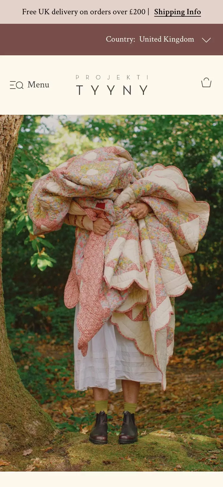
Projektityyny. A mobile-first store launch for a Nordic-inspired textiles brand

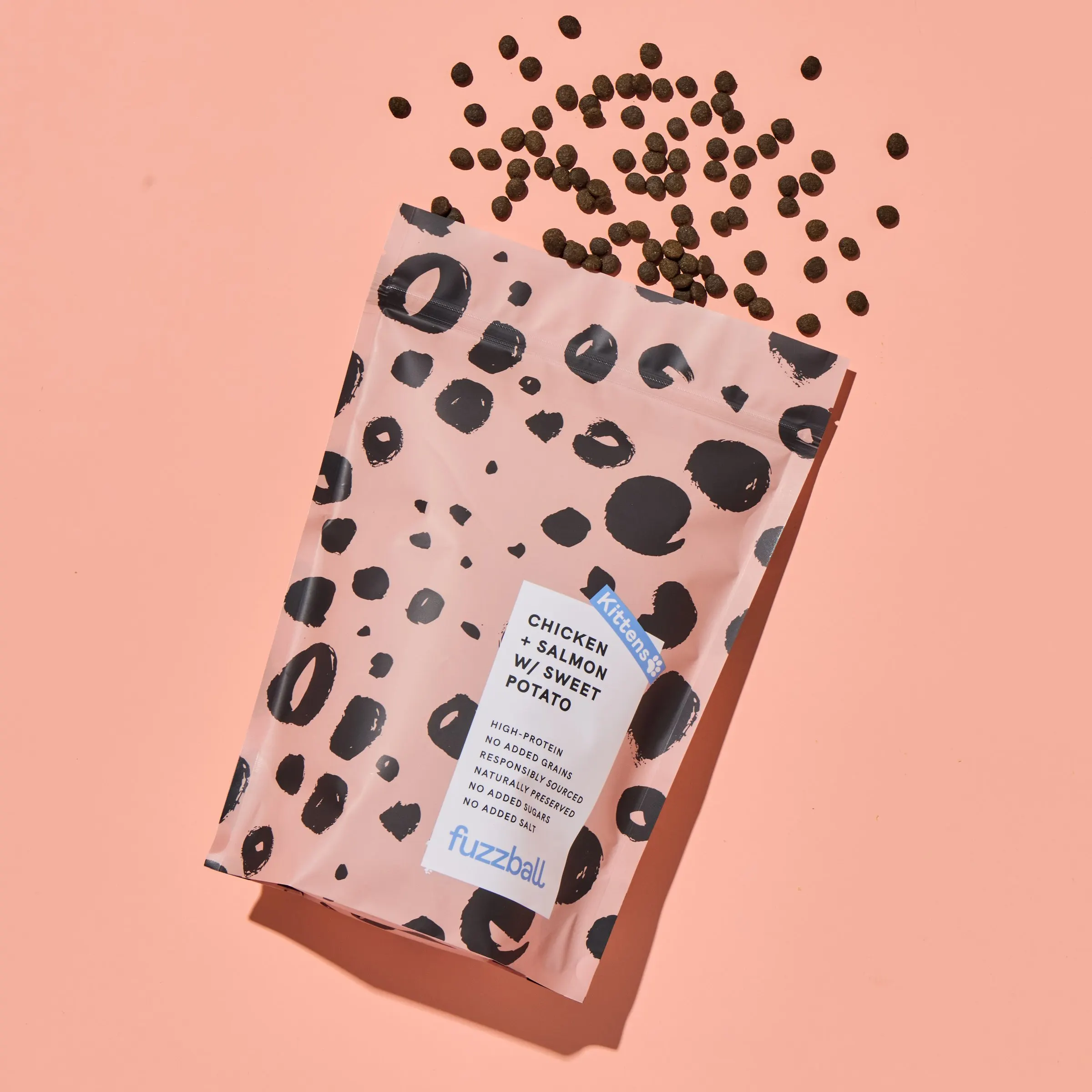
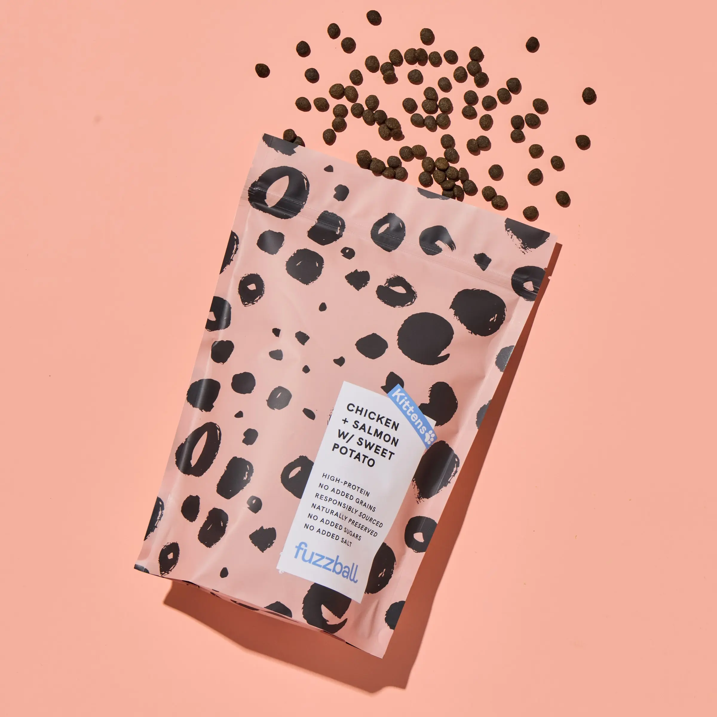
Fuzzball is a premium, health-focused cat food brand sold by subscription, with an animated cat at the heart of its brand. I redesigned its Shopify store and subscription quiz so the personality helps people sign up instead of getting in the way.
The Fuzzball brief came from a UX review of the old journey. Customers were dropping off at two points: the quiz that builds their plan, and the bag where trial and subscription met.
The job was to simplify both, show the value at every step and keep the brand’s playful character without slowing anyone down.
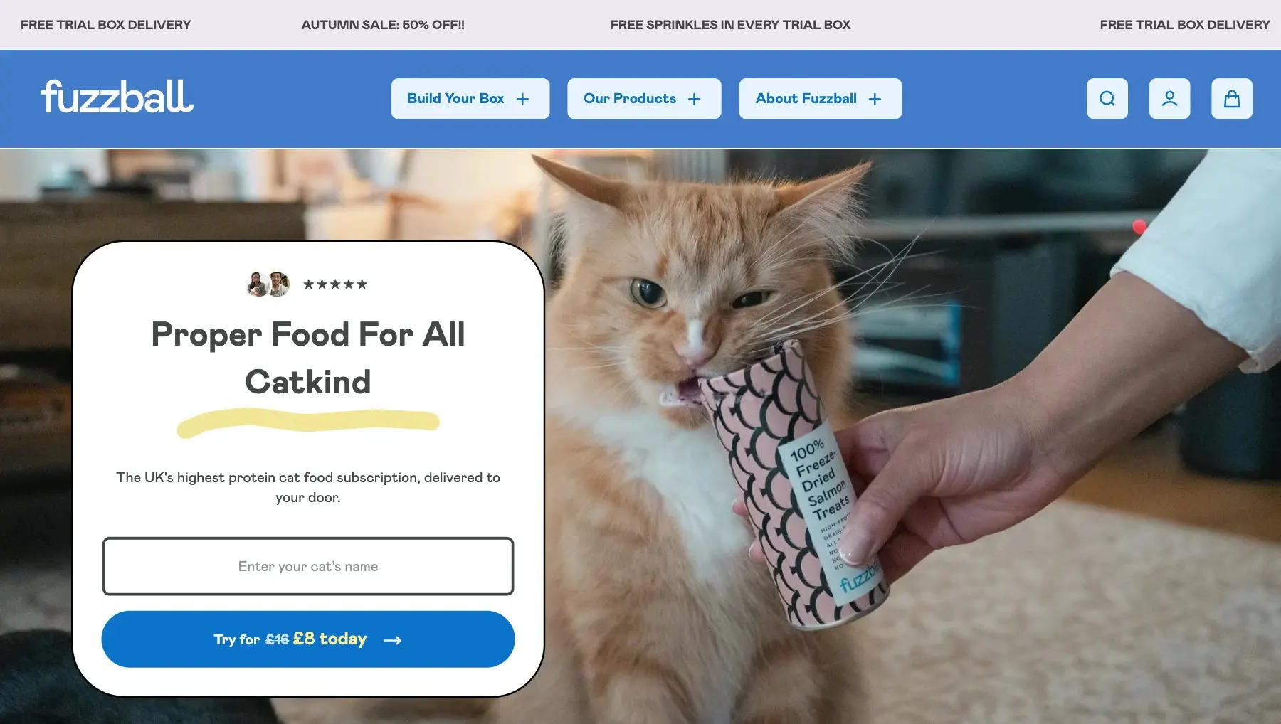
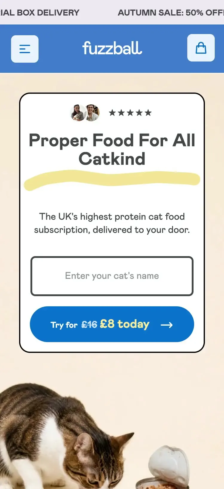
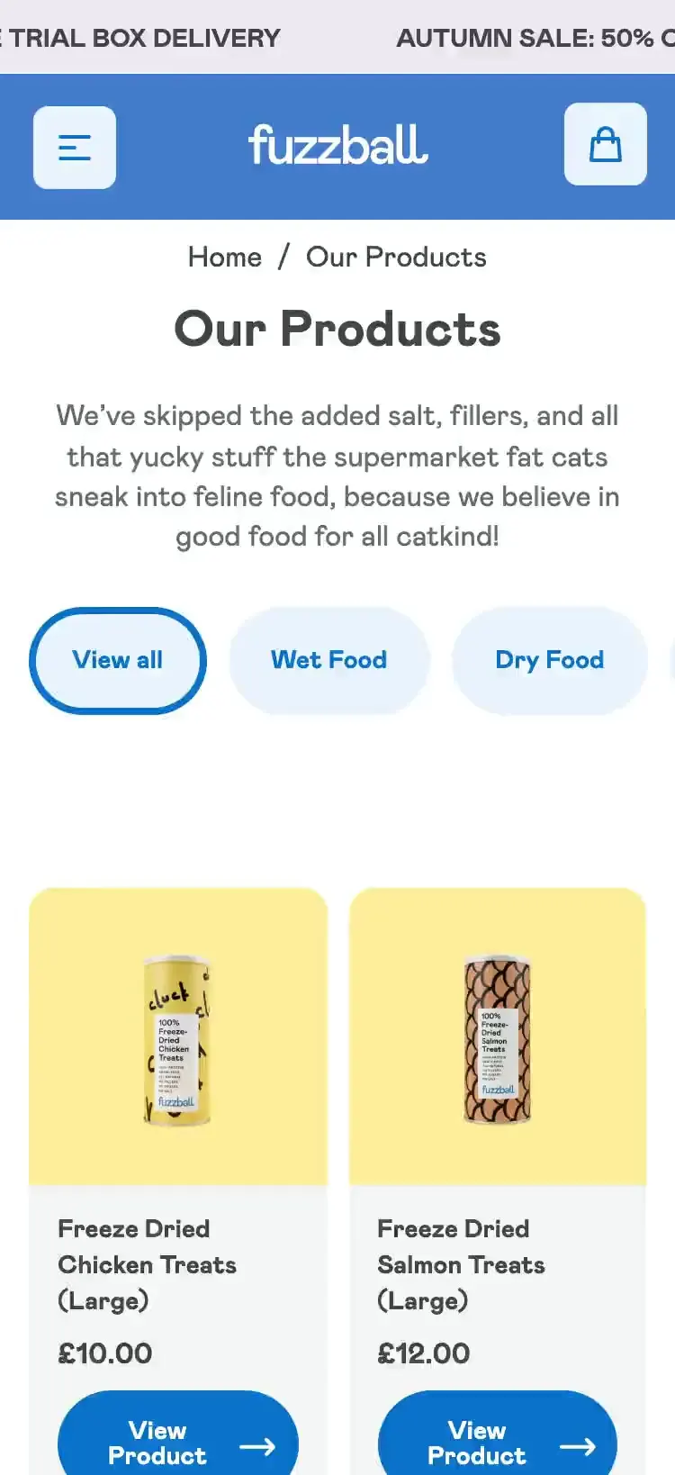
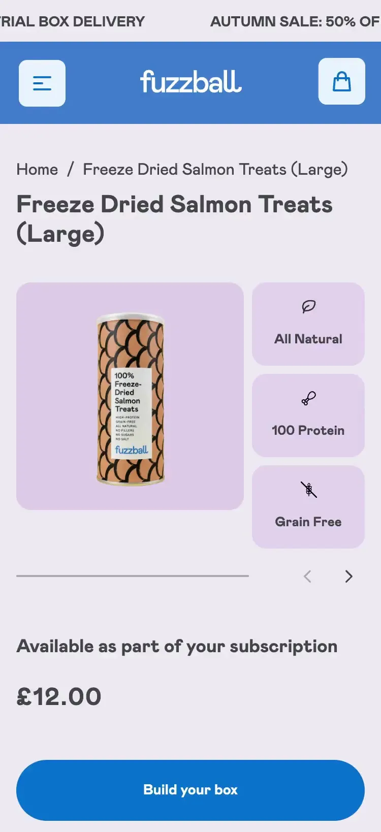
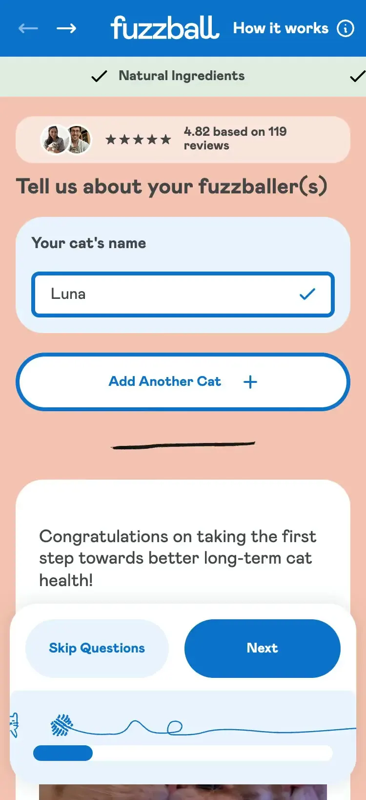
Every Fuzzball decision below targets a point where customers were giving up, from the first tap on the menu to the cart.
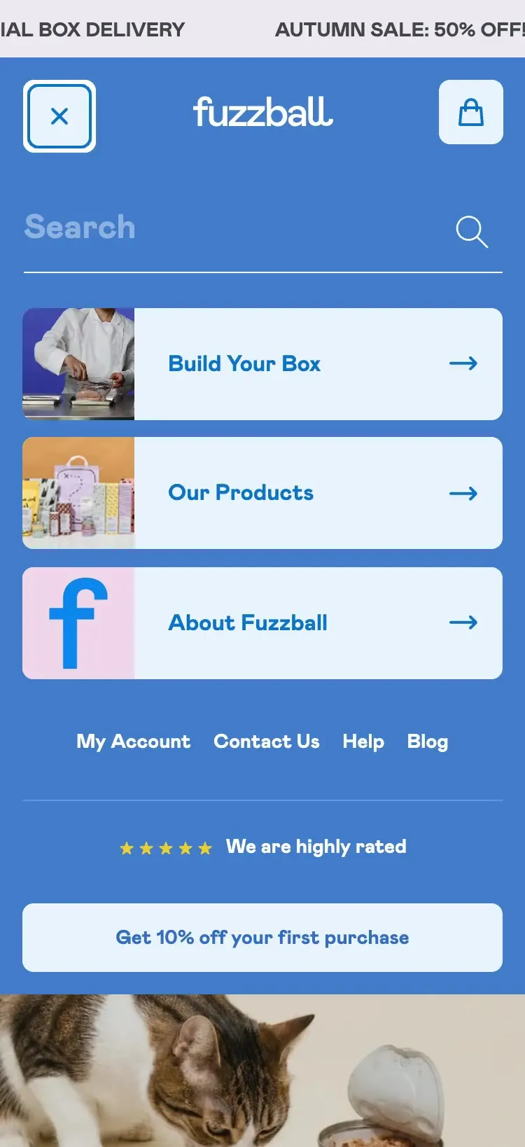
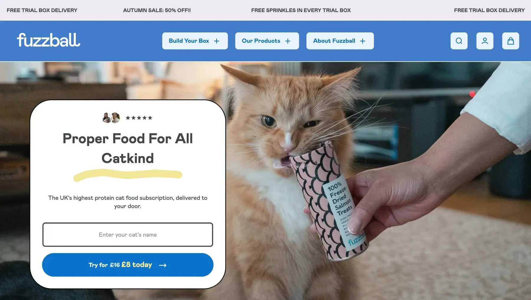
Fuzzball’s menu does more than list products. It carries quality, delivery and how-it-works messages, so people trust the subscription before they start the quiz.
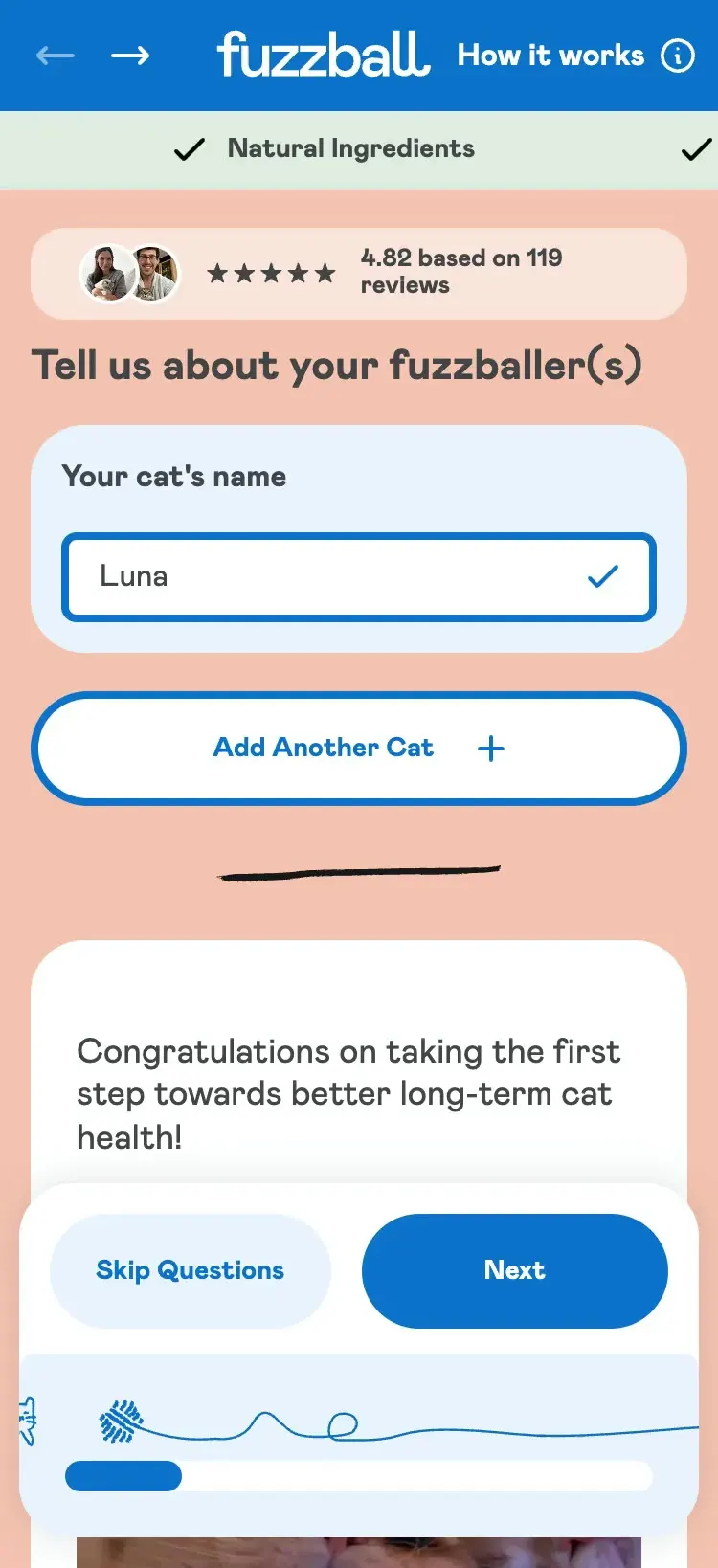
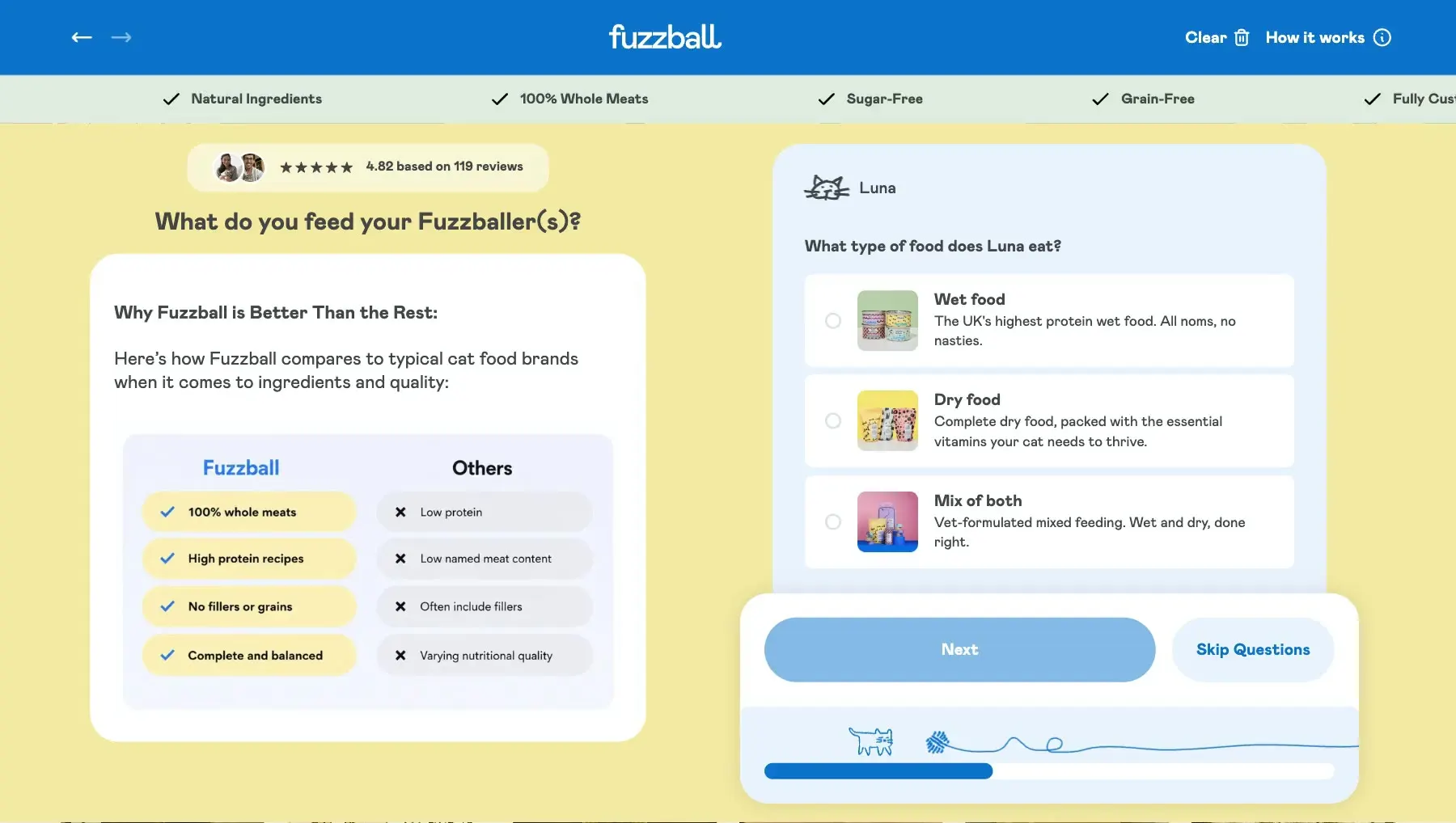
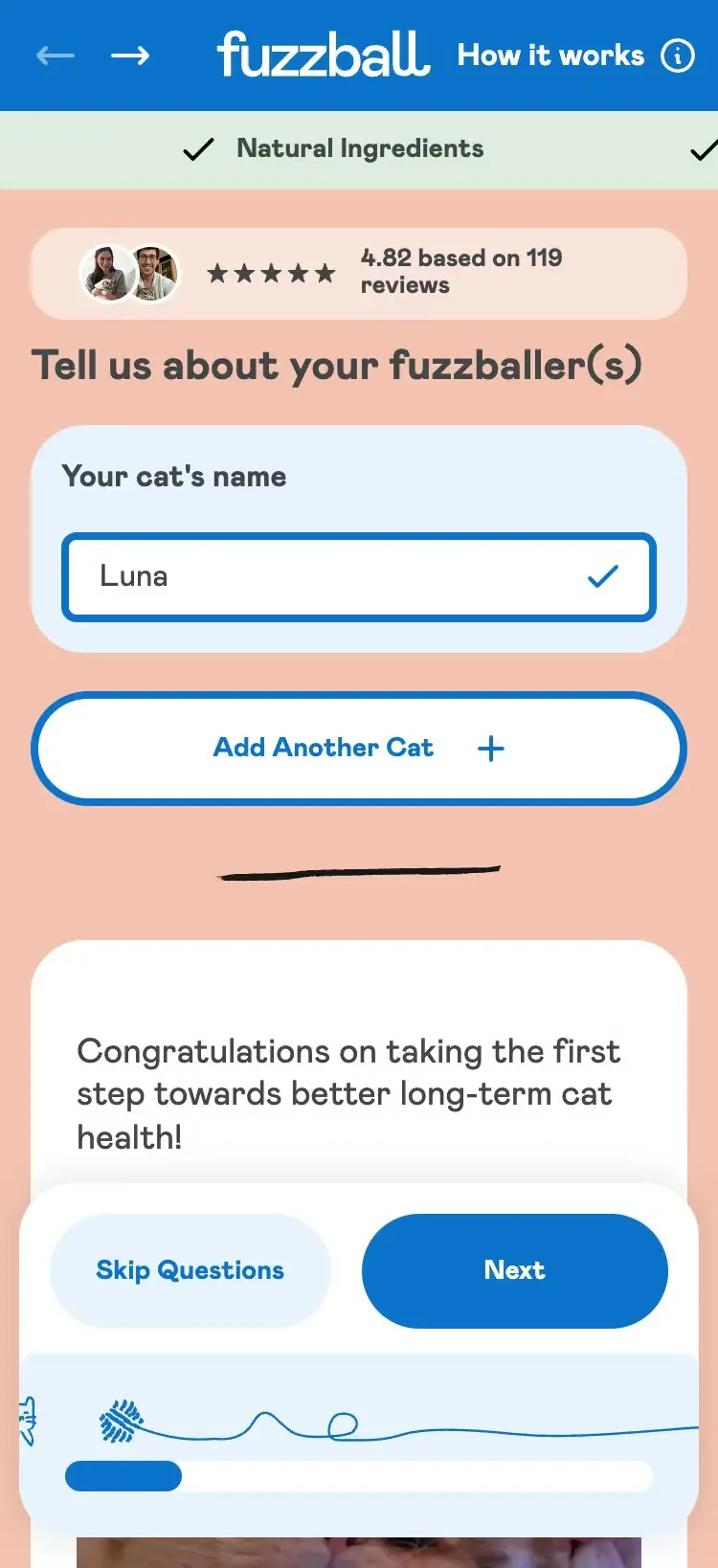
The Fuzzball quiz balances what the brand needs to know with what a customer will put up with. Fewer steps and clicks, clearer button states, and slide-up panels for anyone who wants more detail.
The cart was Fuzzball’s biggest drop-off. It now separates the trial from the repeating order, so customers see exactly what they’re signing up to. In the five months after launch, 82% of customers who started checkout finished their order, up from 59% in the six months before.
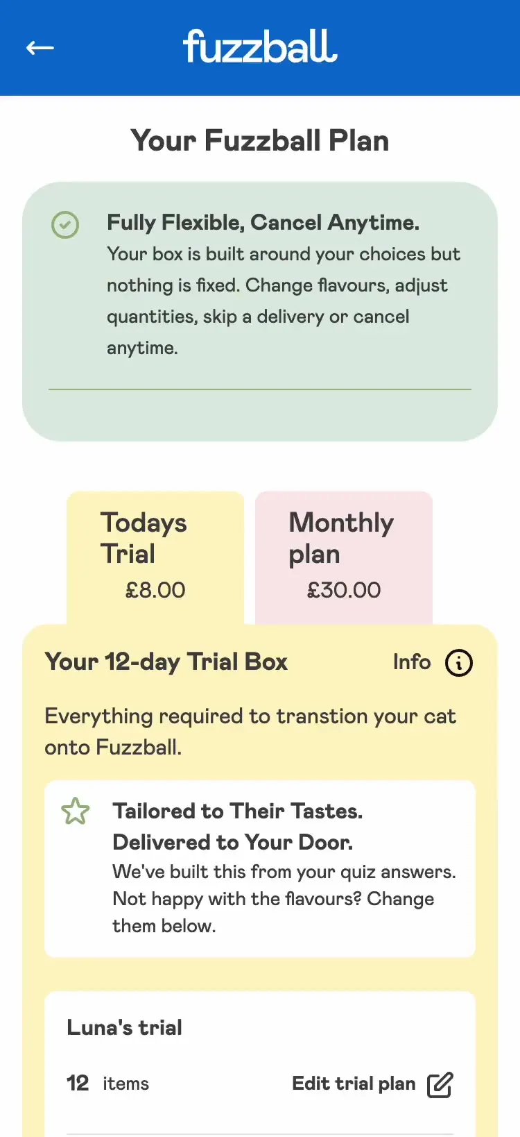
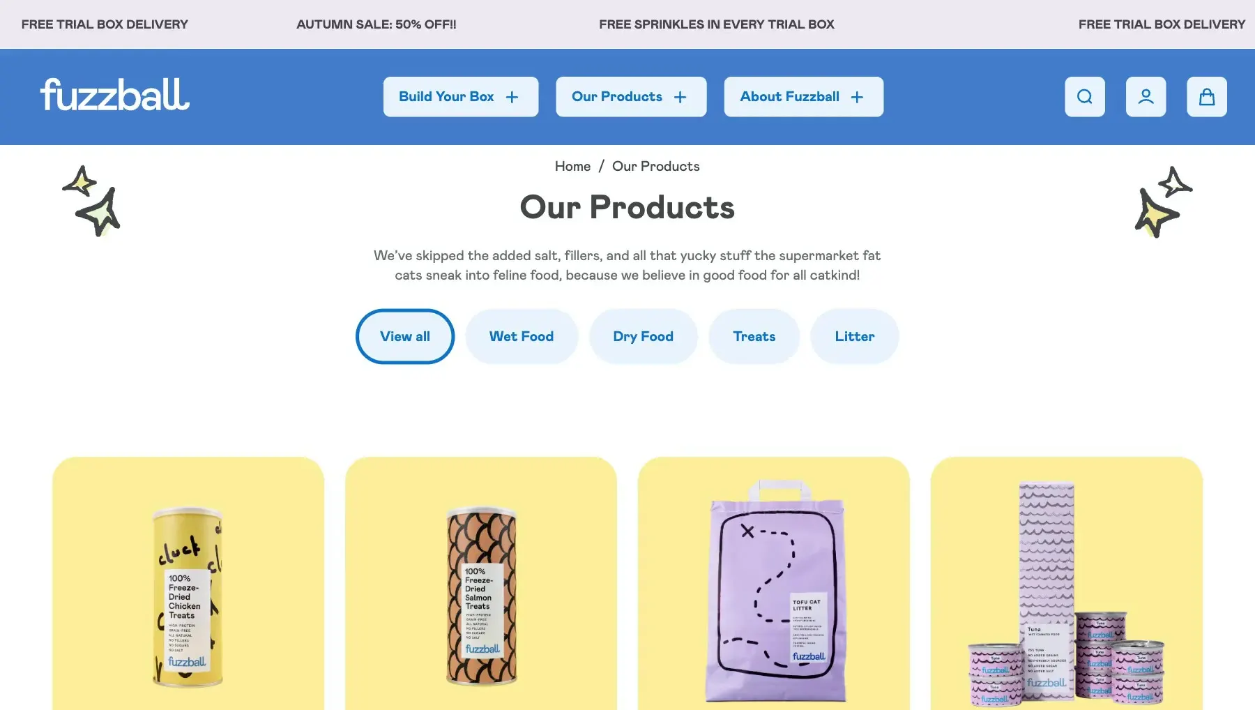
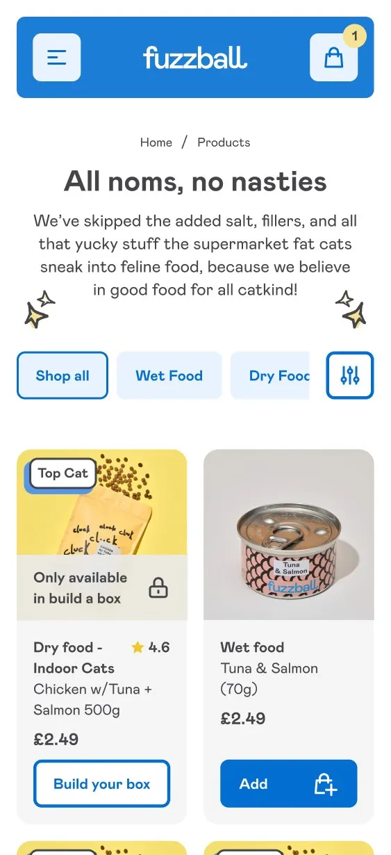
On Fuzzball, products you can only buy on subscription show a lock icon, an “Only available on subscription” label and View Product instead of Add to Bag. Nobody finds out at the last step.
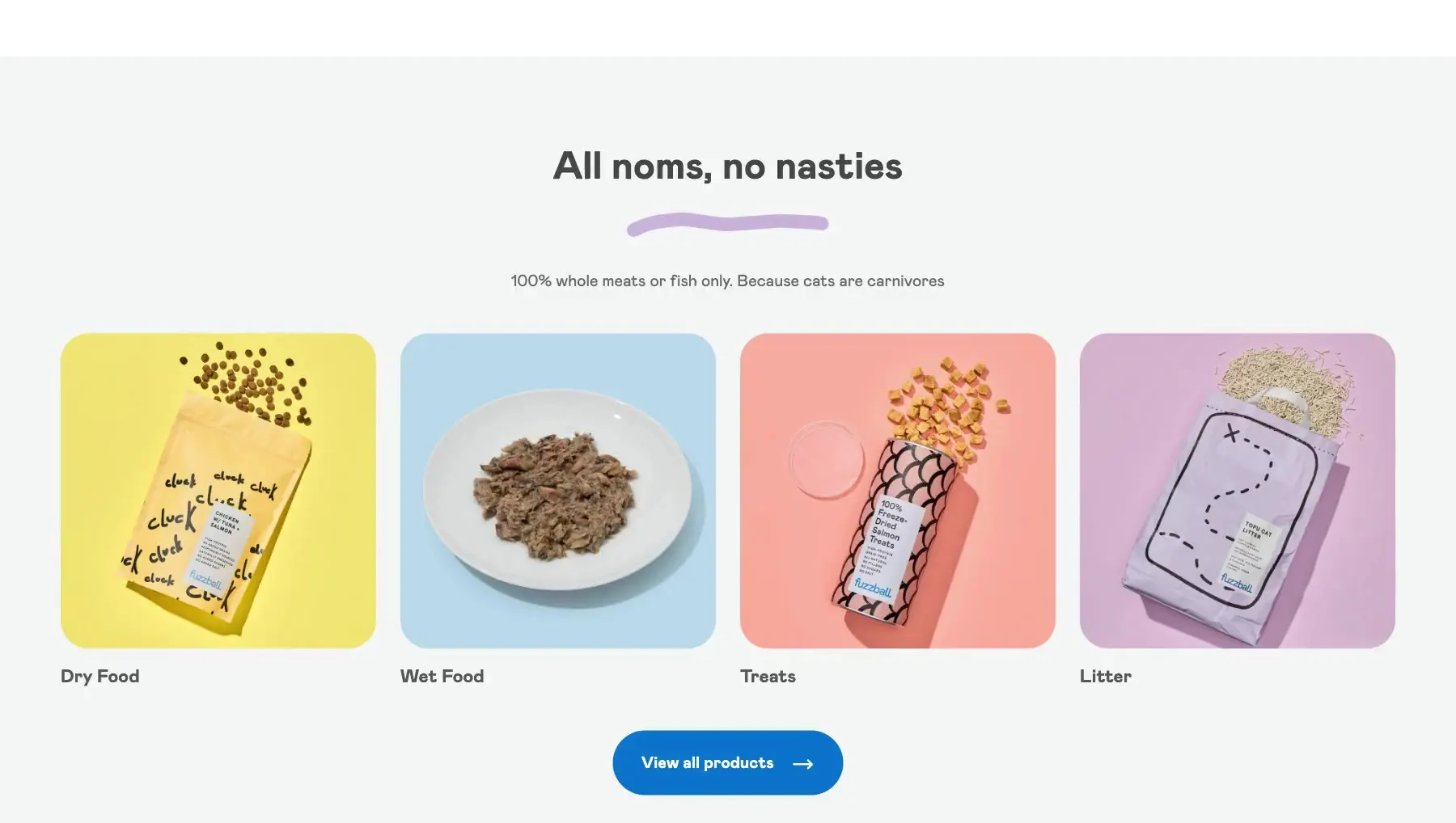
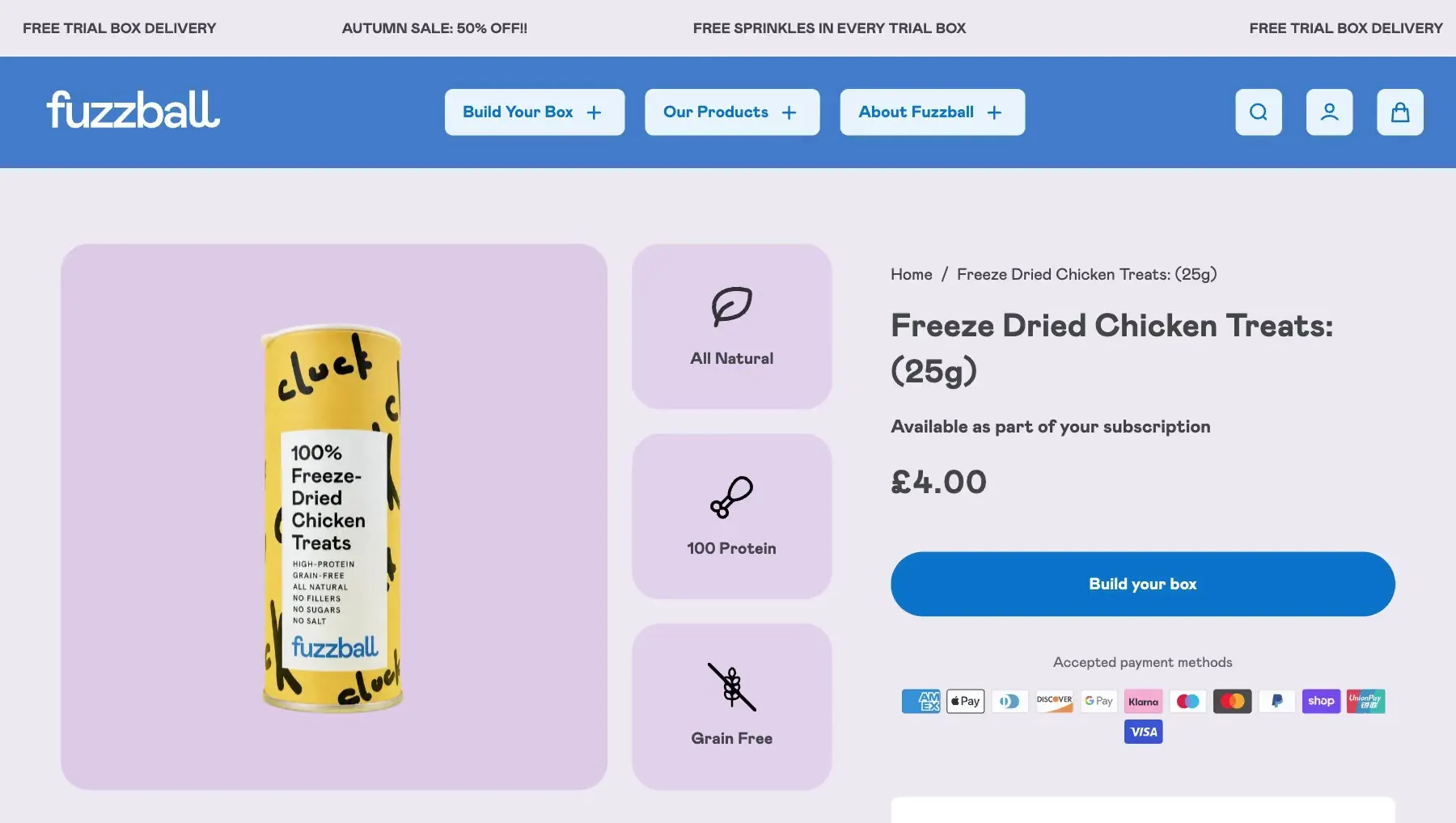
Fuzzball’s product pages set out ingredients and benefits with icons and short callouts for scan readers, plus quick links to build a subscription box, including for quiz-only products.
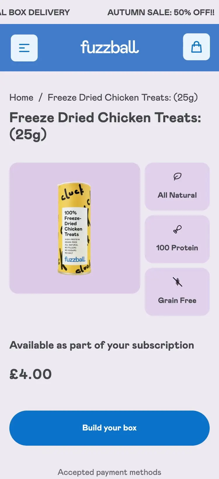
Fuzzball’s interface feels more like an app than a shop: rounded corners, bold hover states and animated icons. On the quiz, the cat chases a ball along the progress bar, bringing that design touch that creates the smile in the mind.

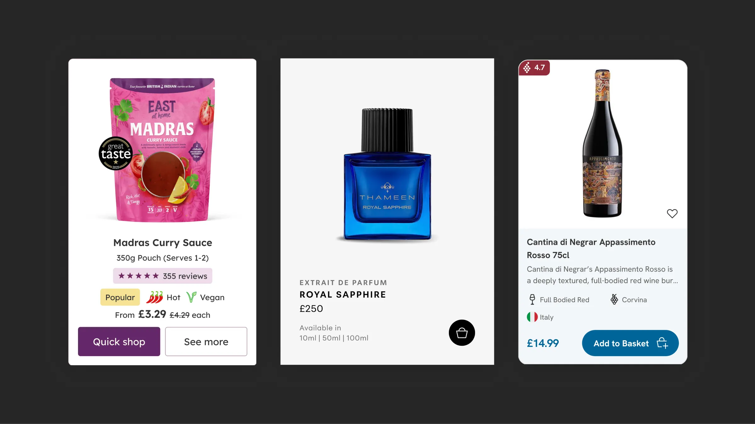
Food & drink · August 2025
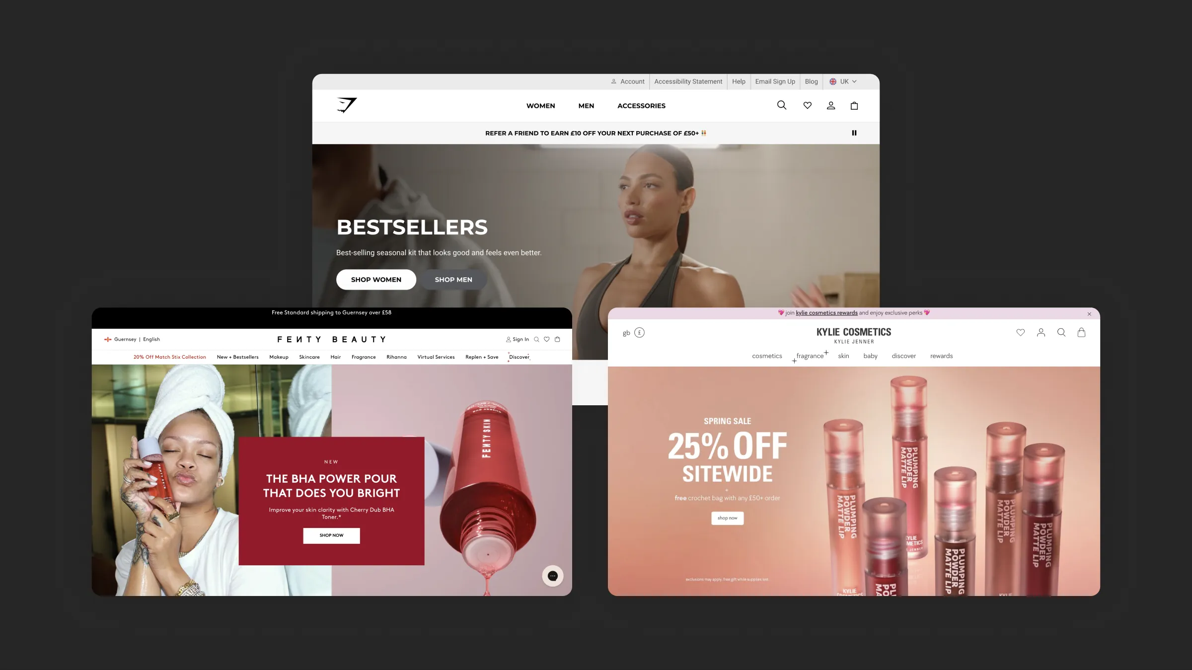
Beauty · March 2026
I reply within two working days.
Cookies
I use analytics cookies to see how people find and use this site. Nothing is tracked unless you accept.