Projektityyny. A mobile-first store launch for a Nordic-inspired textiles brand

Design and UX

By Anthony Bliss, freelance Shopify designer
Published
I simplified Fuzzball’s Shopify product quiz by giving every screen one type of answer, cutting the questions that didn’t change the plan and adding a way to skip. Then I gave it back its character with a cat that chases a ball of wool along the progress bar. Fuzzball’s conversion rate was 63% higher in the year after launch.

A Shopify product quiz asks shoppers a few questions and recommends the right product or plan from their answers. Good quiz design makes every step feel like one quick decision.
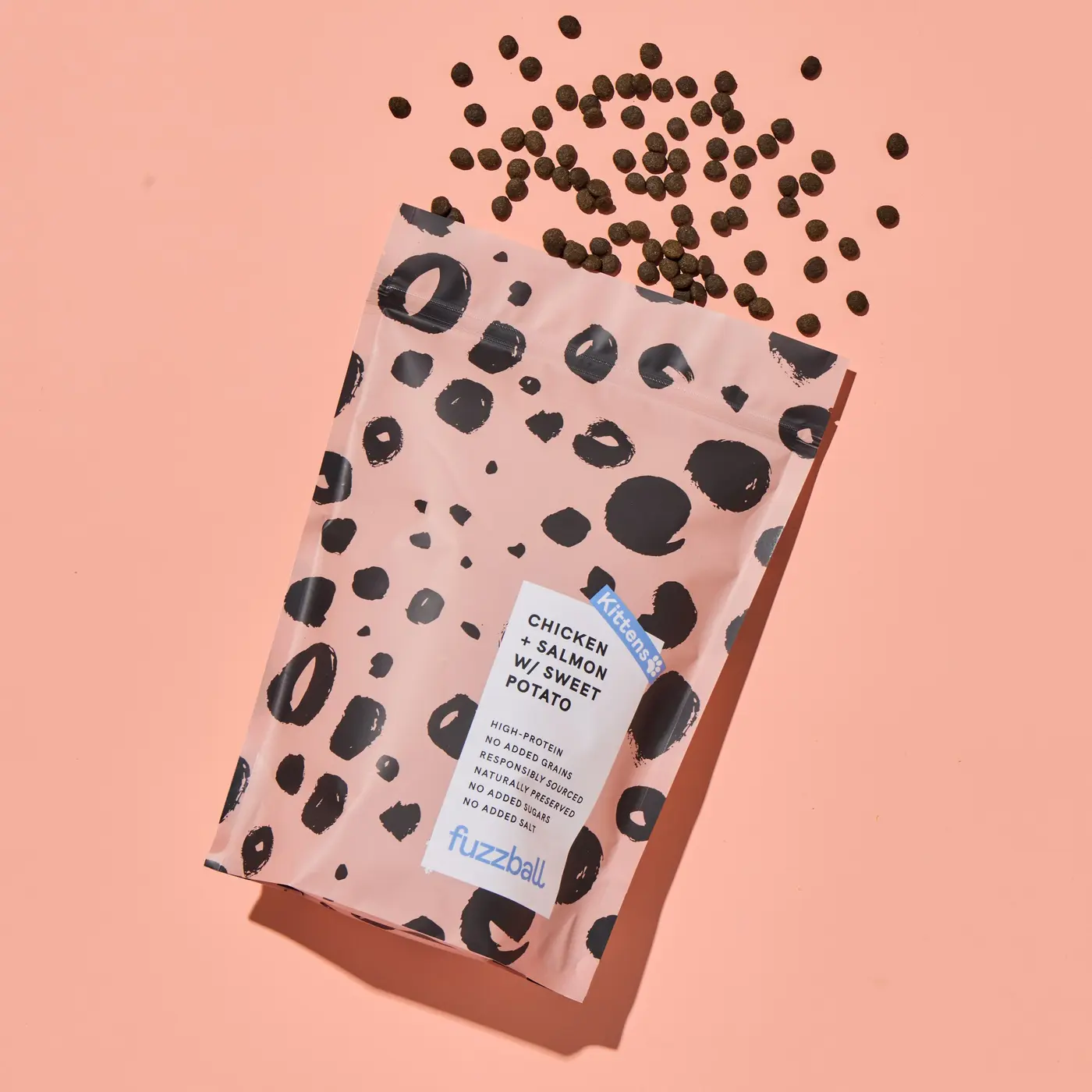
Fuzzball sells cat food through a Shopify subscription, and its quiz is where every new plan starts. Customers were dropping off inside it, so it was the first thing I redesigned as part of the Shopify conversion rate optimisation work.
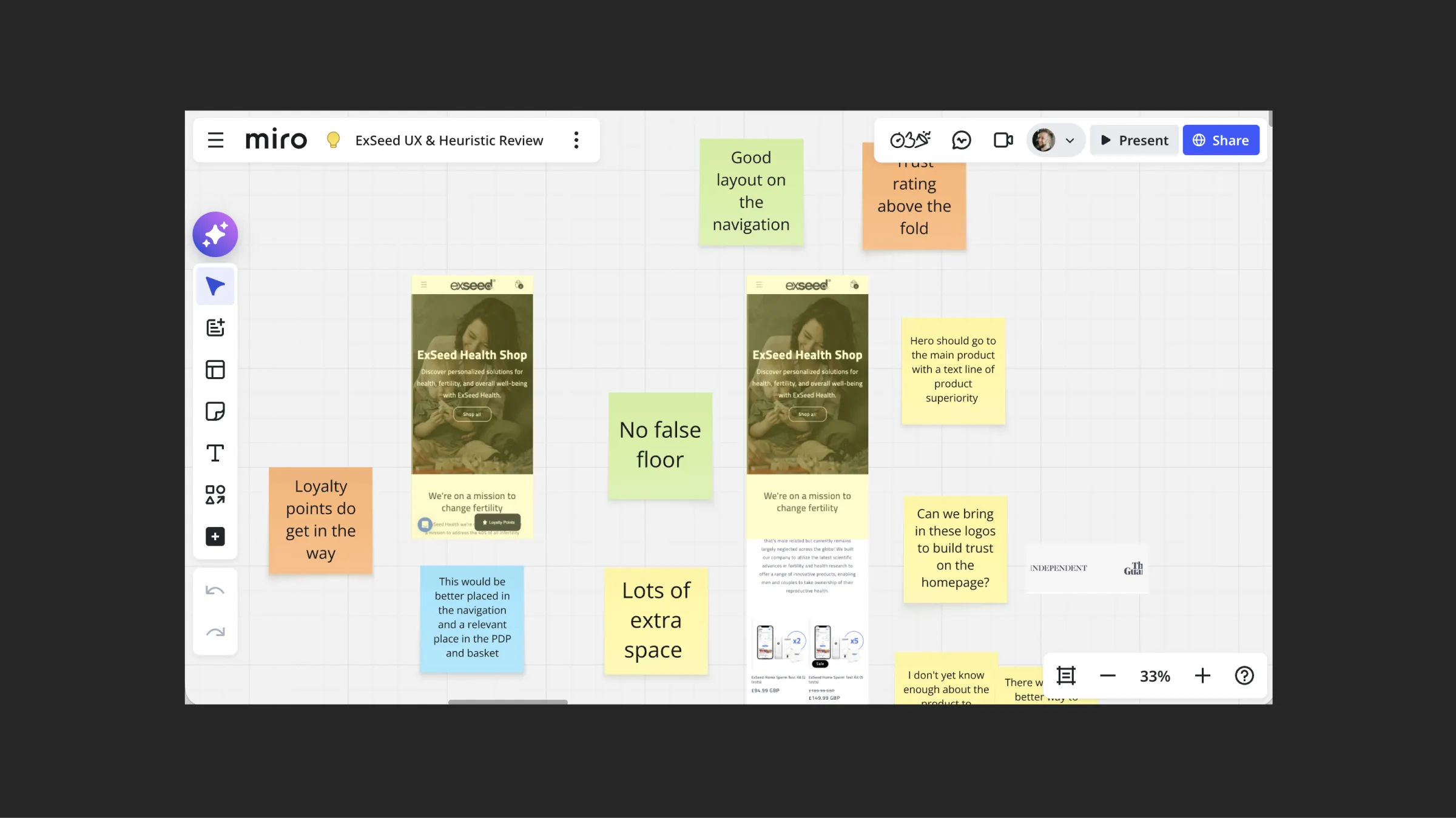
The problems with Fuzzball’s old quiz came out of my Shopify UX review. I went through every screen of the journey in Miro and pinned a note to everything that slowed customers down.
The quiz was hard work. Some screens mixed text inputs, radio buttons and tick boxes on the same step, so customers had to work out how to answer before they could answer. A selected answer looked the same as the Next button, so it wasn’t clear what you’d picked. A unit label looked like a button but wasn’t one. The Next and Back buttons moved to a different place on almost every screen.
There were also a lot of steps, with the most questions on the very first page. Some, like the cat’s birth month, didn’t change the plan at all.
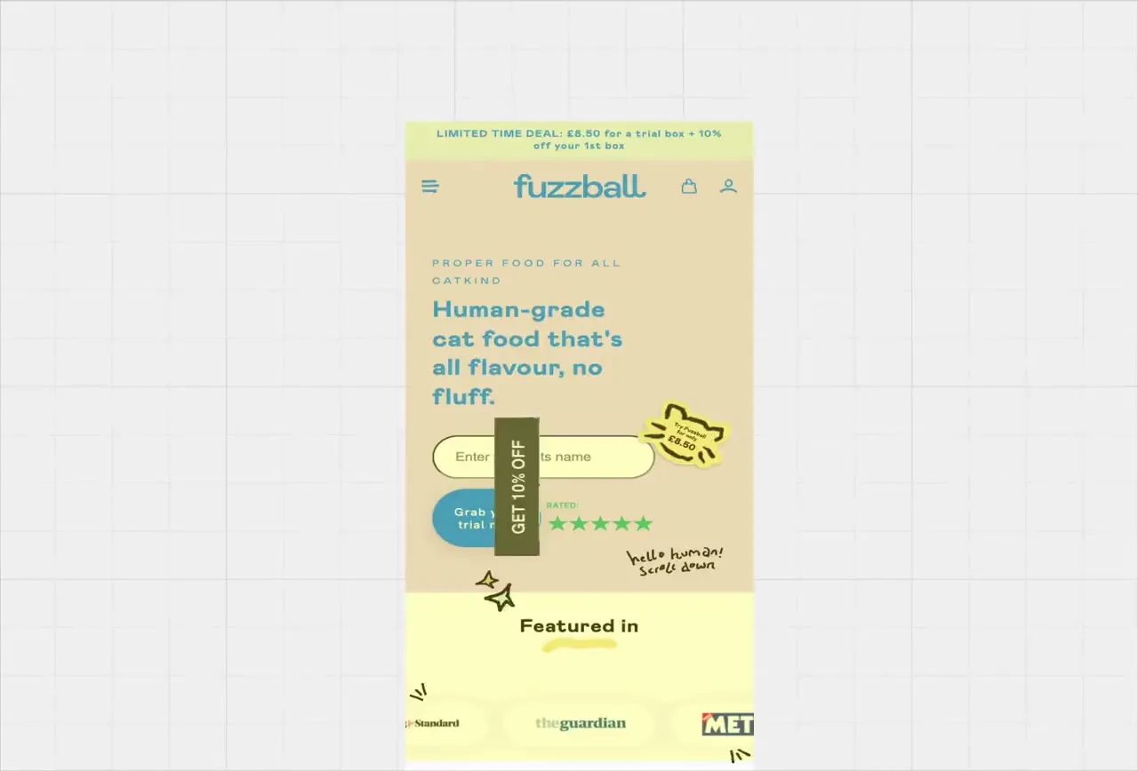
The quiz wasn’t the only drop-off point. The bag was the other, because it wasn’t clear which items were the trial and which would repeat. The brief was to simplify both, show value at each step and keep the brand’s playful character.
The Fuzzball quiz journey starts in the menu, not on the first question. The review found the buttons into the quiz said different things in different places, so customers couldn’t tell they all led to the same place. Now they all say Build Your Box.
The mobile and desktop menus carry a short how it works, plus quality and delivery messages, so customers trust the subscription before they start. The quiz header keeps How it works one tap away.
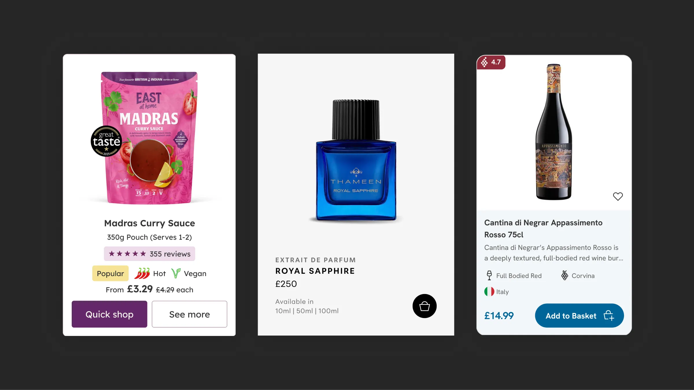
Product pages link straight into building a box, including for products you can only get through the quiz. On collection pages, subscription-only product cards show a lock and a View Product button instead of Add to Bag, so nobody finds out at checkout. I wrote about that card in more detail in Shopify product card design.
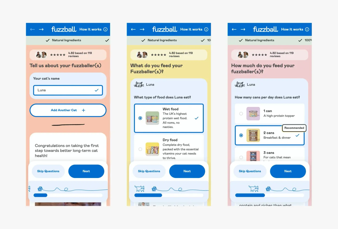
The first fix was consistency. Each screen of Fuzzball’s quiz now asks one question with one type of answer. The cat’s name is a single text field. What your cat eats and how much are big tappable cards with a product photo, one tap per answer.
Selected answers get a blue border and a tick, so they never look like the Next button. Next and Skip Questions sit in a fixed bar at the bottom of every step, in the same place every time. Next stays pale until you’ve answered, so you always know what the screen is waiting for. The recommended portion carries a label, and extra detail sits in slide-up panels instead of crowding the screen.
Clean, consistent and accessible screens are the point of Shopify UX and UI design: they let someone get through the quiz one-handed on a phone without thinking about the form.
Fuzzball’s quiz had more steps than it needed. I went through every question with the client and asked what each one was for. If an answer didn’t change the plan, it didn’t need to be a step.
The quiz now asks for your cat’s name, then what and how much your cat eats. The name carries through, so the next question asks what Luna eats, not what your cat eats. You can add another cat on the same screen instead of starting again.
Skipping was the client’s idea and mine together. Skip Questions sits on every step and takes you straight to a set meal plan, for anyone who already knows what they want or doesn’t want to answer questions at all.
Stripping Fuzzball’s quiz back created a new problem. The review had called out the old quiz’s illustrations as one of its best bits, because they gave it so much personality. Once the quiz was clean, consistent and accessible, a lot of that character had gone. It worked, but it could have been any brand’s quiz.
The answer was already in the brand. Fuzzball uses hand-drawn illustrations, so I turned one of them into a progress bar with character. A line-drawn cat chases a ball of wool along the bar, and every step you complete moves it closer. Finish the quiz and the confetti goes off. The progress bar is something every quiz needs anyway. Making it the cat added character without adding a single step or getting in anyone’s way. It’s one of the microinteractions in Shopify design that does two jobs at once.
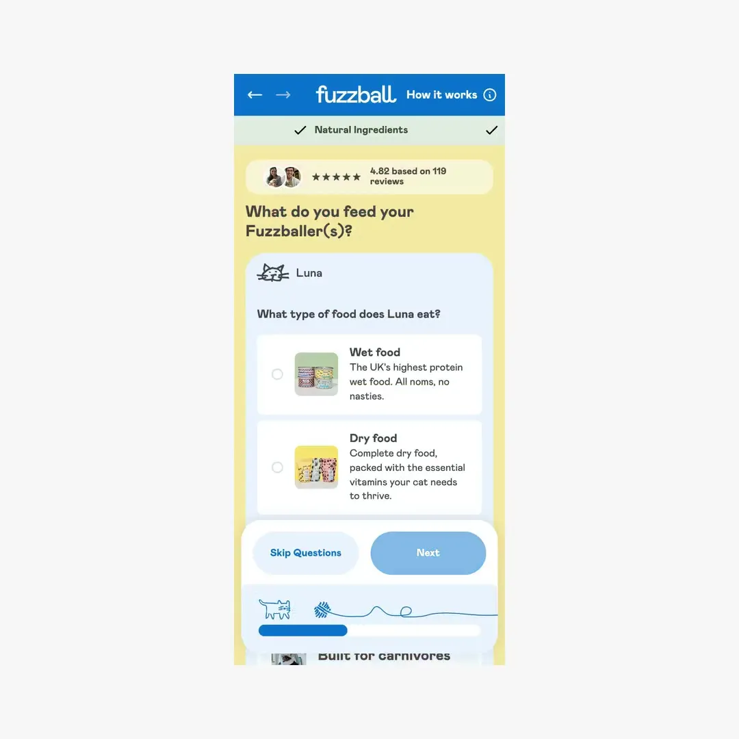
The rest of the character is in the details. Each step has its own background colour from Fuzzball’s palette, and the reviews sit at the top of every step, so the trust is there right through.
This is the bit I enjoy most about Shopify design: taking something functional and making it unmistakably the client’s brand.
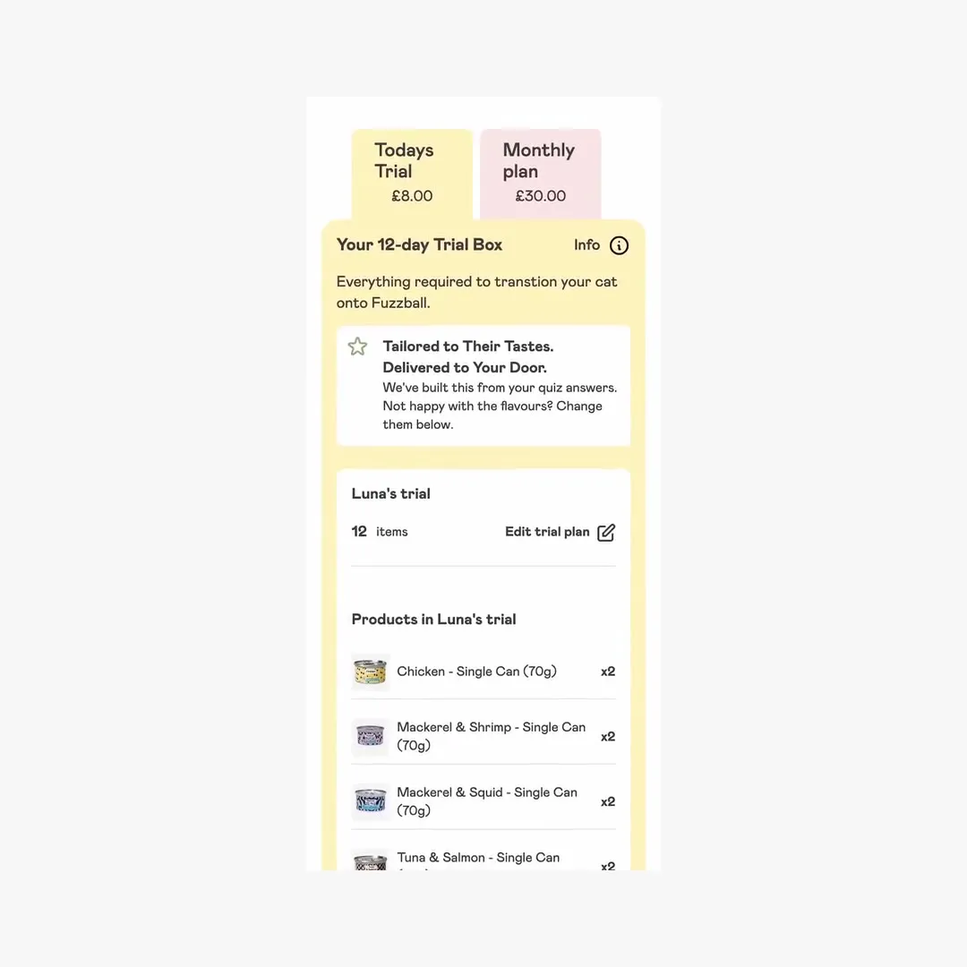
The end of Fuzzball’s quiz is the bag, and it was the biggest drop-off point. The review found the shopping list was a long scroll down the page, and the bag asked again for choices customers had already made in the quiz.
The bag now separates the trial from the repeating order, so customers see exactly what they’re signing up to before they pay. Nobody subscribes by accident.
higher conversion rate in the year after launch
GA4, August 2025 to August 2026 against the year before
of customers who started checkout finished their order
GA4, five months after launch, up from 59%
Checkout completion rose from 59% in the six months before launch to 82% in the five months after. Both figures cover the whole redesign, not the quiz alone. The quiz and the bag were the two places customers were leaving, and both were rebuilt as part of a bespoke Shopify store build. The full project is in the Fuzzball Shopify case study.
For another article written the same way, see how I designed Shopify product discovery for a 5,000-product store.
A Shopify product quiz is a short set of questions that recommends a product, bundle or subscription plan based on the shopper’s answers. It’s common in pet food, skincare and supplements, where customers aren’t sure what to buy.
A Shopify quiz should have as few steps as it takes to make a good recommendation. Every question should change the result. If it doesn’t, it’s slowing customers down for nothing.
Yes. Some customers already know what they want, and making them answer questions can lose the sale. On Fuzzball, Skip Questions sits on every step and goes straight to a set meal plan, so the quiz helps people who want help without blocking anyone who doesn’t.
Keep the questions plain and put the brand into the parts every quiz already has. On Fuzzball, the progress bar became an illustrated cat chasing a ball of wool, so the quiz stayed simple but still felt like Fuzzball.

Anthony Bliss, a freelance Shopify designer in Cornwall, won two UK eCommerce Awards in 2026: UK eCommerce Website of the Year for Drink Finder and UK User Experience of the Year for East at Home.
Anthony Bliss has worked in design for over 20 years, from brand identity to three years at Dyson, and has been independent since August 2023.
I reply within two working days.
Cookies
I use analytics cookies to see how people find and use this site. Nothing is tracked unless you accept.