Introduction
In this article, I’ll look at why product comparisons are so powerful, the psychology behind them, real-world Shopify examples, and practical ways to implement them — all from my perspective as a Shopify Expert.
The Psychology Behind Product Comparisons
Great UX and UI isn’t just about looking good, it’s about aligning with how people actually make decisions. Product comparisons tap into several well-documented psychological principles:
-
Hick’s Law: The more choices you present, the longer it takes to decide. Comparisons reduce “analysis paralysis” by making information clearer.
-
Anchoring Effect: When two similar products are shown side by side, customers tend to anchor on the first and judge the others against it. Smart merchants highlight the mid-tier product as the “best value.”
-
Choice Overload: Too many options without clear differences create confusion. Comparisons clarify distinctions (e.g. size, features, warranty).
-
Loss Aversion: When customers see what they’re missing by not upgrading, they’re more likely to choose the higher-value option. Boosting your average order value.
This is why comparison tables, “best seller” badges, and feature highlights work so well in Shopify stores. This is especially true for DTC brands, where every design decision has to justify the customer acquisition cost, here’s more on what DTC brands specifically need from a Shopify designer.
It’s important not to think of comparison UX purely as traditional tables. Even on a collection page, customers are constantly comparing products side by side before deciding which one to click or add to cart.
There are many creative ways to achieve this through bespoke UX design. This is something I help clients explore in the design phase of their Shopify projects. Learn more about my Shopify website design process.
Real-World Shopify Examples
While not every store uses side-by-side tables, many leading Shopify brands use comparison UX patterns:
Even when you don’t see a formal table, the principle remains the same: reduce decision friction, make comparisons easy, and help customers choose faster.

Casper
Their dedicated “Compare Mattresses” section allows users to see key features side by side in a clean, scannable format, a textbook case of comparison UX in action.
Allowing just two products at a time makes this design manageable on mobile.

Drink Finder
This design allowed users to expand product cards to show more options directly on the collection page. This way, customers could make informed decisions without needing to click through to multiple product pages.
Find out more in the Drink Finder Shopify success story
Not Every Store Uses Tables
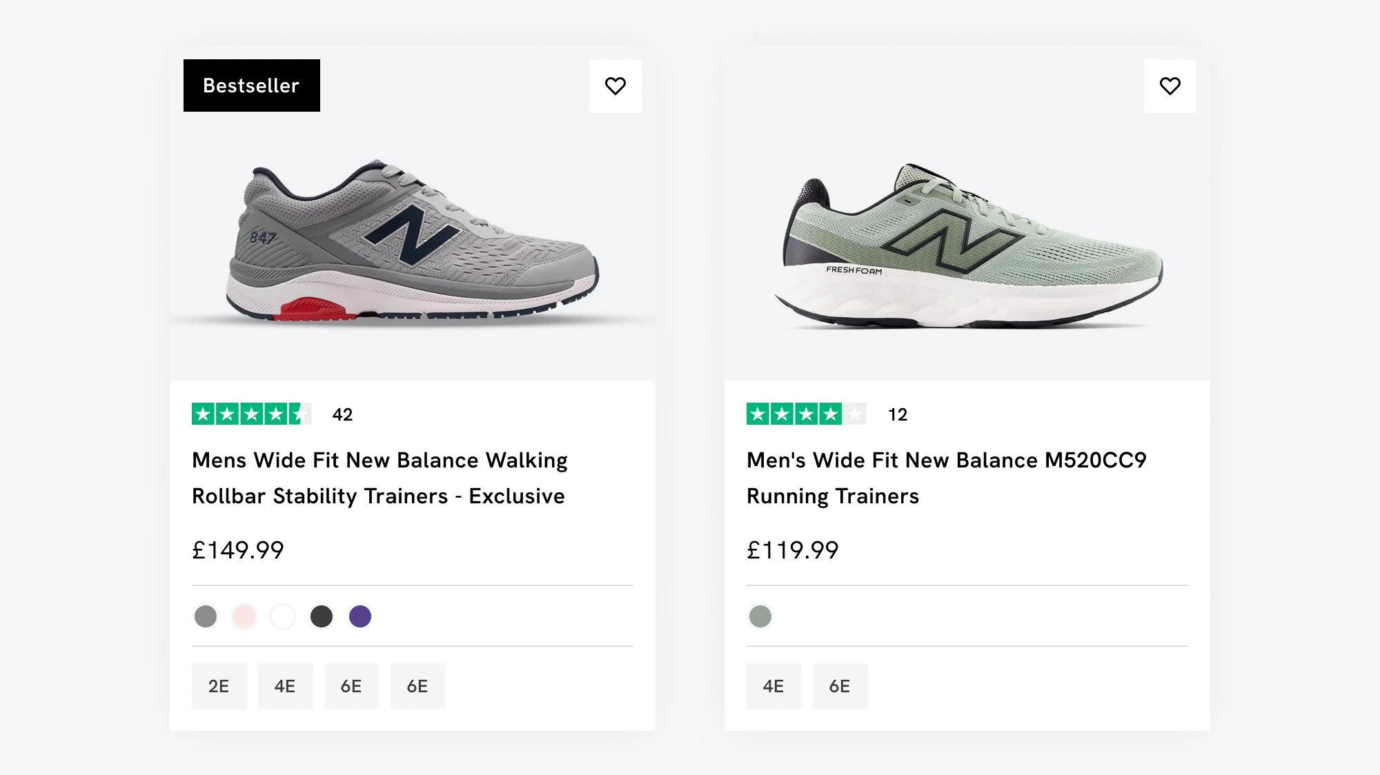
Many Shopify stores avoid formal side-by-side tables but still use subtle comparison tools like badges, filters, and product highlights. For example, lifestyle brands often use “Best Seller” tags or colour-coded filters to guide customers without overwhelming them.
The Business Case: Why Comparisons Increase Conversions
According to Baymard Institute, comparison features directly improve product page usability and decision confidence. For Shopify stores, the benefits include:
-
Reduced Returns: Customers make more informed choices, so they’re less likely to buy the “wrong” item.
-
Higher Average Order Value: Highlighting upgrades nudges buyers toward premium options.
-
Increased Trust: Transparent comparisons show you’re not hiding information.
-
Faster Purchase Decisions: Less confusion means fewer abandoned carts.
For more information and tips on how to boost CRO and AOV see my article How to Increase Conversion Rates on Your Shopify Store
How to Implement Product Comparisons in Shopify
1. Comparison Tables
Ideal for electronics, supplements, software, or any product with features that can be lined up side by side.
-
Apps: Product Compare by Omega or Yotpo.
-
Top tip: Highlight the “recommended” product with a badge or subtle colour shift.
2. Guided Quizzes
For lifestyle brands, quizzes simplify choices while gathering customer data.
-
Example: Which mattress is right for you? or What Coffee would you like?
- App: Recharge.
I have worked on a lot of quizzes which show a curated selection of products at the end. Utilising apps like Recharge can easily badge on subscriptions into this flow, which is great for ongoing sales.
3. Badging & Highlighting
Not every store needs a table. Sometimes a simple “Best Seller” or “Most Popular” badge does the job.
Amazon’s approach is a gold standard, highlighting products with the best value or products with the biggest saving.
4. Filtering & Faceted Navigation
Let customers self-compare by filtering by attributes (size, colour, price, rating).
-
Shopify supports this natively, but UX tweaks can make it far more usable.
My Microinteractions in Shopify Design article is a helpful guide on how you can make filters, badges, and highlights a better user experience.
Design Best Practices for Comparisons
-
Keep it simple: No more than 3–4 products side by side.
-
Use icons: Visuals are processed faster than text.
-
Highlight differences: Don’t just list features — call out what’s unique.
-
Mobile first: Ensure tables stack properly and remain scannable.
-
CTA placement: Always keep “Add to Cart” or “Shop Now” buttons visible.
If you run a homeware or lifestyle store, there are some specific strategies worth reading about, including how to use landing pages and curated collections to aid product comparison.
Step-by-Step: Adding a Comparison Table to Shopify
-
Identify comparable products (don’t compare completely unrelated items).
-
Choose your attributes (size, weight, features, guarantee).
-
Select a format (table, quiz, badge).
-
Test it — check usability on mobile, ensure no performance issues.
-
A/B test with and without comparison to see the uplift in conversions.
These are not cookie-cutter approaches, each of these would need to be bespoke to your store and more importantly your users needs. For example a user looking for a new Coffee to try is a completely different user case to someone looking to purchase a new Sofa. All of their needs are different, and they would have different questions that need answering.
For more information on how I can help discover what your user needs are and help boost your conversion rate please see my Shopify web designer & CRO expert page on my website.
FAQs: Product Comparisons in Shopify
Yes — but they must be designed responsively. Consider stacking rows or using swipeable cards.
Yes. Even two items can benefit from comparison — especially if one is an upgrade. Highlight the value differences clearly.
For tables, Product Compare by Omega is popular. For quizzes, Octane AI is a great choice.
Some apps can affect speed if poorly built. Always test performance before rolling live.
Yes — lifestyle, fashion, and beauty brands often do better with quizzes, while tech, supplements, or B2B products suit tables.
Conclusion: Smarter UX = Smarter Sales
Product comparisons aren’t a gimmick or a dated approach — they’re a proven way to reduce choice overload, build trust, and guide customers to the right purchase. Whether you use tables, quizzes, or subtle badging, the goal is the same: help customers decide faster and with more confidence.
If you’re a Shopify store owner wondering how to integrate comparisons into your store, working with a Shopify Expert and specialist freelance designer like me can help you choose the right approach for your products and your customers’ needs.

This article was written by Anthony Bliss, a Shopify Expert & Freelance Shopify Designer specialising in UX and UI design for DTC brands. With 20+ years of design experience and 6+ years focused exclusively on Shopify, Anthony helps brands create stores that convert.
Let’s create your Shopify success story
Shopify Success Stories

Shopify Migration with Custom & Conversion focussed UX
Drink Finder

Bespoke Shopify Subscription UX and UI and design system
Fuzzball

A fresh mobile-first design system and bespoke product page UX
Hartnack & Co
More Shopify Articles
Shopify Pricing 2026: What Does Shopify Actually Cost?
If you're looking at Shopify for the first time, the pricing page looks fairly straightforward. Pick a plan, pay monthly, done. But after building…

What DTC Brands Should Look for in a Shopify Designer
Direct-to-consumer brands operate differently from traditional ecommerce. You need higher conversion rates, better customer retention, and a store…

What is a Shopify Partner? (And Why It Matters in 2026)
If you're hiring a Shopify designer, developer, or agency, you'll probably see some mention they're a Shopify Partner. But what does that actually…
Shopify expert
Ready to elevate your store? Start your Shopify transformation today
Shopify expert who can help elevate your store to the next level
20 years of agency and direct client experience, without the high price tag
Network of the best developers, Klaviyo experts & SEO experts perfect for big projects
This site is protected by reCAPTCHA and the Google Privacy Policy and Terms of Service apply.
Get in touch
Registered in England & Wales No. 10575474. Based in Falmouth, Cornwall, UK.