Why Off-the-Shelf Shopify Themes Hold Stores Back in 2026
1. They’re built to please everyone, and that is the problem
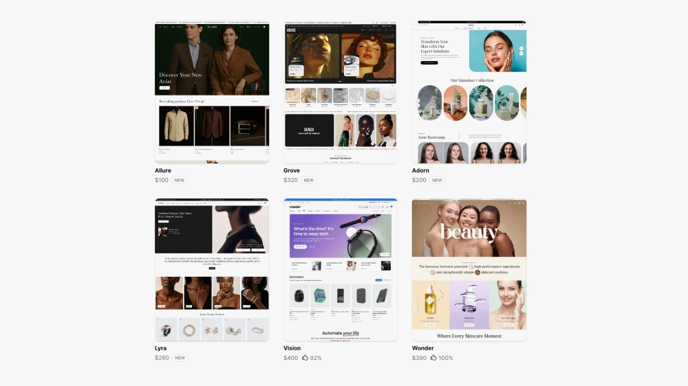
Off-the-shelf themes are designed to work for as many industries as possible. Skincare, clothing, gadgets, furniture. All from one codebase and the same set of Shopify 2.0 sections.
That means bloated feature sets, overly complex settings, and sections that aren’t truly relevant to your unique customer journey.
So instead of having a site designed around your products and customers needs, you’re cramming your business into a framework built for someone else.
For example a store selling fashion would require drop notices, countdowns and shop the look sections. Whereas a store selling food items wouldn’t need any of these and instead would prioritise different functionality around the shopping journey on the collection page.
“You didn’t build a cookie-cutter business — so why use a cookie-cutter website?”
2. Performance issues hiding behind pretty design
Many themes are built to look good out of the box — but under the hood, they can be slow and clunky.
They often:
- Load lots of unused scripts and animations.
- Include integrations you don’t use.
- Aren’t optimised for your real-world image or content needs.
- Have lots of features and settings you would never use
That’s a big issue when it comes to mobile shoppers and SEO.
Stat: A 1-second delay in page load time can reduce conversions by up to 20% (source: Portent). Site speed feeds directly into conversion rate. If you want to understand the full relationship between performance and conversion, this article on human-led CRO explains it well.
If you want to learn more about how site speed affects SEO and sales, Google’s Page Experience Guide is a great place to start.
3. Limited flexibility and customisation
Most pre-made themes let you “drag and drop” sections around, but only within certain boundaries. Try to do something slightly different and suddenly you’re in the code editor, fiddling with Liquid or CSS.
This often leads to:
- Frankensteined layouts and clashing styles.
- Rigid templates that don’t fit the product.
- A design you’re always “working around.”
By contrast, custom design starts with the customer experience — not a predetermined template. If you’re interested in what a bespoke Shopify build actually involves, here’s an overview of my bespoke Shopify store builds.
If you want to explore Shopify theme development, Shopify’s official Liquid documentation is an excellent resource.
4. You blend In instead of standing out
There are hundreds of thousands of stores using the same themes — many even leave the demo text and colour palette untouched.
That doesn’t exactly inspire trust. And in competitive markets, that lack of uniqueness is a conversion killer.
“Your brand is more than your logo — it’s how your entire online experience feels.”
Remember: Customers make snap judgments. If your store looks just like a dozen others, why should they believe your product is better?
Trust is one of the biggest drivers when it comes to sales, and if someone notices the same theme being used from a previous shopping experience, this will increase the abandonment rate.
5. Your unique purchasing journey isn't accounted for
Themes can’t anticipate how your buyers behave.
- Do they compare lots of similar products before deciding?
- Do they need education or reassurance?
- Do they buy quickly on mobile while commuting?
These details matter, and most themes aren’t built with those in mind.
A good Shopify Expert studies your business, market and analytics to map out a user journey that fits your funnel, not someone else’s.
This is tackled with the UX review I undertake before every project
Are themes all bad? Not at all.
Let’s be clear — themes can be a good starting point, especially if:
- You’re launching a side project.
- You have a tiny product range.
- You’re testing a new concept with minimal budget.
But if you’re serious about growing a Shopify store, whether that’s a DTC brand, a homeware business, or a scaling ecommerce operation — a theme is usually where you start, not where you stay. The brands that consistently outperform their competitors invest in design that is built around their customers, not borrowed from a template library. If you’re ready to explore what a custom Shopify build could do for your store, take a look at my Shopify web design services.

This article was written by Anthony Bliss, a Shopify Expert & Freelance Shopify Designer specialising in UX and UI design for DTC brands. With 20+ years of design experience and 6+ years focused exclusively on Shopify, Anthony helps brands create stores that convert.
Is your site ready to be upgraded to the next level?
Shopify Success Stories

Shopify Migration with Custom & Conversion focussed UX
Drink Finder

Bespoke Shopify Subscription UX and UI and design system
Fuzzball

A fresh mobile-first design system and bespoke product page UX
Hartnack & Co
More Shopify Articles
Klaviyo Pricing 2026: Complete Breakdown for Shopify Stores
If you're running a Shopify store, you've probably heard about Klaviyo. It's one of the most powerful email marketing platforms for ecommerce, and…
Why Conversion Rate Optimisation Is Still a Human Skill
Conversion rate optimisation isn’t about tools, dashboards, or automated tests. It’s about understanding how real people think, hesitate, and decide.…
What to Look for When Hiring a Shopify Designer (2026 Guide)
Hiring a Shopify designer is a big decision. The right designer doesn't just make your store look good — they create an experience that converts…
Shopify expert
Ready to elevate your store? Start your Shopify transformation today
Shopify expert who can help elevate your store to the next level
20 years of agency and direct client experience, without the high price tag
Network of the best developers, Klaviyo experts & SEO experts perfect for big projects
This site is protected by reCAPTCHA and the Google Privacy Policy and Terms of Service apply.
Get in touch
Registered in England & Wales No. 10575474. Based in Falmouth, Cornwall, UK.
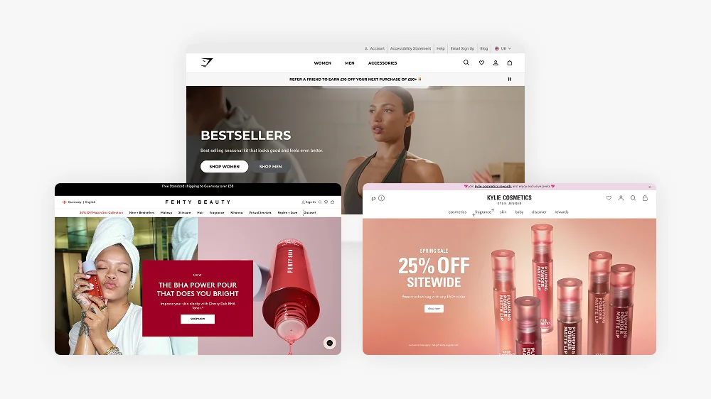
25 Biggest Brands using Shopify in 2026
Introduction
In this article, we will explore 25 of the biggest brands using Shopify in 2025. We will delve into their histories, previous platforms, target markets, future plans, and overall financial performance. If you’re considering migrating your business to Shopify, this article will provide valuable insights into how some of the most successful brands made the transition and have soared since. I’m a Shopify Expert who works with brands at various stages of growth — from new store builds to full migrations, and Shopify’s dominance at enterprise level is part of why I’m confident recommending it to every kind of business.
Let’s dive into the reasons why so many top-tier brands trust Shopify as their eCommerce solution of choice, and how it has helped them scale and succeed.
Gymshark
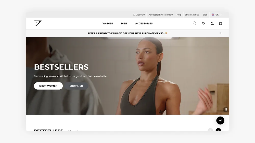
Gymshark, a UK-based fitness apparel brand, has become a leader in the fitness fashion sector, thanks to its social media-driven direct-to-consumer model. The company moved to Shopify Plus to handle its rapid growth and large-scale online operations. Gymshark focuses on millennials and Gen Z, who are drawn to its stylish, high-performance workout wear. Gymshark is a classic example of a DTC brand that succeeded through direct customer relationships and conversion-focused design, if you run a DTC store, here’s what to look for in a Shopify designer.
In 2024, Gymshark reported a turnover of over £500 million. The brand is expanding its reach globally, with a focus on opening physical retail stores and leveraging AI to personalise customer experiences.
Tesla
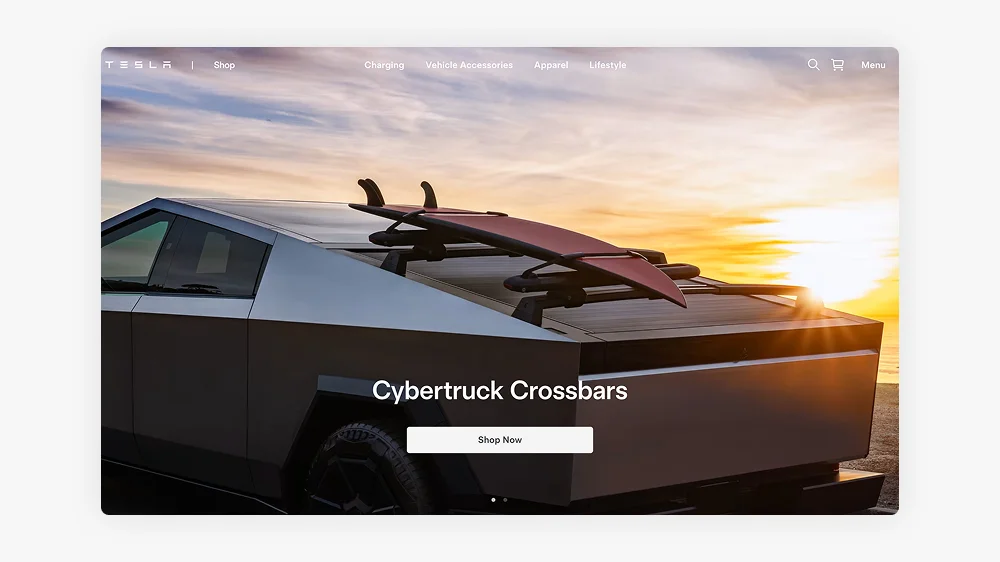
Tesla uses Shopify for its online store, offering exclusive merchandise that complements its electric vehicles and also Cybertrucks for posh kids. The company has a bespoke platform for its core business but relies on Shopify to manage its global merchandise sales. Tesla’s focus is on expanding its product lines and promoting sustainable innovation.
In 2024, Tesla’s total revenue from all operations exceeded £100 billion, with a significant contribution from its merchandise sales.
Kylie Cosmetics
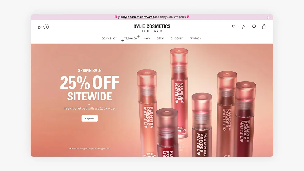
Kylie Cosmetics, founded by Kylie Jenner, leverages Shopify’s capabilities to run its successful direct-to-consumer model. The brand focuses on beauty enthusiasts, especially millennials and Gen Z. Kylie Cosmetics has grown rapidly and expanded into skincare and exclusive limited-edition product lines.
In 2024, Kylie Cosmetics reported a turnover of approximately £500 million, reflecting its strong position in the global beauty market.
Heinz
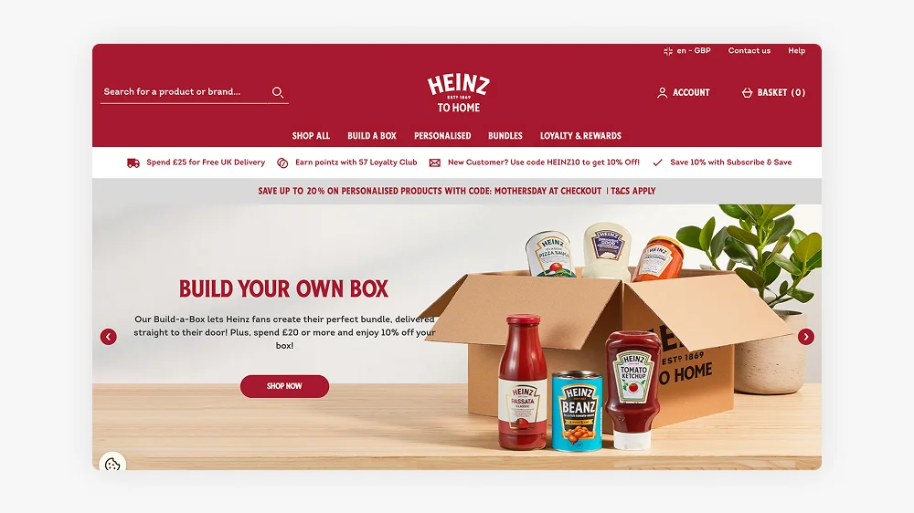
Heinz transitioned to Shopify to streamline its direct-to-consumer operations, moving away from third-party retailers. The company focuses on virtual-first strategies, including subscriptions and limited-edition product drops. Heinz has experienced significant growth in online sales, contributing to its multi-billion-pound annual revenue.
In 2024, Heinz’s overall revenue exceeded £20 billion, with online sales continuing to be a growing part of the brand’s financial portfolio.
Red Bull
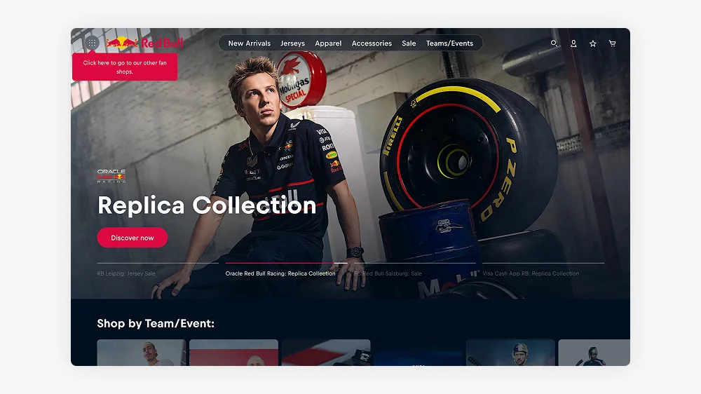
Red Bull uses Shopify to power its online store, where it sells branded merchandise such as apparel, accessories, and sports gear. Shopify supports Red Bull’s global reach, providing seamless transactions and customer experiences. The company is focused on expanding its digital presence through exclusive drops and new collaborations.
In 2024, Red Bull’s revenue reached approximately £7.5 billion, with a significant contribution from its online merchandise sales.
Allbirds
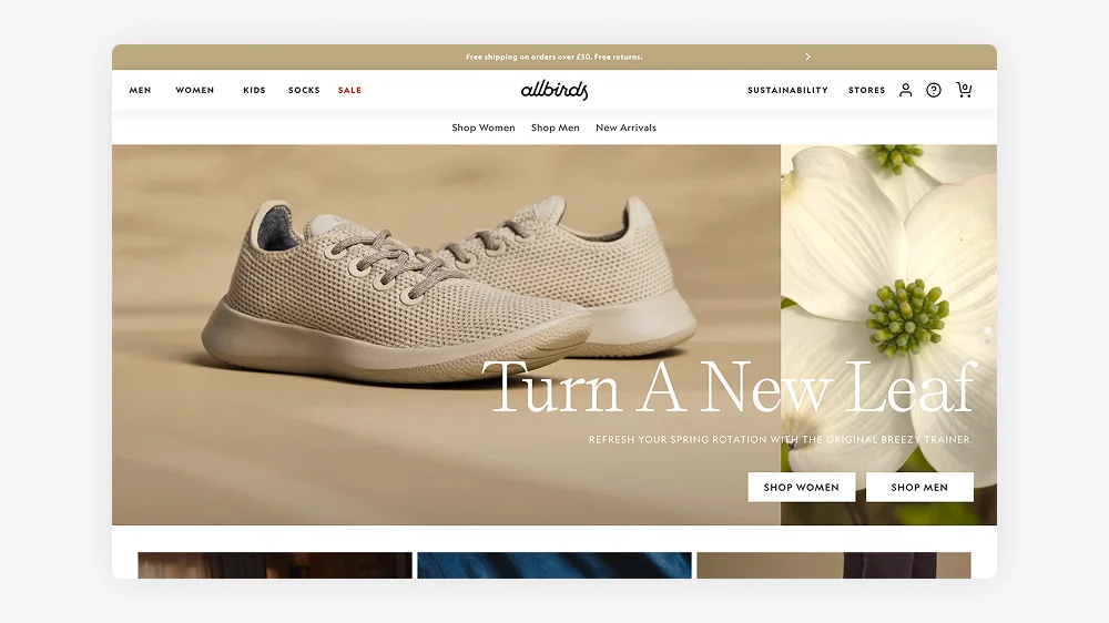
Allbirds, the sustainable footwear brand, transitioned to Shopify Plus to scale its operations efficiently. Known for its eco-friendly products, Allbirds has expanded its range to include performance footwear and clothing. The brand is committed to sustainability while growing its market share globally.
In 2024, Allbirds reported a turnover of over £200 million, demonstrating the growing demand for its environmentally conscious products.
Checkout the Allbirds Shopify store
Netflix Shop
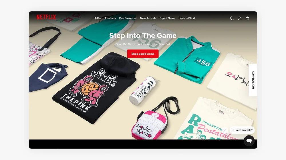
Netflix’s Shopify store offers exclusive merchandise inspired by its popular shows, tapping into fan culture with limited-edition releases. Shopify enables Netflix to provide seamless transactions and innovative shopping experiences for its audience. The brand is continually expanding its merchandise offerings to maintain fan engagement.
While specific revenue figures for the Netflix.shop platform are not disclosed, the company has expanded its merchandise collaborations, including partnerships with Lacoste and Athletic Brewing Co. These efforts suggest that Netflix’s merchandise sales contribute positively to its overall revenue, which in 2024 exceeded £30 billion.
Hasbro Pulse
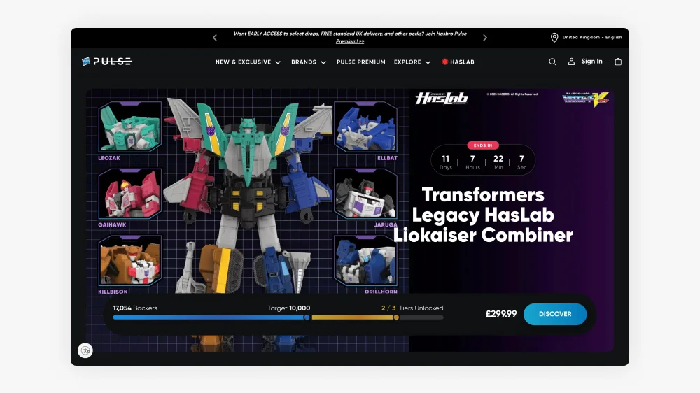
A personal favourite of my to get my Geek fix. Hasbro Pulse, Hasbro’s eCommerce store, targets collectors with exclusive pre-order and limited-edition products. The company moved to Shopify from third-party platforms to engage directly with its fan base, offering unique releases unavailable elsewhere.
In 2024, Hasbro’s total revenue reached £3.2 billion, with significant contributions from its eCommerce operations, including Hasbro Pulse. The brand’s digital sales have helped drive growth amidst challenges in the broader toy market.
Check out the latest Marvel, transformers and Star Wars toys for adults
Staples
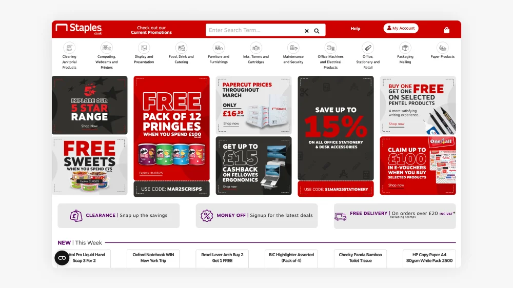
Staples transitioned to Shopify to enhance its eCommerce capabilities, focusing on office supplies and business solutions. The brand is leveraging Shopify’s features to optimise subscription services and expand its global reach. Staples continues to lead the office products sector while embracing digital-first sales strategies. Their site useless modern headless architecture.
In 2024, Staples reported revenue of approximately £6.5 billion, with online sales contributing significantly to its overall performance.
Sephora
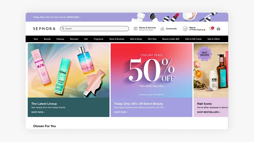
Sephora, a global leader in the beauty industry, uses Shopify to power its online store, offering a wide range of beauty products from various brands. Sephora integrates Shopify’s features to streamline its online experience and provide customers with a seamless shopping journey.
In 2024, Sephora’s parent company, LVMH, reported total revenue of £70 billion, with a growing portion of that coming from eCommerce, including Sephora’s online operations.
Sony
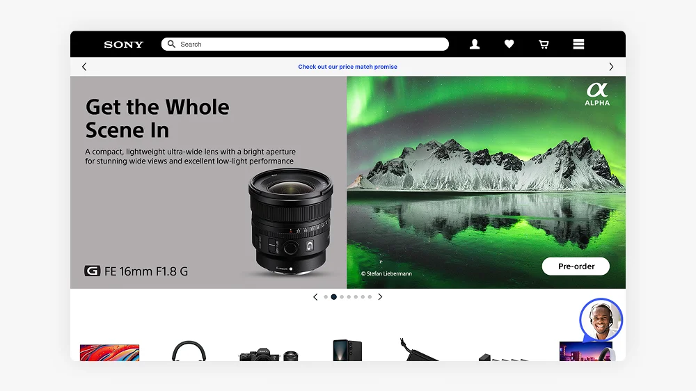
Sony uses Shopify for some of its eCommerce operations, particularly for merchandise related to its gaming division, including PlayStation products. The brand benefits from Shopify’s robust infrastructure to manage global transactions and offer a seamless experience for its customers.
In 2024, Sony’s overall revenue from all sectors reached £80 billion, with a portion coming from PlayStation merchandise and online sales.
Bumble
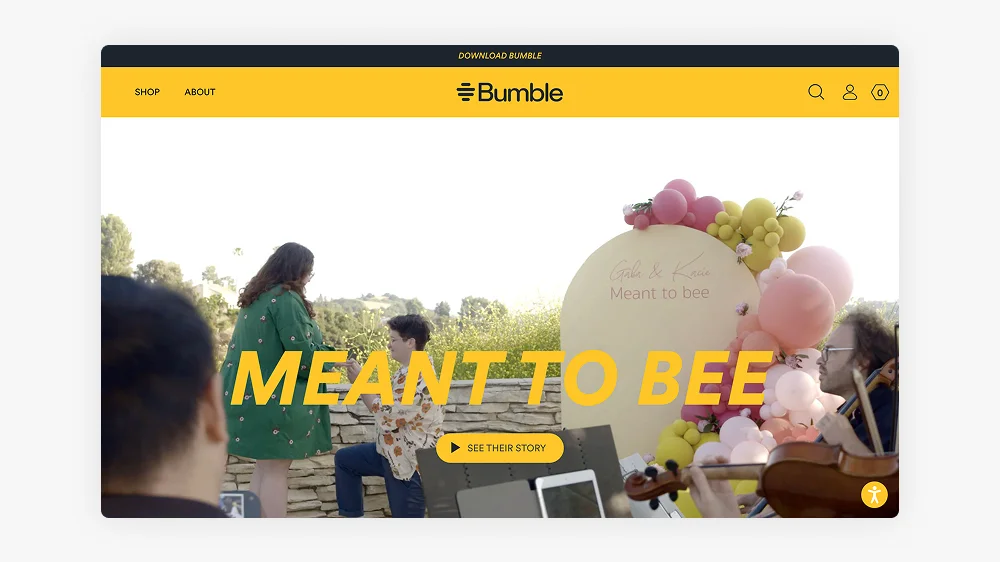
Bumble, the popular dating app, uses Shopify to sell branded merchandise, offering products that align with its empowering message for women. The company has embraced digital-first strategies, including exclusive merchandise and collaborations, to enhance brand loyalty.
In 2024, Bumble reported a turnover of £1 billion, with a growing share coming from its online sales and merchandise offerings.
Victoria Beckham Beauty
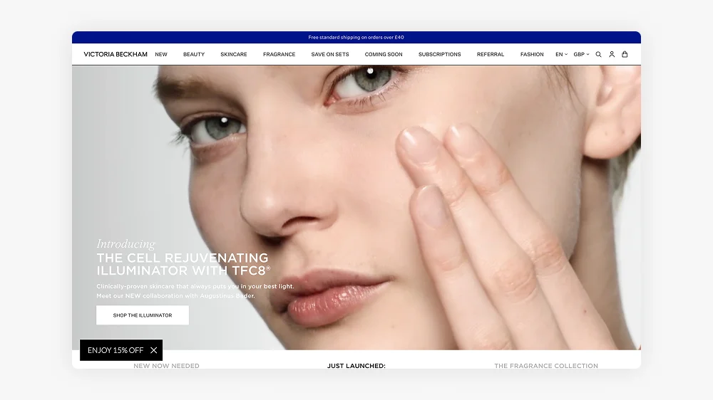
Victoria Beckham Beauty, founded by the fashion icon, uses Shopify to offer its premium beauty products directly to consumers. The brand focuses on high-quality skincare and cosmetics, targeting a luxury audience with a strong emphasis on sustainability.
In 2024, Victoria Beckham Beauty reported revenue of approximately £35 million, with Shopify enabling seamless eCommerce operations for the brand.
Fenty Beauty
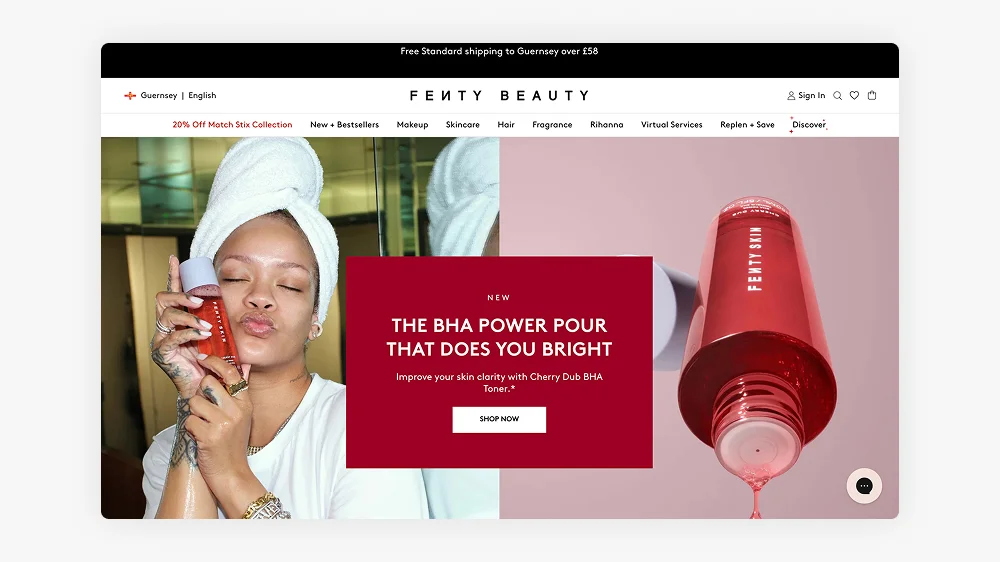
Fenty Beauty, created by Rihanna, uses Shopify to power its direct-to-consumer platform, offering a wide range of inclusive beauty products. Shopify’s robust infrastructure allows Fenty to efficiently manage its global sales and reach a diverse audience.
In 2024, Fenty Beauty’s revenue was reported at around £450 million, with a substantial portion coming from its online sales, highlighting the brand’s global reach and popularity.
Fear of God
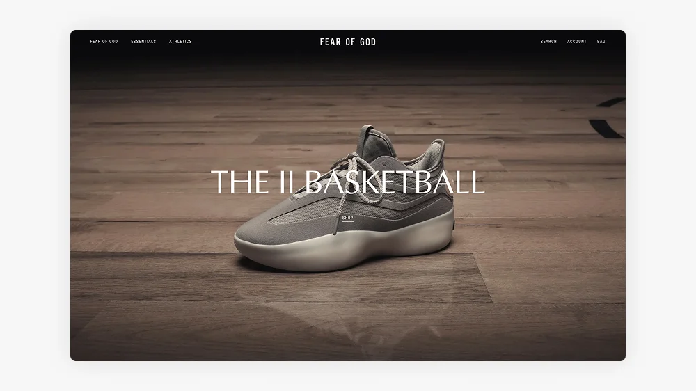
Fear of God, the luxury streetwear brand, uses Shopify to power its online store, where it sells its high-end apparel and exclusive collaborations. The brand focuses on limited-edition releases and custom drops to maintain exclusivity while catering to fashion-forward consumers.
In 2024, Fear of God’s revenue was estimated at approximately £250 million, with a significant portion of its sales coming from its online platform, including collaborations with high-profile brands.
The New York Times Store
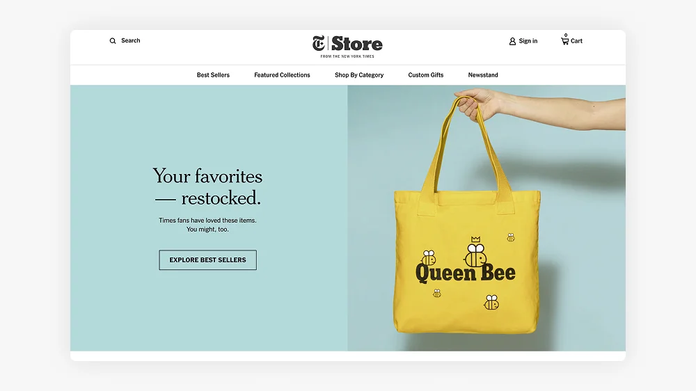
The New York Times, one of the world’s leading news organisations, uses Shopify to power its direct-to-consumer store, offering branded merchandise, books, and exclusive archival prints. The brand has embraced a digital-first approach, capitalising on the growing trend of eCommerce for media-driven products.
In 2024, The New York Times Company’s revenue exceeded £7 billion, with a growing portion of that coming from its online store and digital subscription services.
Decathlon
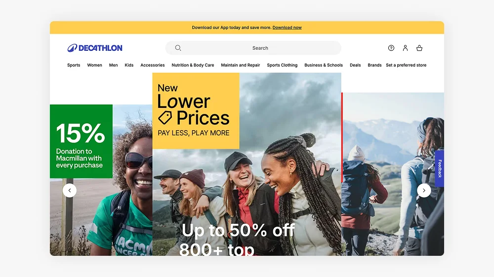
Decathlon, the global sporting goods retailer, uses Shopify to manage its online store, offering a wide range of sports equipment and apparel. With a focus on accessibility and affordability, Decathlon uses Shopify’s features to streamline its eCommerce operations and reach a global audience.
In 2024, Decathlon reported a turnover of approximately £15 billion, with a growing share of that coming from its online sales and direct-to-consumer operations.
BrewDog
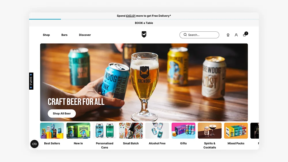
BrewDog, the popular craft beer brand, uses Shopify to sell its products online, including exclusive brews and merchandise. The brand has embraced direct-to-consumer strategies, offering subscription services and special product drops to enhance customer engagement.
In 2024, BrewDog’s revenue reached approximately £350 million, with a significant portion of sales coming from its online store and product subscriptions.
Check out the superb UX on the new Brewdog Store
Huel
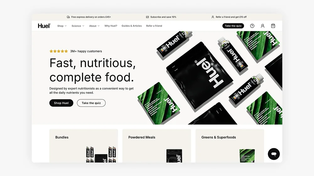
Huel, the plant-based meal replacement brand, uses Shopify to power its online store, offering nutritionally complete meals in the form of shakes, bars, and powders. The brand has grown rapidly in recent years, thanks to its direct-to-consumer model and commitment to health-conscious, sustainable products.
In 2024, Huel reported a turnover of £100 million, with the majority of its revenue coming from its eCommerce platform, including subscription services.
If you want to drink your food click here
Alo Yoga
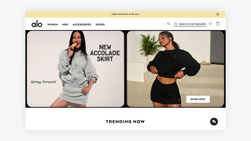
Alo Yoga, a popular yoga and athleisure brand, uses Shopify to manage its online store, selling apparel, accessories, and yoga mats. Known for its high-quality products and celebrity endorsements, Alo Yoga has successfully built a loyal customer base, particularly among wellness and fitness enthusiasts.
In 2024, Alo Yoga’s estimated revenue was £400 million, with a significant portion of its sales driven through its online store.
Razer
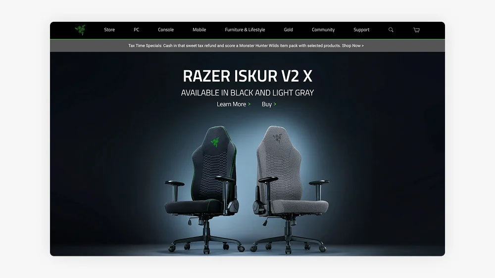
Razer, a leading brand in gaming hardware and peripherals, uses Shopify to sell its products directly to consumers. Known for its high-performance gaming laptops, mice, keyboards, and accessories, Razer relies on Shopify’s platform to manage its global eCommerce operations.
In 2024, Razer reported a turnover of approximately £1.5 billion, with a large share of that coming from its online store and direct-to-consumer sales.
Check out the store for all your gaming needs
YETI
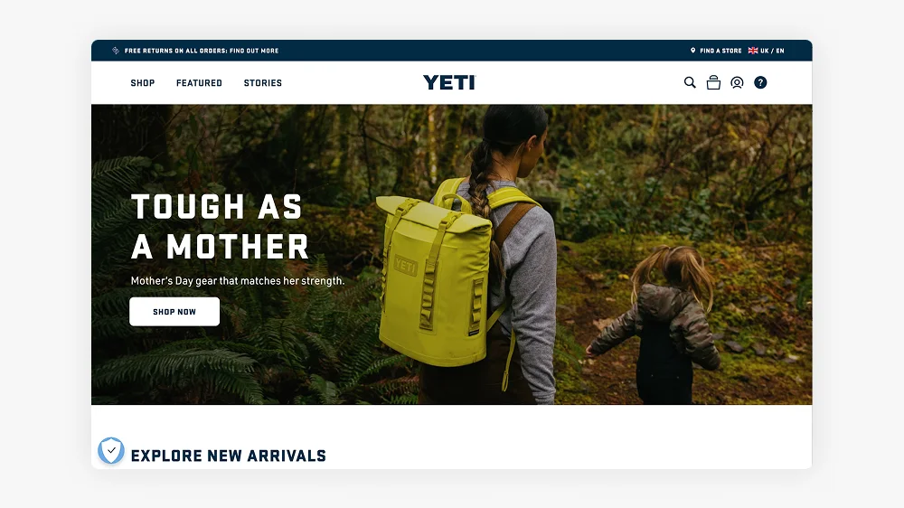
YETI, known for its premium coolers and outdoor gear, uses Shopify to manage its online store. The brand caters to outdoor enthusiasts and adventurers, offering high-end products that are built to last. Shopify’s robust platform supports YETI’s direct-to-consumer business model, providing a seamless experience for customers.
In 2024, YETI’s revenue reached approximately £1.5 billion, with significant contributions from its online sales, including product subscriptions.
Harley-Davidson
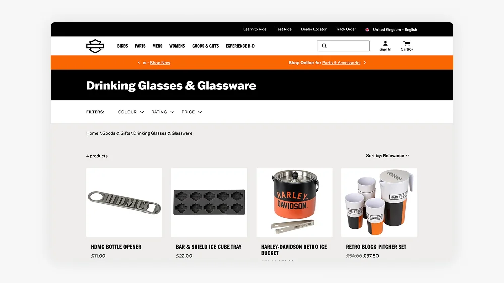
Harley-Davidson uses Shopify to sell merchandise and accessories that complement its iconic motorcycles. While the brand’s core business operates through dealerships, Shopify enables Harley-Davidson to engage directly with its global fan base through its eCommerce store.
In 2024, Harley-Davidson’s total revenue was approximately £4.5 billion, with merchandise and online sales contributing significantly to the brand’s growth.
Check out the Classic US Store
Spanx
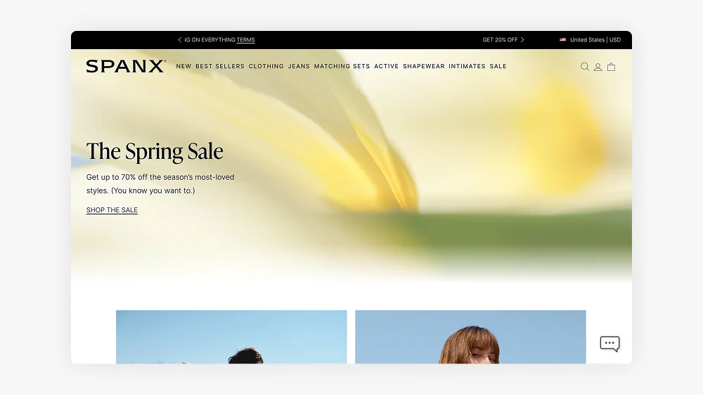
Spanx, the global shapewear and activewear brand, uses Shopify to power its online store, offering products that enhance comfort and confidence. Shopify’s features allow Spanx to streamline its eCommerce operations and reach its diverse audience directly.
In 2024, Spanx reported a turnover of approximately £500 million, with a growing share of sales coming from its online store.
Check out the latest Shapewear
OBEY Clothing
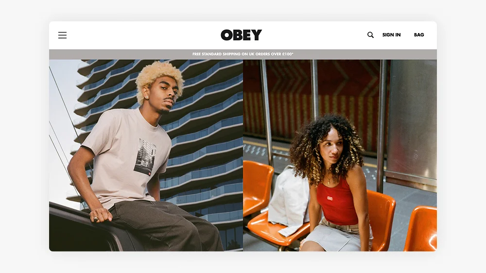
OBEY Clothing, the streetwear brand founded by artist Shepard Fairey, uses Shopify to sell its apparel, accessories, and art-inspired products. The brand is deeply rooted in political activism and street art culture, using Shopify’s platform to engage with its audience and promote its limited-edition releases.
In 2024, OBEY Clothing’s estimated revenue was £50 million, with a large portion of sales coming through its online platform.
Why Shopify is the Best Choice for Scaling Brands
Shopify provides businesses with an all-in-one eCommerce solution that simplifies store management while offering enterprise-level capabilities. The platform supports businesses of all sizes, from start-ups to multinational corporations, and its flexibility allows brands to adapt and grow seamlessly. Shopify empowers companies to scale efficiently, offering tools and features designed to streamline operations and maximise revenue potential.
Key benefits of Shopify include:
- Scalability: Whether you’re a small business or a global enterprise, Shopify can handle your growing demands. As your business expands, Shopify grows with you, providing a platform that can support increased traffic, orders, and inventory without compromising performance.
- Customisation: With thousands of apps, integrations, and themes, Shopify allows stores to be fully tailored to specific business needs. From product display to customer experience, Shopify offers endless possibilities for customisation, ensuring your store stands out in a crowded marketplace.
- Speed & Security: Shopify ensures fast load times and robust security measures to protect customer data. With built-in SSL encryption, your store is safe from breaches, while optimised loading speeds improve the user experience and contribute to higher conversion rates.
- Omnichannel Selling: Shopify makes it easy to sell across multiple channels, including social media, online marketplaces, and physical stores. This omnichannel approach helps you reach customers wherever they are, whether they’re browsing on Instagram, shopping on Amazon, or visiting your brick-and-mortar location.
- Seamless Checkout & Payment Processing: Shopify’s secure and optimised checkout process helps increase conversions by providing a smooth and hassle-free experience for customers. Shopify’s integrated payment processing ensures your store is always ready to accept payments, from credit cards to digital wallets, all while ensuring data security and compliance.
In summary, Shopify’s flexibility, scalability, and robust features make it the ideal choice for businesses looking to grow and scale efficiently, offering both the tools and support to succeed in a competitive eCommerce landscape.
How I Can Help with Your Shopify Migration
If you’re looking to transition to Shopify, I can help ensure a smooth and successful migration that positions your business for long-term success. From UX/UI design optimisation to guiding the overall customer experience, I provide expert support every step of the way, work with a Shopify expert.
First, I’ll design a user-friendly, conversion-focused Shopify store tailored to your business goals. This involves not only creating an intuitive and visually appealing design but also ensuring the user experience is seamless, making it easy for visitors to navigate and complete purchases. The goal is to optimise the customer journey from discovery to checkout, maximising sales and customer engagement at every touchpoint.
When migrating from platforms like Magento, WooCommerce, or BigCommerce to Shopify, I work closely with developers to ensure a smooth transfer of data and functionality. While I focus on the design and user experience, my developer partners handle the technical migration, making sure everything runs smoothly and securely.
Additionally, I’ll integrate advanced features and apps tailored specifically to your business needs. Whether through custom tools, payment gateways, or inventory management solutions, Shopify’s flexibility allows me to enhance your store’s functionality while developers manage the more technical aspects.
Beyond the technicalities, I believe in creating memorable experiences for your customers. Incorporating micro-interactions such as subtle animations, engaging hover effects, and personalised messages can elevate your brand’s personality and leave a lasting impression. These small yet impactful details help increase user engagement, encourage repeat visits, and foster long-term brand loyalty.
In short, I’m here to ensure that your migration to Shopify is not just a transition but an opportunity to enhance your store’s performance and create an exceptional customer experience, working alongside developers to ensure everything runs seamlessly.
Get in touch today to discuss Shopify Migration and see how I can elevate your brand with Shopify!
Frequently Asked Questions
Gymshark is arguably the most well-known brand built entirely on Shopify, having grown from a small UK fitness brand to a billion-dollar company on the platform. Other major global names include Heinz, Mattel, Kylie Cosmetics and Red Bull, all of which use Shopify or Shopify Plus to run their ecommerce operations.
Enterprise brands at the scale covered in this article almost always use Shopify Plus, which is Shopify’s enterprise tier. Shopify Plus offers higher API call limits, a fully customisable checkout, dedicated account management, and access to Shopify Flow for complex automation — all of which large brands need to run efficiently at scale.
The main reasons are speed to market, reliability, and total cost of ownership. A fully custom-built ecommerce platform requires an ongoing engineering team just to maintain it. Shopify handles hosting, security patches, and platform updates — letting brands focus on products and marketing instead. For most businesses, even at enterprise scale, the cost and complexity of building custom outweighs the benefits.
Yes. Shopify’s infrastructure is purpose-built for high-volume traffic spikes, and Shopify Plus merchants get enhanced support and infrastructure guarantees during peak periods. Gymshark and other major brands have publicly credited Shopify for holding up during some of the highest traffic periods in their history.
Yes, many. Gymshark and Allbirds (which has a significant UK presence) are among the best-known UK-associated Shopify success stories. Smaller but well-known UK brands across fashion, lifestyle and homeware also commonly use Shopify — it has strong market penetration in the UK.
Shopify is used by companies processing hundreds of millions of pounds in annual revenue — so for the vast majority of businesses, the platform is more than capable. If you’re on standard Shopify and feeling constrained, the question is usually whether you need Shopify Plus features, a better custom design, or both. A Shopify Expert can help you identify where the limitations actually are.
This article was written by Anthony Bliss, a Shopify Expert & Freelance Shopify Designer specialising in UX and UI design for DTC brands. With 20+ years of design experience and 6+ years focused exclusively on Shopify, Anthony helps brands create stores that convert.
Shopify Success Stories
Shopify Migration with Custom & Conversion focussed UX
Drink Finder
Bespoke Shopify Subscription UX and UI and design system
Fuzzball
A fresh mobile-first design system and bespoke product page UX
Hartnack & Co
More Shopify Articles
Klaviyo Pricing 2026: Complete Breakdown for Shopify Stores
If you're running a Shopify store, you've probably heard about Klaviyo. It's one of the most powerful email marketing platforms for ecommerce, and…
Why Conversion Rate Optimisation Is Still a Human Skill
Conversion rate optimisation isn’t about tools, dashboards, or automated tests. It’s about understanding how real people think, hesitate, and decide.…
What to Look for When Hiring a Shopify Designer (2026 Guide)
Hiring a Shopify designer is a big decision. The right designer doesn't just make your store look good — they create an experience that converts…
Shopify expert
Ready to elevate your store? Start your Shopify transformation today
Shopify expert who can help elevate your store to the next level
20 years of agency and direct client experience, without the high price tag
Network of the best developers, Klaviyo experts & SEO experts perfect for big projects
This site is protected by reCAPTCHA and the Google Privacy Policy and Terms of Service apply.
Get in touch
Registered in England & Wales No. 10575474. Based in Falmouth, Cornwall, UK.
How to Increase Conversion Rates on Your Shopify Store
Introduction
A good conversion rate leads to increased revenue without the need for additional traffic. The average eCommerce conversion rate typically falls between 1% and 3%, but top-performing stores often achieve rates exceeding 5%. By implementing effective strategies, you can enhance your store’s performance and increase sales.
In this guide, we will explore actionable strategies to improve conversions and maximise your store’s success. I’m a Shopify Expert specialising in UX and conversion design, and below I’ll walk through the exact areas I focus on when auditing a store. I will highlight a recent success story of Shopify conversion rate optimisation (CRO) for Zen Maitri, where not only did the conversion rate increase, but customer engagement and page scrolling percentages improved as well.
1. Improve Your Website Speed
Slow-loading websites drive visitors away. For Shopify stores, it’s important to load within 3 seconds to achieve the best results.
Why Speed Matters
– 53% of users abandon websites that take longer than 3 seconds to load.
– Faster websites rank better on Google, which improves organic traffic.
Quick Fixes
– Use Shopify’s free Online Store Speed Report
– Compress your images with free tools like TinyPNG or Crush.pics.
– Reduce the number of apps your site has running in the background.
– Choose a lightweight, optimised Shopify theme like Dawn.
Example
When I redesign websites, I always use Dawn as a starting point. It’s lightweight, fast, and built with Shopify’s best practices in mind.
Many themes come with excessive functionality and sections that don’t suit every niche or sector. For example, a fashion-focused theme might include a “Shop the Look” section, which would be irrelevant for a grocery store.
Creating bespoke sections tailored to your business will enhance the user experience while keeping the theme lean and efficient—resulting in a faster, more optimised site.
Check out the Window Fleur Case Study which was built using Dawn as a starting point.
2. Optimise Product Pages
Your product pages should be clear, engaging, and persuasive to convert visitors into buyers.
Key Enhancements
– High-quality product images and videos. Use multiple angles and lifestyle shots.
– Detailed, benefit-driven product descriptions. Highlight what makes your product unique.
– Clear pricing, shipping, and return information. No hidden costs!
– Customer reviews and testimonials. Social proof boosts trust and conversions.
One often-overlooked element on product pages is helping customers compare options. Here’s how product comparison UX can reduce choice overload and lift conversions.
For a deep dive into creating high-converting product pages, check out Shopify’s guide to product pages.
Example
Before
After custom CRO work
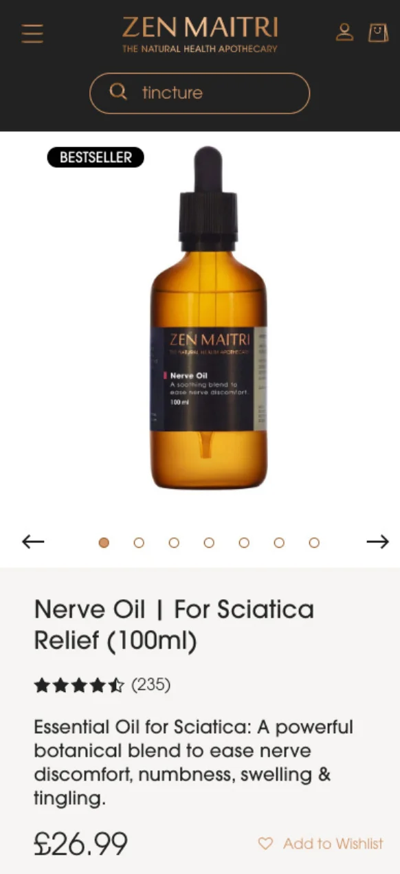
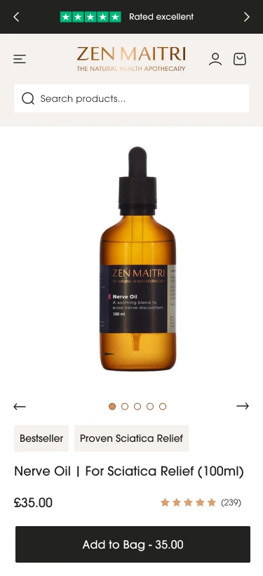
The product page required some enhancements, including a design tweak for improved visual calmness, as there were too many styles and backgrounds competing for attention.
It was essential to establish a clear hierarchy instead of overwhelming the user with too much information above the fold.
I decided to place the Trustpilot rating at the very top to build trust from the outset. Following that, I included the key elements—product image, title, price, and review rating—on the initial screen, along with a sticky “Add to Cart” button.
This layout provides users with all the essential information they need before they scroll down. The rest of the page features a clear content hierarchy, utilising bullet points and call-outs to assist readers in scanning the information. Additionally, more detailed information is housed in accordions for easy access.
Take a look at the final product page for Zen Maitri Nerve Oil.
3. Simplify the Checkout Process
A complicated checkout is one of the biggest conversion killers. Reducing friction can lead to more completed purchases.
How can you simplify the checkout process?
– Enable Shopify’s one-page checkout for faster purchases.
– Offer guest checkout to avoid unnecessary sign-ups.
– Display multiple payment options, including Apple Pay, Google Pay, and Klarna.
– Reduce checkout fields to the essentials.
For best practices, check out Baymard Institute’s research on checkout optimisation.
Example
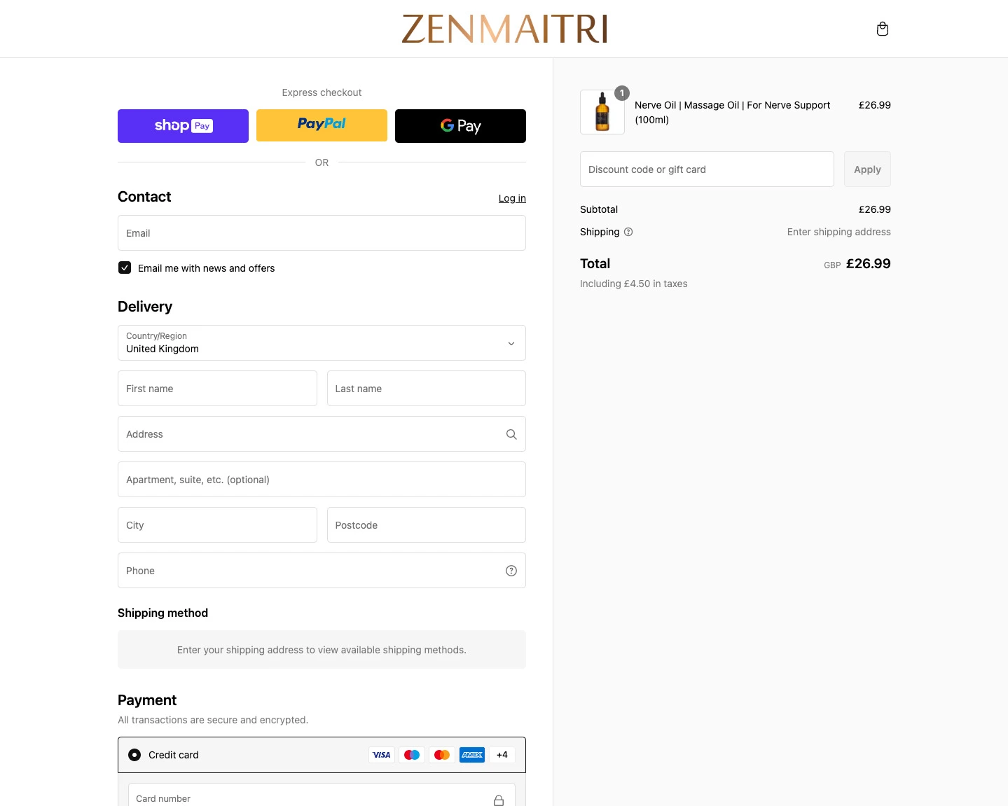
The Zen Maitri checkout has the 1 page checkout enabled. Allowing the user to scroll through the entire checkout in one go. Even easier if you are like me and have the autofill set up on your device.
4. Build Trust with Social Proof
People trust real experiences from other buyers. 79% of consumers trust online reviews as much as personal recommendations.
Ways to add trust
– Display customer reviews using apps like Judge.me or Loox.
– Showcase trust badges (secure checkout, money-back guarantee, etc.).
– Add an “As Seen In” section featuring press mentions or influencer partnerships.
– Offer a solid money-back guarantee to reduce purchase hesitation.
The small design details that reinforce trust, like cart animations, sticky add-to-cart buttons, and progress indicators, fall under the broader topic of microinteractions. Read more about how they improve the Shopify purchase journey.
Example

Zen Maitri use the Loox platform which utilises video reviews.
Some key takeaways for having video reviews
– Testimonial videos on sales pages increase conversions by 80%.
– Around 72% of customers trust a brand more with positive video testimonials and reviews.
– Research shows that company websites with video content are 53 times more likely to appear on Google’s first page.
5. Offer Free Shipping & Clear Return Policies
Many customers abandon their cart when they see unexpected shipping costs. 48% of shoppers say free shipping influences their buying decisions.
What You Can Do
– Offer free shipping (either sitewide or above a certain amount).
– Clearly state your return and refund policy on product pages.
– Use urgency tactics like “Limited stock” or “Only 2 left in stock.”
– Offer a simple return process—Shopify’s guide to return policies provides best practices.
Example

For the Zen Maitri Store I brought in the Free shipping threshold right next to the add to cart button. Then the more in-depth shipping information is in the accordion so the user doesn’t have to go off the page to find out more.
The Rebuy App has also been utilised in the cart so there is a clear message if you have hit the free shipping threshold. The bonus with this app is that you can have different levels to hit. First level is free shipping, second level is for a free gift. This is a great way to boos the average order value.
Check out the Delli website for a great example of well placed delivery messaging and the upsells in the cart.
6. Leverage Email & SMS Remarketing
Not all customers buy on their first visit. Retarget them effectively to bring them back.
Tactics to try
– Send abandoned cart emails using Shopify Email or Klaviyo.
– Use SMS marketing tools like Postscript to send reminders and exclusive discounts.
– Offer first-time buyer discounts through pop-ups.
– For more on abandoned cart recovery, read Shopify’s blog on abandoned carts.
7. Personalise the Shopping Experience
Personalisation makes customers feel valued and can increase conversion rates significantly.
Ways to do this
– Use product recommendation apps like LimeSpot to show “Recommended for You” products.
– Shopbox takes AI to the next level, integrating personalisation at every touchpoint—from a dedicated Shopify section to a chatbot-style button and even fully tailored emails.
– Enable personalised discount pop-ups based on user behaviour.
– Implement a chatbot (like Tidio) to offer real-time support.
Want expert help optimising your Shopify store?
A high conversion rate isn’t just about having great products—it’s about optimising every step of the customer journey. From site speed and product pages to checkout flow, trust signals, and retargeting efforts, each element plays a role in turning visitors into loyal customers.
If you’re ready to grow your Shopify store, a UX audit is a great place to start. I begin by analysing your Google GA4 data, then walk through the entire purchasing journey with real user behaviour in mind. Using a Miro board, I annotate screenshots with insights on what’s working, what’s not, and actionable ideas to improve conversions. Read more about my process and how you could work with a Shopify conversion rate optimisation expert. For a deeper read on why conversion optimisation is still fundamentally a human discipline, read this article on why CRO can’t be automated.
Would you like a UX & Heuristic Review of your site? Then Let’s chat!
What the client said
It has been such a pleasure to work with Anthony. We are a premium health and wellness brand and we were looking to do a revamp of our website to make it more user friendly, cleaner and sleeker. We were introduced to Anthony through a colleague. Anthony is a careful listener and he immediately grasped what we were trying to do. He has an incredible eye for design and functionality, two skills that you rarely find in the same person. We were also impressed by how data driven Anthony was: the first thing he did was do an analysis of our website to identify click rates and where page views were dropping off. This analysis allowed us to figure out where exactly our priorities need to be. We were extremely pleased with the end result and we would not hesitate to recommend Anthony. He has become our go to for all things UX related. Thank you Anthony!
Jaideep Shah | Zen Maitri Director
Frequently Asked Questions
The average Shopify store converts at around 1.4%, but the top 20% of stores convert at 3.3% or above. A “good” conversion rate varies by industry — fashion and apparel often sits lower (around 1–2%) while subscription or consumable products can reach 4–5%. Rather than benchmarking against a single number, the goal is consistent improvement on your own baseline.
The most frequent culprits are slow page speed (especially on mobile), unclear product pages that don’t answer buyer objections, a complicated or untrustworthy checkout experience, and weak or absent social proof. In most stores I audit, the biggest issue isn’t any single thing — it’s several small friction points adding up throughout the customer journey.
Even a 0.5% improvement in conversion rate can make a significant difference to revenue. If your store does £50,000 a month in revenue at a 1.5% conversion rate, getting to 2% would increase revenue by roughly £16,700 a month without changing your traffic at all. This is why CRO often has a better ROI than increasing ad spend.
Yes, significantly. Research consistently shows that a one-second delay in page load time can reduce conversions by up to 20%. On mobile, where the majority of Shopify traffic now comes from, this effect is even more pronounced. Slow themes, unoptimised images, and too many installed apps are the most common causes on Shopify stores.
A/B testing is valuable, but only once you have enough traffic to generate statistically significant results — typically at least a few thousand sessions per month per test. For smaller stores, making informed design and copy improvements based on user behaviour data (heatmaps, session recordings) is usually more effective than trying to run formal tests with insufficient traffic.
UX (user experience) design focuses on making your store intuitive and enjoyable to use. CRO (conversion rate optimisation) focuses specifically on removing barriers to purchase. In practice, they overlap significantly — good UX tends to improve conversion, and CRO work often identifies UX problems. The distinction matters more in theory than in practice for most Shopify stores.
Quick wins — like improving product page copy, adding trust signals, or fixing mobile layout issues — can show measurable results within 2–4 weeks. Structural changes like redesigning the checkout flow or rebuilding navigation take longer to implement and test. Most stores see meaningful improvement within 60–90 days of a focused CRO engagement.
This article was written by Anthony Bliss, a Shopify Expert & Freelance Shopify Designer specialising in UX and UI design for DTC brands. With 20+ years of design experience and 6+ years focused exclusively on Shopify, Anthony helps brands create stores that convert.
Shopify Success Stories
Shopify Migration with Custom & Conversion focussed UX
Drink Finder
Bespoke Shopify Subscription UX and UI and design system
Fuzzball
A fresh mobile-first design system and bespoke product page UX
Hartnack & Co
More Shopify Articles
Klaviyo Pricing 2026: Complete Breakdown for Shopify Stores
If you're running a Shopify store, you've probably heard about Klaviyo. It's one of the most powerful email marketing platforms for ecommerce, and…
Why Conversion Rate Optimisation Is Still a Human Skill
Conversion rate optimisation isn’t about tools, dashboards, or automated tests. It’s about understanding how real people think, hesitate, and decide.…
What to Look for When Hiring a Shopify Designer (2026 Guide)
Hiring a Shopify designer is a big decision. The right designer doesn't just make your store look good — they create an experience that converts…
Shopify expert
Ready to elevate your store? Start your Shopify transformation today
Shopify expert who can help elevate your store to the next level
20 years of agency and direct client experience, without the high price tag
Network of the best developers, Klaviyo experts & SEO experts perfect for big projects
This site is protected by reCAPTCHA and the Google Privacy Policy and Terms of Service apply.
Get in touch
Registered in England & Wales No. 10575474. Based in Falmouth, Cornwall, UK.
Shopify vs Shopify Plus
Introduction
In this post, we will examine the key differences between Shopify and Shopify Plus, helping you determine which option best aligns with your eCommerce goals.
As a Shopify Expert who works with brands across both plans, I’ll walk through the key differences to help you decide.
Pricing Comparison
Let’s start with one of the biggest deciding factors: cost.
Shopify Pricing
Plans range from £25/month (Basic) to £344/month (Advanced). These plans offer all the essential features to run a small to medium-sized online store. View Shopify pricing
Shopify Plus Pricing
Starts at around £1,600/month, with pricing scaling based on your business revenue. While this is a significant jump, it includes enterprise-level features and dedicated support tailored for fast-growing brands.Many of the world’s biggest brands run on Shopify Plus. Here’s a look at 25 of them and what makes Shopify their platform of choice. Learn more about Shopify Plus
Features & Capabilities
The price difference comes with a substantial boost in features. Let’s explore what you get with each option.
Customisation & Design
Let’s start with one of the biggest deciding factors: cost.
Shopify
Access to themes and the ability to customise with the theme editor or by editing Liquid files.
Shopify Plus
Full control over your site, including a completely customisable checkout, perfect for optimising conversions.This is where working with a Shopify designer on a bespoke store build really pays off; you get full control of the design rather than being constrained by theme settings. Shopify Plus checkout customisation
Checkout Experience
Shopify
Standard checkout with limited customisation.
Shopify Plus
Tailor your checkout experience with custom fields, branded elements, and dynamic discounting.
Automation & Workflows
Shopify
Basic automation features.
Shopify Plus
Shopify Flow lets you create advanced workflows, like automating inventory alerts or segmenting VIP customers. Discover Shopify Flow
API Access & Integrations
Shopify
Access to standard APIs.
Shopify Plus
Greater API rate limits and access to more advanced APIs for custom app development. Shopify API documentation
Support & Guidance
Shopify
24/7 support via live chat, email, and phone.
Shopify Plus
A dedicated Merchant Success Manager, plus priority support and strategic guidance. Shopify support
Which Shopify plan Should I Use?
Choosing between Shopify and Shopify Plus ultimately depends on your business’s size, growth stage, and specific needs.
Shopify
Ideal for small to medium-sized businesses that need a robust, easy-to-use platform without a hefty price tag.
Shopify Plus
Best for large or rapidly growing brands (typically generating £750k+ per year) that need advanced features, scalability, and hands-on support.
Final Thoughts
If you’re a smaller business or just starting out, Shopify’s core plans likely offer everything you need to build and run a successful online store. But if you’re scaling quickly, need a custom checkout, or want enterprise-level automation, Shopify Plus could be the game-changer that helps you level up.
If you’re ready to build or upgrade your Shopify store, I’d love to help. Take a look at my Shopify web design services and get in touch.
Feel free to contact me — I’d love to help you navigate your Shopify journey and build a store that grows with your business!
Frequently Asked Questions
The main differences come down to customisation, scale, and support. Shopify Plus gives you full control over the checkout experience (something standard Shopify locks down), access to higher API rate limits for complex integrations, Shopify Flow for advanced automation, and a dedicated merchant success manager. It’s designed for brands that have outgrown the standard plan’s limitations.
Shopify Plus pricing typically starts from around £1,800 per month on a long-term contract, or approximately £1,950 per month on a shorter rolling agreement.
For high-revenue stores generating more than £630,000 per month, pricing can shift to a revenue-based model (around 0.35% of monthly turnover), allowing costs to scale alongside growth. This structure makes Shopify Plus most cost-effective for brands operating at significant ecommerce volume.
The clearest triggers are: when you need to customise the checkout beyond what standard Shopify allows; when your store requires complex B2B or wholesale functionality; when you’re processing over £1 million per year and the transaction fees on standard Shopify start to add up significantly; or when your integrations are hitting API rate limits. For most stores, these issues don’t arise until they’re well past the £500k–£1m annual revenue mark.
Standard Shopify allows limited checkout customisation — you can change colours and add a logo, but you cannot modify the checkout layout, add custom fields, or embed third-party scripts. Shopify Plus unlocks full checkout customisation through checkout.liquid (and increasingly through Checkout Extensibility), which is why it’s so valuable for brands with specific upsell flows or B2B requirements.
For the right business, yes — the combination of reduced transaction fees (Shopify Plus waives third-party transaction fees entirely), checkout customisation, and automation capabilities can deliver significant ROI. However, for stores doing under £500k annually, the cost of Plus rarely justifies itself. The honest answer is: it depends on which specific limitations you’re hitting on your current plan.
Yes. Shopify Plus merchants get a dedicated merchant success manager as well as priority support, including faster response times and access to Shopify’s Plus-specific partner ecosystem. For growing brands, having a direct line to Shopify support rather than dealing with generic customer service is one of the practical benefits people don’t always think about.
This article was written by Anthony Bliss, a Shopify Expert & Freelance Shopify Designer specialising in UX and UI design for DTC brands. With 20+ years of design experience and 6+ years focused exclusively on Shopify, Anthony helps brands create stores that convert.
Shopify Success Stories
Shopify Migration with Custom & Conversion focussed UX
Drink Finder
Bespoke Shopify Subscription UX and UI and design system
Fuzzball
A fresh mobile-first design system and bespoke product page UX
Hartnack & Co
More Shopify Articles
Klaviyo Pricing 2026: Complete Breakdown for Shopify Stores
If you're running a Shopify store, you've probably heard about Klaviyo. It's one of the most powerful email marketing platforms for ecommerce, and…
Why Conversion Rate Optimisation Is Still a Human Skill
Conversion rate optimisation isn’t about tools, dashboards, or automated tests. It’s about understanding how real people think, hesitate, and decide.…
What to Look for When Hiring a Shopify Designer (2026 Guide)
Hiring a Shopify designer is a big decision. The right designer doesn't just make your store look good — they create an experience that converts…
Shopify expert
Ready to elevate your store? Start your Shopify transformation today
Shopify expert who can help elevate your store to the next level
20 years of agency and direct client experience, without the high price tag
Network of the best developers, Klaviyo experts & SEO experts perfect for big projects
This site is protected by reCAPTCHA and the Google Privacy Policy and Terms of Service apply.
Get in touch
Registered in England & Wales No. 10575474. Based in Falmouth, Cornwall, UK.
Microinteractions in Shopify Website Design
Introduction
One such detail is microinteractions, subtle yet powerful design elements that enhance usability, provide feedback, and delight users. As a Shopify Expert and UX designer, microinteractions are one of the details I focus on in every store build — because they’re often the difference between a store that feels polished and one that feels generic. Whether you’re on a social media platform, a brochure website, or a Shopify site, microinteractions can increase engagement and drive conversions by making the user journey smoother and more intuitive.
What Are Microinteractions?
Microinteractions are small, functional animations or responses that help users understand system feedback, navigate easily, and feel connected to a digital product.
Some examples of microinteractions include:
✔️ The cart icon updating after an item is added in an online store.
✔️ An animation for the like button on social media.
✔️ A progress bar displayed during checkout.
✔️ A pull-to-refresh gesture in mobile apps.
✔️ A typing indicator in a messaging app.
Although these elements may seem minor, they play a significant role in enhancing overall user experience (UX). As Dan Saffer, the author of “Microinteractions: Designing with Details,” explains, “great design is in the details.”
Why Microinteractions Matter
1. Enhancing User Feedback
Microinteractions offer immediate feedback for user actions. For instance, when a user clicks “Add to Cart” on an eCommerce site, they may feel uncertain about whether the action was successful. A small animation, such as a cart icon bouncing, provides instant reassurance. This kind of feedback design is central to conversion rate optimisation, it reduces uncertainty and keeps users moving through the journey.
Example: A small positive animation on a product card lets the user know that the product has been added to the cart.
2. Reducing Friction & Improving Navigation
Microinteractions help users navigate complex interfaces without feeling overwhelmed. Features like hover effects, tooltips, and animations can guide attention and enhance usability.
Example: The icon animation teamed up with a background overlay lets the user know that they have opened a modal.
3. Increasing Engagement & Delight
Small design elements enhance interfaces, making them more enjoyable and human. Animated loading indicators, playful success messages, and confetti effects can transform routine tasks into delightful moments.

Example: The new Whistlefish Shopify website design utilised Lottie files to bring in special gamification elements to let users know they completed a stage in the purchase journey or that they have just unlocked a promotion.
Microinteractions in Social Media: The Facebook Example
Social media platforms, especially Facebook, have mastered microinteractions to keep users engaged. Some of the most effective ones include:
🎭 Reactions on posts – The evolution of the simple “Like” button into multiple reaction emojis (Love, Haha, Wow, Angry, etc.) adds emotional depth to user interactions.
💬 Typing indicators in Messenger – This subtle animation lets users know the other person is responding, making conversations feel more natural.
📢 Live video engagement – When users react to a Facebook Live video, reactions float across the screen in real time, fostering a sense of community.
🔔 Subtle notifications – Red notification badges and gentle animations draw attention to new messages or alerts without being intrusive.
These elements keep users engaged, informed, and emotionally connected to the platform—proving that microinteractions are essential to digital engagement. In fact, this article on UX Scotland explores how microinteractions can evolve into signature moments that define an entire user experience.

Small microinteractions when users react to a post not only indicate that a button has been pressed, but also animate the emoticon, creating deeper engagement.
How Microinteractions Improve the Purchase Journey on Shopify
1. Product Discovery & Engagement
In an online store, first impressions matter. Microinteractions like:
🔍 Hover animations that reveal product details.
🖼️ Zoom-in effects on product images.
⭐ Smooth rating animations that highlight reviews.
🎥 GIFs or short animations showing product usage.
🔄 360-degree product viewers that let customers rotate and explore items.
These small touches boost confidence and encourage product exploration.
2. Making the "Add to Cart" Process Seamless
A satisfying visual confirmation reassures customers that their selection has been added. Effective microinteractions include:
🛒 Cart icon animations (bounce, slide-in, or number increment).
🔔 Subtle success pop-ups with “Added to Cart” messages.
⏩ Quick-buy buttons that skip unnecessary steps and speed up shopping.
📍 Sticky “Add to Cart” buttons that stay visible as customers scroll.
3. Enhancing the Checkout Experience
A complicated checkout process is a conversion killer. Microinteractions help by:
✅ Step-by-step progress indicators reducing uncertainty.
🔄 Loading animations showing when payments are processing.
✏️ Editable cart previews allowing last-minute changes before checkout.
🎉 Fun order confirmation animations (confetti, checkmarks, or animated “Thank You” messages).
📦 Live order tracking microinteractions, updating shipping status in real time.
4. Boosting Customer Engagement Post-Purchase
The experience shouldn’t stop after checkout! Keep customers engaged with:
📧 Interactive email confirmations (animated order status updates).
💬 Live chat bubbles with subtle pulsing effects, prompting users to ask questions.
🌟 Animated review request pop-ups encouraging customers to leave feedback.
🎁 Loyalty points counters with dynamic progress bars to track rewards.
Bringing Microinteractions into Your Shopify Store
1. No-Code Solutions (Apps & Tools)
If you’re on Shopify, there are some apps and services that can help, however you would be restricted in the UX around these. Here are some top-rated tools:
📌 PageFly – Drag-and-drop builder with interactive elements.
📌 Shogun – Adds animated buttons and hover effects.
📌 LOOX – Displays animated product reviews to build trust.
2. Ways to implement more bespoke microinteractions
For more tailored solutions, developers can use:
💻 CSS animations for hover effects and transitions.
⚡ JavaScript libraries (GSAP, Lottie) for dynamic interactions.
🛒 Shopify Liquid code to trigger microinteractions at key touchpoints.
Round up. Small details, Big impact.
Microinteractions may be small, but they elevate the entire user experience—from navigation to engagement to conversions. Whether they are small UX touches to make everything super clear for the user or using more bespoke gamification approaches to drive up customer engagement, conversion rate and loyalty there is no limits with what is achievable on the Shopify platform and using a Shopify website designer who knows what he is doing.
Want to read more on microinteractions and UX? Check out Shopify’s UX Best Practices for inspiration.
Want to bring microinteractions onto your site? Why don’t you contact me and set up a call. Want to bring microinteractions onto your site? Take a look at my Shopify web design services or contact me to set up a call.
This article was written by Anthony Bliss, a Shopify Expert & Freelance Shopify Designer specialising in UX and UI design for DTC brands. With 20+ years of design experience and 6+ years focused exclusively on Shopify, Anthony helps brands create stores that convert.
Shopify Success Stories
Shopify Migration with Custom & Conversion focussed UX
Drink Finder
Bespoke Shopify Subscription UX and UI and design system
Fuzzball
A fresh mobile-first design system and bespoke product page UX
Hartnack & Co
More Shopify Articles
Klaviyo Pricing 2026: Complete Breakdown for Shopify Stores
If you're running a Shopify store, you've probably heard about Klaviyo. It's one of the most powerful email marketing platforms for ecommerce, and…
Why Conversion Rate Optimisation Is Still a Human Skill
Conversion rate optimisation isn’t about tools, dashboards, or automated tests. It’s about understanding how real people think, hesitate, and decide.…
What to Look for When Hiring a Shopify Designer (2026 Guide)
Hiring a Shopify designer is a big decision. The right designer doesn't just make your store look good — they create an experience that converts…
Shopify expert
Ready to elevate your store? Start your Shopify transformation today
Shopify expert who can help elevate your store to the next level
20 years of agency and direct client experience, without the high price tag
Network of the best developers, Klaviyo experts & SEO experts perfect for big projects
This site is protected by reCAPTCHA and the Google Privacy Policy and Terms of Service apply.
Get in touch
Registered in England & Wales No. 10575474. Based in Falmouth, Cornwall, UK.

6 Strategies for your Homeware & Lifestyle Shopify Store
Top tips for your Homeware & Lifestyle Shopify website
1. Perfect branding and design
What to do
- Clean & clear aesthetics & messaging.
- Have consistent imagery.
- Highlight what makes your company unique to help get new customers buy-in and separate you from the competition.
Why it is important
A beautiful website design will gain trust amongst customers and boost their confidence in the quality of your products. Whilst also making it clearer and easier to use. After all, if you are selling products that imply design and beauty and your design isn’t up to scratch then it’s likely your customers won’t trust what the brand is selling.
First impressions are massive in eccommerce, when a potential customer is shopping around on multiple sites you need to stand out. The conversion could be done solely on price point, however trust in the brand also plays a huge part.
2. Clear Navigation & User Journeys
What to do
- Multiple routes into collection pages and product pages. Some users may want to shop by a room, some may want to shop by a specific styling that they are looking for.
- Well thought out landing pages with clear sub pages and filtering.
- Search with recommended products.
Why it is important
Not all users have the same needs. Some users will land on your site from a search engine. Some know exactly what they want and want it fast. Whereas some users may be engaged in the brand and only want to see what your latest products are.
So how do you make your website usable for researchers and impulse buyers?
It’s all down to a clear hierarchy. Separating different journey methods and making them easy to find. There has been a recent trend of bringing key collections out of the burger menu so they are clear and upfront on every page of your store. This works great as the user doesn’t have to open a menu and look around, saving time and clicks.
You can also visually separate them in the menu. This could be done by color, spacers or content. You could also have imagery or icons for some links and text links for others, this method works great when you have some collections that need sub pages in the menu, which creates a clear visual hierarchy.
Examples
The new La radoute site brings some of their key collections and landing pages out of the burger menu. They even draw the eye and highlight the top offers by using their brand colour. This approach means there are less clicks for a user to get to a collection page and start shopping.

3. Curate meaningful landing pages of your collections and products
What to do
- Utilise your your skills and group products and collections for rooms and trends
- This will help your customers find products they might not be looking for but ina well throughout way
- ‘Get/shop the look’ on Collection and product pages
Why it is important
Chances are you have a lot of products. Use your knowledge and expertise to curate bestseller collections. Group colours, finishing, stylings and trends to make it easy for users to find associated products that would otherwise lay in a separate collection. Enable users to add to the basket from the landing page for the win!
4. Collect and showcase User-Generated Content (UGC)
What to do
- Create a section on the product page EG ‘As seen on Instagram’ so customers can see your products in real environments from happy customers.
- Encourage customers to share content. This could be through Socials or email marketing and you could offer a reward/gift to entice more content.
Why it is important
Lots of brands struggle to generate images and videos that stand out from their competitors. Prioritising UGC can help because;
- More relatable to customers and helps build trust seeing real products in real places with real people.
- More of an authentic way to ensure diversity, rather than handpicking models/influencers.
- Minimises costs.
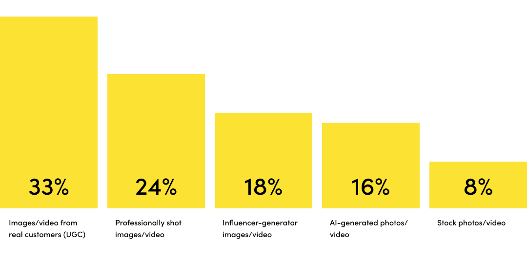
Source: Noso, 2023
Creating a community feel is a great way of getting customers to buy into your brand and go onto the next step in the journey. That might be revisiting the website, signing up to socials or signing up to your newsletter. Having engaged customers in turn helps new users to convert in customers.
This approach also helps you to create great unique content which is great for SEO and helps visibility on SERPs (search engine result pages).
Taking the user-generated content a step further you could utilise a customer gallery and link products to the images.
Reference: https://www.nosto.com/blog/new-research-brands-prefer-ugc-for-diversity/
Examples
The Ikea Customer Gallery is a section which is used through the site on the homepage, collections and product pages. It allows user generated content to be linked with products, so the user can purchase all the products used in that single UGC image.

5. Build Trust indicators
What to do
- Hero your reviews and start gathering reviews with customer photos to help build trust.
- Show Third-party endorsements.
- Make Returns & Guarantees easy to find.
- Think if Trustpilot is right for you.
Why it is important
Genuine reviews and product ratings build trust in your products and your brand. Customers are more likely to trust what their peers say over marketing claims.
But trust doesn’t end with customer reviews. Endorsements from known organisations can help with your brand’s credibility. Also enabling Trustpilot widgets is a great way to gain trust without having to say anything.
Lastly, trust and peace of mind about a purchase can play a huge part in converting a user to a customer. Letting users know the policies on delivery and returns can play a huge part in converting potential customers. Try to not hide these bits of information. Having icons near the add to cart button or price has always worked well as the user doesn’t have to go searching, it is always in a predominant part and helps with scan readers.
Examples
Nkuku bring in their review rating into the stick add to cart on mobile which is a great touch, this is even clickable which anchors links to the review section.

6. Treat your product pages as landing pages
What to do
- Put your trust indicators high up on every page. Not just on the homepage
- Focus on benefits over features
- Upsell and link related products and blog content
Why it is important
Not every user will come from the homepage, some organic users will arrive to a product page via a search engine result page (SERP’s). And may miss out on important messaging or trust indicators that could help convert.
On product pages when you focus on benefits, you’re informing potential customers how your product or can make their lives better. This is much more compelling than just simply listing features.
Examples
Rockett St George do a great job of having their product pages as content rich landing pages. Nothing is hidden and the information is easy to find for scan readers.

Looking to elevate your Shopify Store with an expert Shopify website designer?
Having worked on lots of Shopify stores both directly with clients and collaborating with agencies, I am in a fabulous place to offer my expertise. I can help elevate your store to the next level and by undertaking my trusted Brand & UX/UI design process.
This article was written by Anthony Bliss, a Shopify Expert & Freelance Shopify Designer specialising in UX and UI design for DTC brands. With 20+ years of design experience and 6+ years focused exclusively on Shopify, Anthony helps brands create stores that convert.
Shopify Success Stories
Shopify Migration with Custom & Conversion focussed UX
Drink Finder
Bespoke Shopify Subscription UX and UI and design system
Fuzzball
A fresh mobile-first design system and bespoke product page UX
Hartnack & Co
More Shopify Articles
Klaviyo Pricing 2026: Complete Breakdown for Shopify Stores
If you're running a Shopify store, you've probably heard about Klaviyo. It's one of the most powerful email marketing platforms for ecommerce, and…
Why Conversion Rate Optimisation Is Still a Human Skill
Conversion rate optimisation isn’t about tools, dashboards, or automated tests. It’s about understanding how real people think, hesitate, and decide.…
What to Look for When Hiring a Shopify Designer (2026 Guide)
Hiring a Shopify designer is a big decision. The right designer doesn't just make your store look good — they create an experience that converts…
Shopify expert
Ready to elevate your store? Start your Shopify transformation today
Shopify expert who can help elevate your store to the next level
20 years of agency and direct client experience, without the high price tag
Network of the best developers, Klaviyo experts & SEO experts perfect for big projects
This site is protected by reCAPTCHA and the Google Privacy Policy and Terms of Service apply.
Get in touch
Registered in England & Wales No. 10575474. Based in Falmouth, Cornwall, UK.