Introduction
As a Shopify Expert, I’ve designed landing pages for brands like Whistlefish and Wide Fit Shoes, and I’ve seen first-hand what separates a page that converts from one that underperforms.
This guide will break down the core elements of a high-performing landing page, show how scalable design systems make Shopify sites more flexible, and share practical examples you can apply to your own store. You can always view more of my Shopify website design services.
Why Landing Pages Matter in Ecommerce
Unlike a homepage, which is largely a navigation tool with trust converters, a landing page has a single focus: convert visitors. This could mean signing up for a newsletter, claiming a discount, or buying a featured product.
Landing pages aren’t just important for conversions, they’re also a powerful tool for SEO. A well-optimised landing page can rank for specific keywords, attract targeted traffic, and provide a clear entry point for new visitors. When structured properly, landing pages act as signposts that guide customers deeper into your site, helping them drill down into categories, collections, or products in a logical way.
They’re also perfect for seasonal campaigns. For example, a retailer might create a Christmas landing page, a summer sale page, or a Mother’s Day promotion. Each can be optimised for search, linked from paid ads, and slotted neatly into your navigation without disrupting your core site structure.
For Shopify store owners, this means landing pages are one of the smartest investments you can make, they boost conversions, support your SEO, and make your site more adaptable to customer journeys.
The Key Ingredients of a Good Landing Page
1. A Clear, Compelling Headline
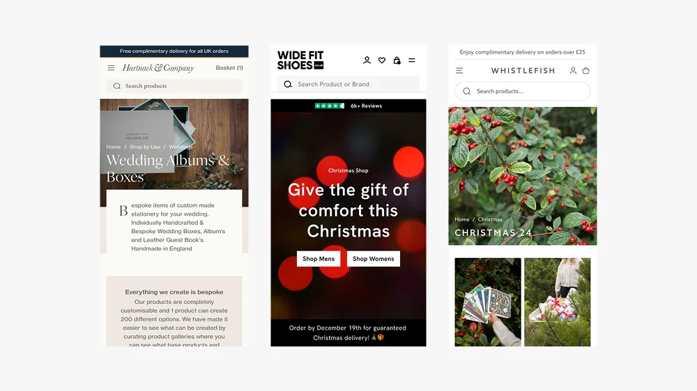
Your headline needs to immediately explain the value proposition. For Wide Fit Shoes, the headline highlighted comfort and fit — instantly addressing customer pain points.
Top Tip: Keep headlines short and impactful. Test variations to see which resonates most.

Example: Wide Fit Shoes Christmas landing page.
2. Strong Visual Hierarchy
For the bespoke store design of the new Whistlefish website, bold typography, product imagery, and whitespace kept the focus on the art prints rather than clutter.
I designed a modular Shopify design system that ensured each block works in harmony. This means sections can be rearranged without breaking the flow, ideal for seasonal campaigns or A/B testing.

Example: The 2024 Christmas landing page showcases how the sections in Shopify 2.0 would work.
3. Trust Signals
People buy from brands they trust. Customer reviews and editorial mentions can give immediate credibility. Adding trust badges (secure checkout, delivery info, etc.) further reduced hesitation. This connects closely to conversion rate optimisation, landing pages that convert aren’t just well-designed, they reduce uncertainty at every step.
Read more about Trust Signals and how they help eccomerce stores and boost conversion rates.
4. Mobile-First Design
With more than 70% of ecommerce traffic now mobile (Statista), responsive design is non-negotiable. On Shopify 2.0, flexible sections ensure CTAs, headlines, and product images render correctly across devices.
See my guide on Conversion Rate Optimisation to learn why mobile-first design is essential.
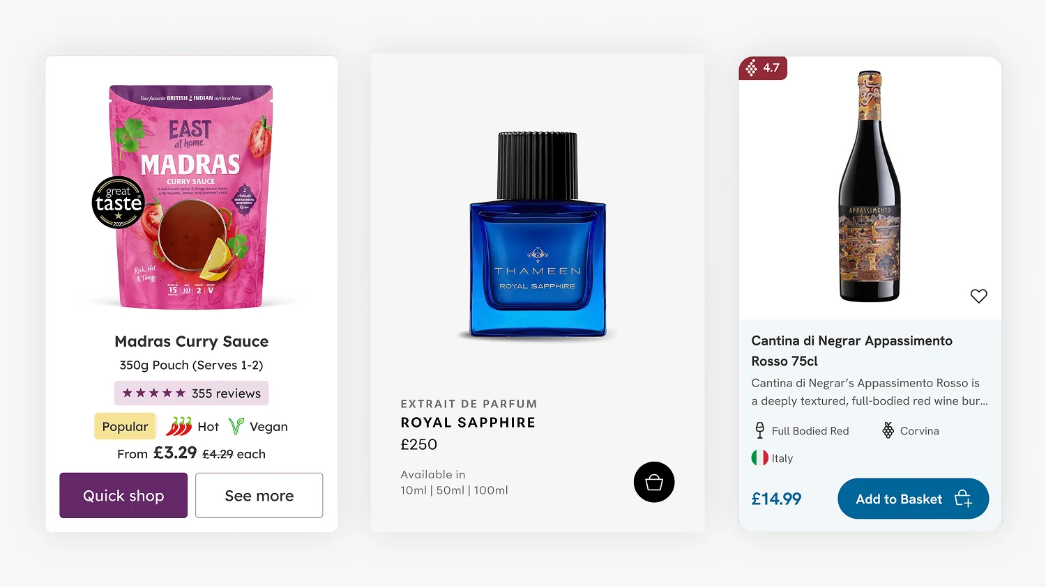
5. A Single Call-to-Action (CTA)
The best landing pages avoid distraction. One clear CTA, repeated in the right places, ensures the user journey stays focused. For Wide Fit Shoes, the CTA was consistent: “Shop the Collection.”
Placement tips:
- The first CTA should appear “above the fold.”
- Repeat it after major sections like testimonials or product grids.
- Avoid giving visitors more than one competing choice.
6. Fast Loading Speed
Slow pages kill conversions. Optimised imagery, efficient video hosting, and Shopify’s built-in performance tools keep landing pages lightweight.
7. Scalable Design Systems
Instead of building one-off pages, I create modular systems. Each section (hero banner, testimonials, product grid, CTA) can be reused, reordered, or replaced without breaking the brand aesthetic.
This gives clients complete flexibility so they can launch new campaigns in minutes without calling in a developer.
8. Colour Psychology & Emotional Triggers
The colours you choose have a huge impact on conversions. Blue signals trust, red creates urgency, and green reassures users. For Hartnack & Co, muted heritage tones reinforced their credibility and connection to history.
Top Tip: Test CTA button colours. Sometimes a small contrast (like a warm tone against a cool background) can improve click-through rates by double digits.
More in my article on how to raise conversion rates.
9. Common Mistakes to Avoid
Some of the most common pitfalls I see on Shopify landing pages:
-
Too many CTAs make the experience confusing and lower conversions.
-
Cluttered layouts that overwhelm the user.
-
Unclear value proposition, visitors don’t know why they should care.
-
Ignoring mobile, broken layouts and lost sales.
A professional Shopify web designer can help avoid these traps.
Examples in Action
-
Whistlefish: Seasonal landing pages that showcased collections with strong headlines and visually dominant artwork See Case Study
-
Wide Fit Shoes: Clear CTAs and product-focused design that catered to customer needs around comfort and sizing. See Case Study
FAQs: What Makes a Good Landing Page?
There’s no fixed length — it depends on your product and audience. Some perform best with just a headline, image, and CTA. Others need testimonials, detailed benefits, and FAQs. The key is clarity.
No. Your homepage is a broad entry point, while a landing page is campaign-specific. Think of it as a focused tool to convert targeted traffic.
Start with small tweaks: refine headlines, test CTA colours, add trust signals, and ensure your mobile experience is flawless. For bigger gains, work with a Shopify expert UK who understands conversion rate optimisation.
Yes. You can duplicate templates and run tests using Shopify apps or external testing tools. This is one of the best ways to find out what truly resonates with your audience.
Final Thoughts
A good landing page isn’t just about aesthetics; it’s about clarity, focus, trust, and scalability. By combining strong headlines, trust signals, mobile-first design, and modular systems, you give your Shopify landing pages the best chance to convert.
If you’re ready to improve your landing pages, I’d love to help. Work with an experienced Shopify designer to save time, improve results, and grow your store. Not sure what to look for in a designer? Read the guide on hiring a Shopify designer in 2026.

This article was written by Anthony Bliss, a Shopify Expert & Freelance Shopify Designer specialising in UX and UI design for DTC brands. With 20+ years of design experience and 6+ years focused exclusively on Shopify, Anthony helps brands create stores that convert.
Partner with a Shopify expert to elevate your store
Shopify Success Stories

Shopify Migration with Custom & Conversion focussed UX
Drink Finder

Headless to Shopify Migration with a Luxury Premium Theme Build
Thameen London

Bespoke Store Design with Key AOV Results and Rise in Revenue
East At Home
More Shopify Articles
What Is a Shopify UX Review (And Why It’s Where Every Project Should Start)
A Shopify UX review is where every project should start, and yet most agencies skip it in favour of made-up personas and assumptions. This article…
Shopify Product Card Design: The Art of Cards That Convert
Product cards are the most fundamental component of any ecommerce site, and the place where premium Shopify themes quietly underperform. When a theme…
Benefits of Shopify Plus: Should You Upgrade in 2026?
If you are already running a Shopify store and weighing up whether to move to Plus, this article is for you. Most guides on the topic are written by…
Shopify Expert
Ready to elevate your store? Start your Shopify transformation today
Shopify expert who can help elevate your store to the next level
20 years of agency and direct client experience, without the high price tag
Network of the best developers, Klaviyo experts & SEO experts perfect for big projects
This site is protected by reCAPTCHA and the Google Privacy Policy and Terms of Service apply.
Get in touch
Registered in England & Wales No. 10575474. Based in Falmouth, Cornwall, UK.