Whistlefish 2.0 Shopify Website Design Case Study

Whistlefish, a returning client, approached me to refresh their website design as part of their move to Shopify 2.0. The goal was to create a flexible, scalable design system that gave their team the power to build out landing pages for seasonal gifting campaigns, while also setting the foundations for future CRO (conversion rate optimisation) and AOV (average order value) improvements.
Client: Whistlefish Services: UX & UI Design, ShopifyRole: Shopify Design Expert
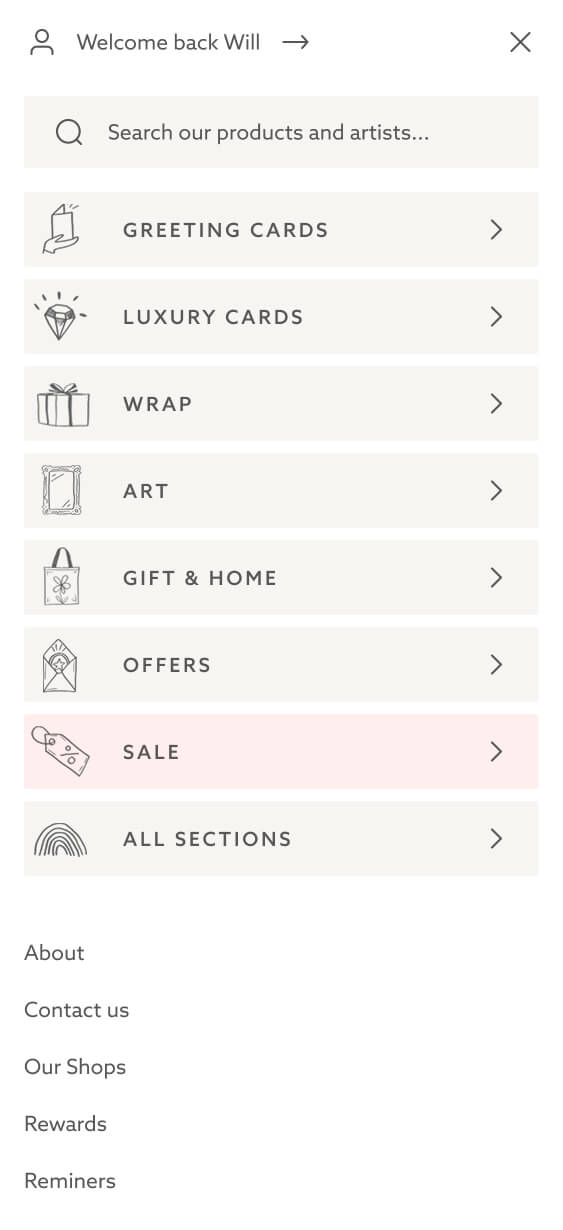
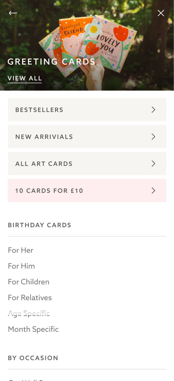
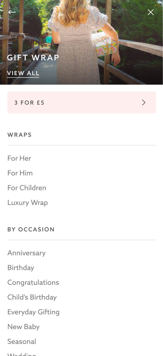
Mobile-First Navigation
Navigation plays a huge role in Whistlefish’s user journey, especially on mobile where the majority of browsing takes place. I designed a mobile-first navigation system that made it effortless to filter products while keeping Whistlefish’s signature imagery front and centre. This ensured usability without sacrificing brand storytelling.


Easy Collection Drilling Down
A key innovation was the ability for users to drill down through collections and sub-collections from a single block. On a small screen, this design allowed shoppers to navigate multiple levels of categories quickly, without clutter or confusion.
This approach saved space, simplified browsing, and made it far easier for users to find exactly what they wanted.
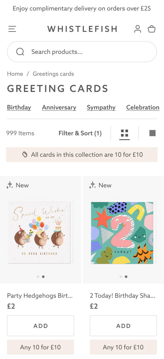
Smarter Collection UX and UI
Whistlefish’s main products, greetings cards, are more lower priced products compared to most other Shopify stores I deal with. Popular bundles include “10 for £10” or “15 for £10” deals. So they needed a different collection page UX.
On the old site, every add-to-cart triggered a full slide-out cart, which frustrated users and slowed the flow. On the new site, I introduced:
-
A subtle slide-in message instead of a full cart takeover
-
Dynamic buttons that transform into quantity selectors after adding an item
This made it much easier to add multiples and take advantage of bundle offers, directly supporting higher AOV.


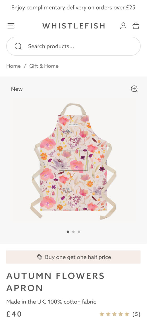
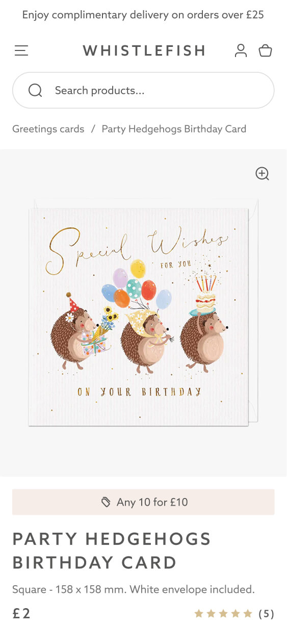
Product Pages: Simple and Elegant
Product pages were redesigned to be clean, elegant, and intuitive, with every element placed where users expect it. The simplified layout keeps the focus on the product imagery while also highlighting key details, such as the type of ink used. Subtle upsells, like the Rewards Club, were integrated to add value without distracting from the main purchase journey.
Shopify 2.0 Sections
A key part of this project was creating a full set of bespoke Shopify 2.0 blocks tailored to the Whistlefish brand. These components were designed consistently at mobile scale, ensuring clarity and cohesion across every screen. Once the system was in place, full pages were built out and developed into a clickable prototype, complete with UX interactions.
This approach allowed the team to see exactly how each block worked together in a real journey, while also future-proofing the site with a flexible design system that can be reused for seasonal campaigns and new landing pages.
Bespoke Search UI
A custom search experience was created to separate results into clear categories: popular searches, collections, and products. Strong visual hierarchy and considered layouts make it quick and easy for users to find what they need, without having to sift through irrelevant results.


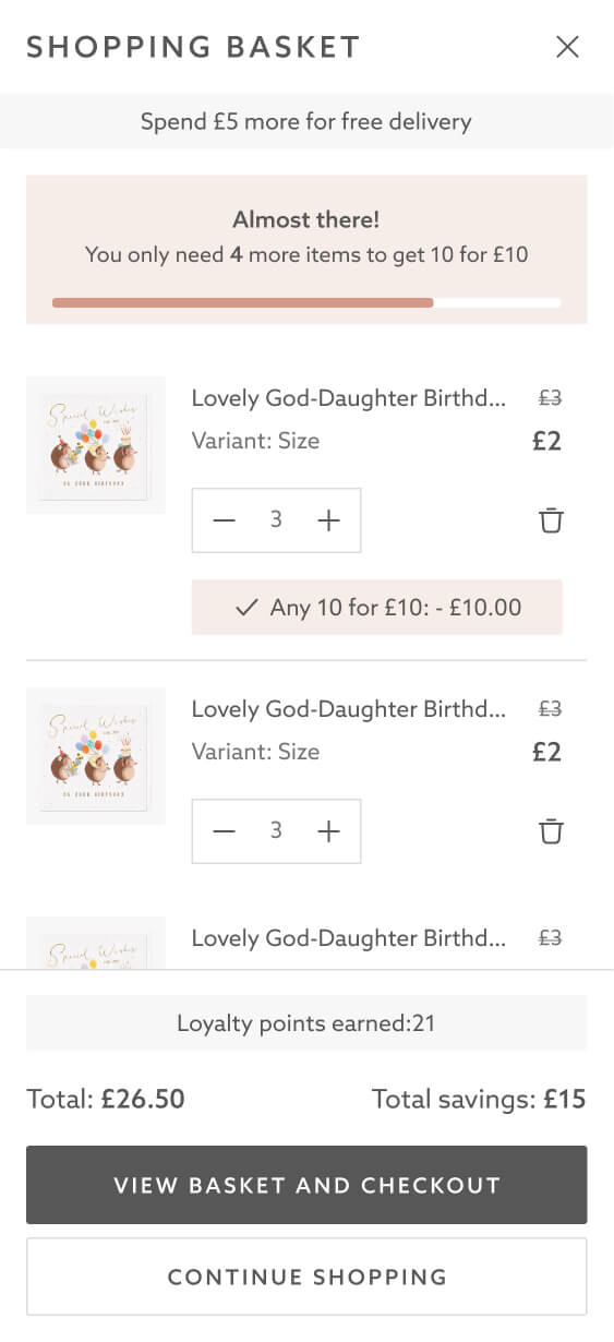
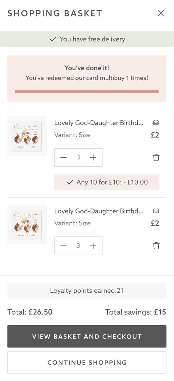
Bespoke Cart Experience
The cart was redesigned with conversion in mind. Key improvements included:
-
Delivery messaging to reduce uncertainty
-
Clear product messaging showing how many more items were needed to unlock an offer
-
Automatic application of promotions once thresholds were reached
Since Whistlefish runs multiple offer types across different products, this clarity was essential in reducing friction and driving more completed baskets.
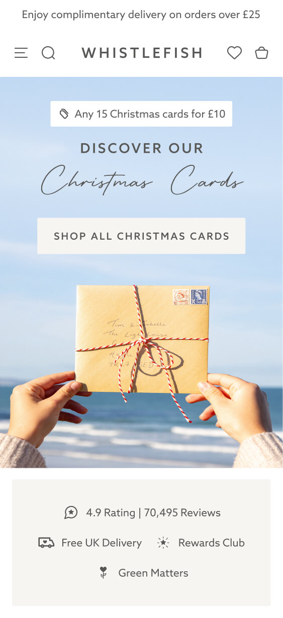
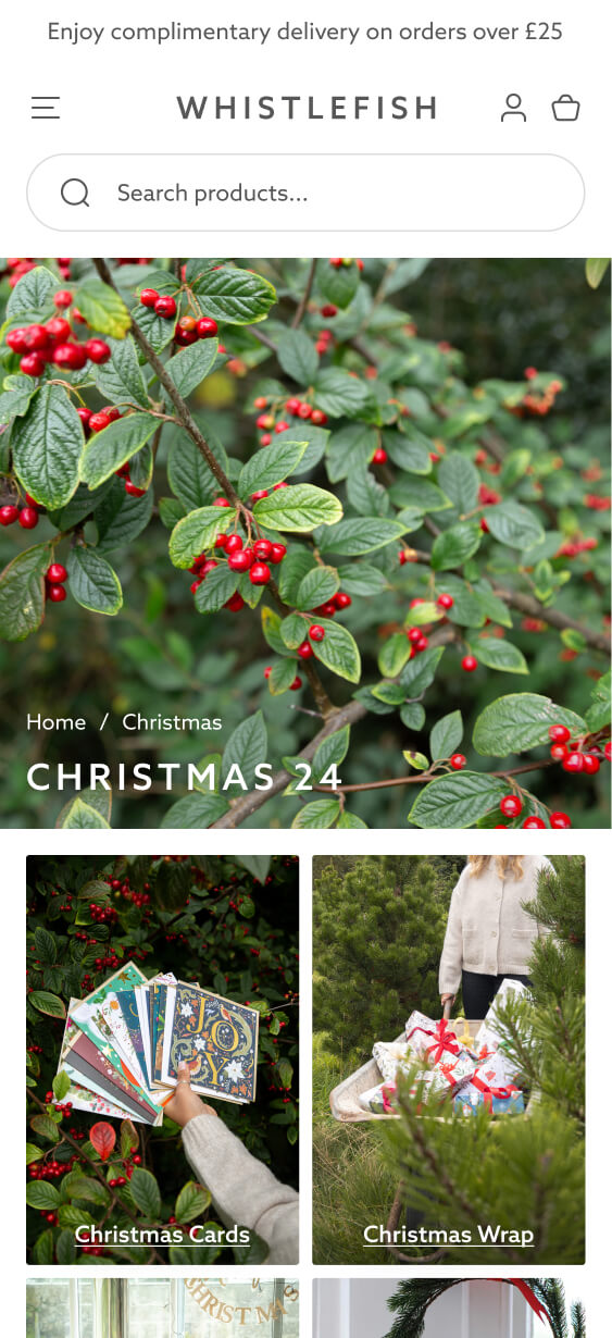
Seasonal Landing Pages
To demonstrate the flexibility of the new system, I created a Christmas landing page concept. This included curated collections, seasonal imagery, and offers. This helped show how Whistlefish could roll out future campaigns quickly without needing a full redesign each time.

The design process and finalised site helped our brand leap into its next phase with a fresh, clean look that our customers immediately loved. Working with Anthony and the wider development team was a great experience, and one we’d be happy to repeat in the future.
The new UX and UI were exceptional — customers could find products and complete purchases effortlessly, while the clean, professional design made browsing intuitive and trustworthy. Using Figma as a templating system meant all of our building blocks worked seamlessly together, and we’ve since been able to carry that framework into our own design team, making adjustments easily while staying true to the original vision.
Will Manders
Head of
Future-Proof Your Shopify Store with a Bespoke Design System
More Shopify Success Stories

Shopify Migration with Custom & Conversion focussed UX
Drink Finder

Bespoke Shopify Subscription UX and UI and design system
Fuzzball

Elegant High-End Design with Customisable Product Pages
Hartnack & Co
Shopify expert
Ready to elevate your store? Start your Shopify transformation today
Shopify expert who can help elevate your store to the next level
20 years of agency and direct client experience, without the high price tag
Network of the best developers, Klaviyo experts & SEO experts perfect for big projects
This site is protected by reCAPTCHA and the Google Privacy Policy and Terms of Service apply.
Get in touch
Registered in England & Wales No. 10575474. Based in Falmouth, Cornwall, UK.