Drink Finder Shopify Website Design Case Study
Drink Finder came to me with a well-established brand and a wide range of products, but their existing website wasn’t performing as well as it could be if it were on the Shopify platform. The purchase journey was cluttered, mobile usability needed improvement, and opportunities to increase conversion and average order value were being missed. The goal was clear: deliver a high-end Shopify migration with refined UX/UI design that not only preserved the essence of the brand but also unlocked more revenue through smart, conversion-driven functionality.
Client: Drink FinderServices: UX & UI Design, ShopifyRole: Shopify Design Expert
Conversion Rate Highlights
27%
Increase in users clicking Add to Basket.
181%
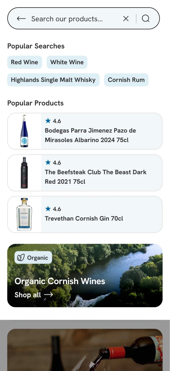
Increase in users using the new search functionality and discovering more products.
143%
Increase in users starting the checkout process.
UX and Heuristics review
I always start a project of this size with a detailed UX and heuristics review of the existing site, analysing GA4 data to understand real user behaviour. From there, I mapped the entire purchase journey using a Miro board, highlighting what users actually see on common screen sizes.
This process revealed key friction points, such as sticky upsells and chatbots blocking important actions. While also surfacing opportunities to add trust signals and refine the flow. The review stage always sparks productive conversations, ensuring business needs align with user expectations. The outcome: a clear roadmap to improve conversions and create a frictionless journey.
Brand refinement
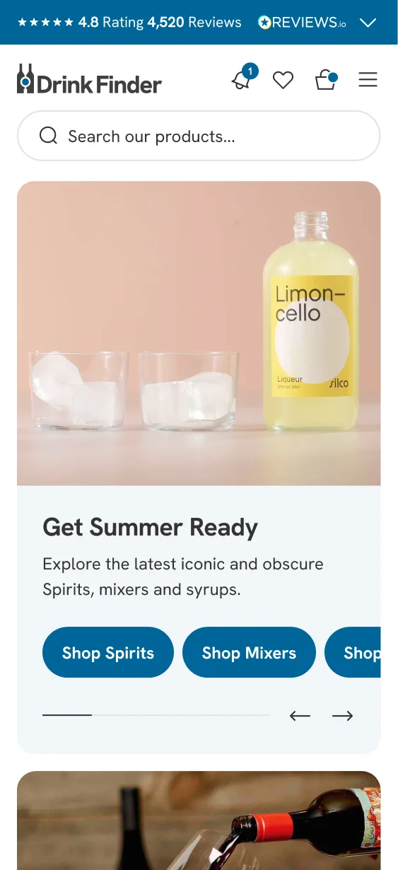
Drink Finder’s branding was already recognised by loyal customers, so the brief wasn’t to reinvent the wheel, it was to modernise and refine. I made subtle tweaks to the logomark to ensure it was crisp and legible on mobile, adjusted typography for better readability, and ensured colours worked consistently across all touchpoints.
The result was a cleaner, more accessible look and feel that stayed true to the brand’s identity while elevating it for today’s digital-first customer.
Product cards fit for the users needs
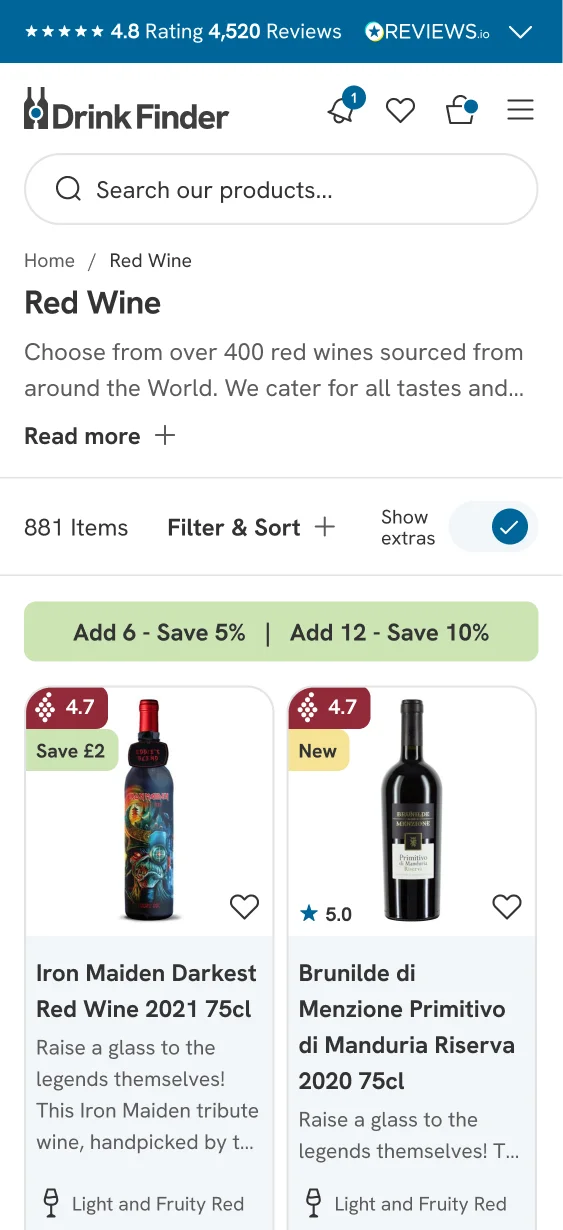
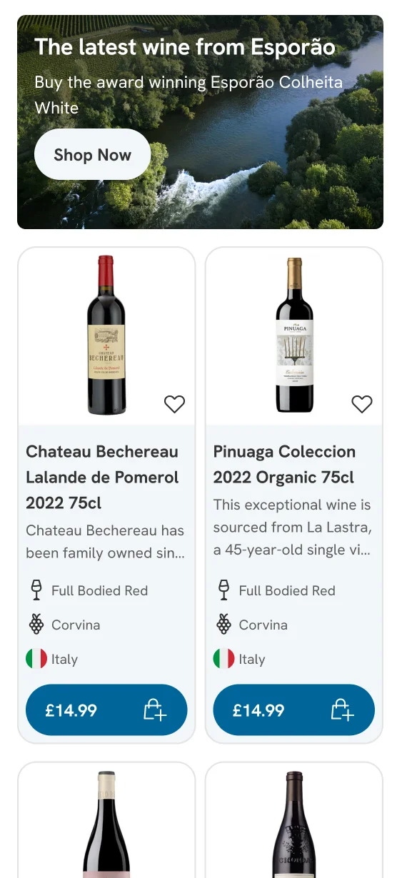
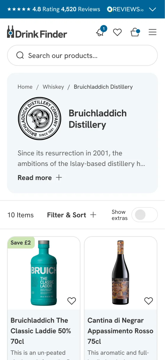
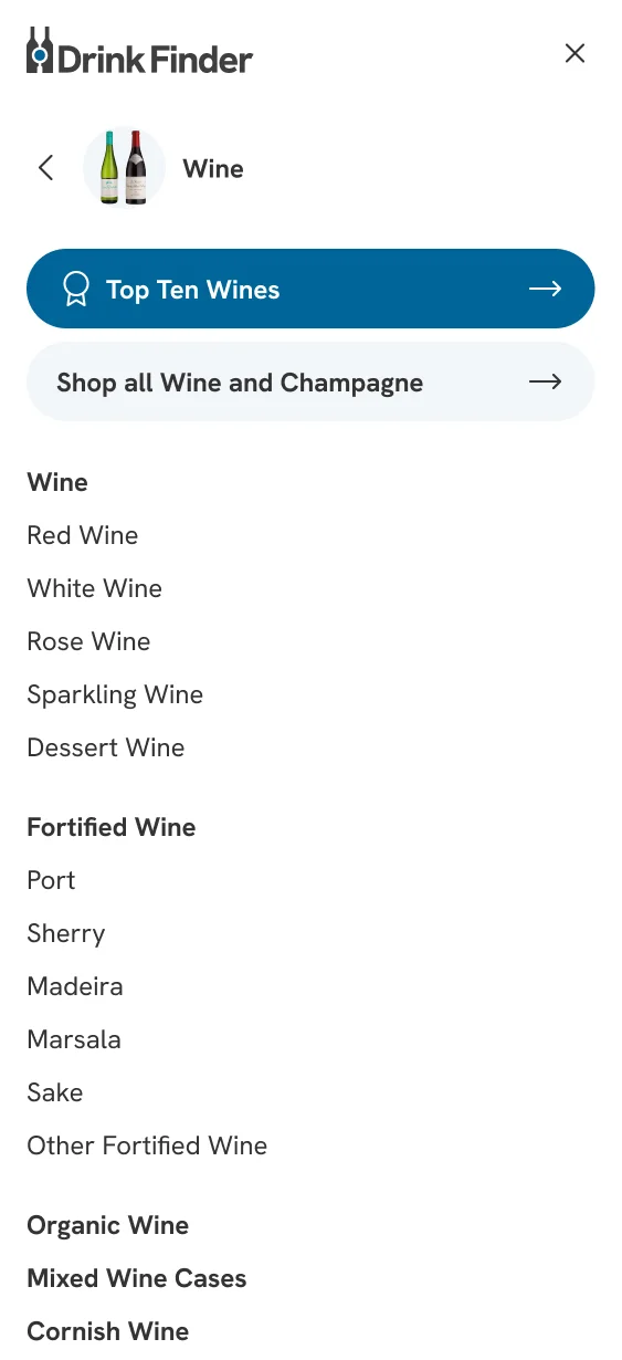
Collection pages play a crucial role in browsing, so we reimagined the product cards to give users control. Customers could now expand or collapse product details, making it easy to compare key attributes such as country of origin or age without clicking into every product page.
This design put the power in the shopper’s hands, helping them make informed decisions quickly and reducing unnecessary clicks.
Raising average order value
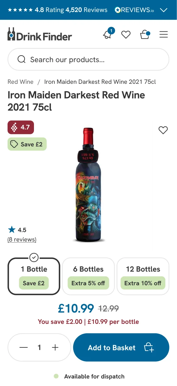
One of the biggest wins came from optimising the product detail pages (PDPs). For wine, we introduced clear, incentive-driven offers such as:
-
Buy 6 bottles — Save 5%
-
Buy 12 bottles — Save 10%
These offers weren’t just hidden in the text, they were surfaced through variant buttons and bold badges, making the value proposition impossible to miss.
Raising the average order in the bag
In the bag overlay, a dynamic progress bar showed customers exactly how close they were to unlocking extra discounts. This subtle yet powerful nudge encouraged larger basket sizes and helped increase the average order value, all while maintaining a smooth and enjoyable experience.
Handy notifications instead of annoying sticky buttons
During the UX review, I identified a major pain point: sticky newsletter sign-up buttons were blocking the checkout process. Instead of removing the feature entirely, we repositioned it more intelligently.
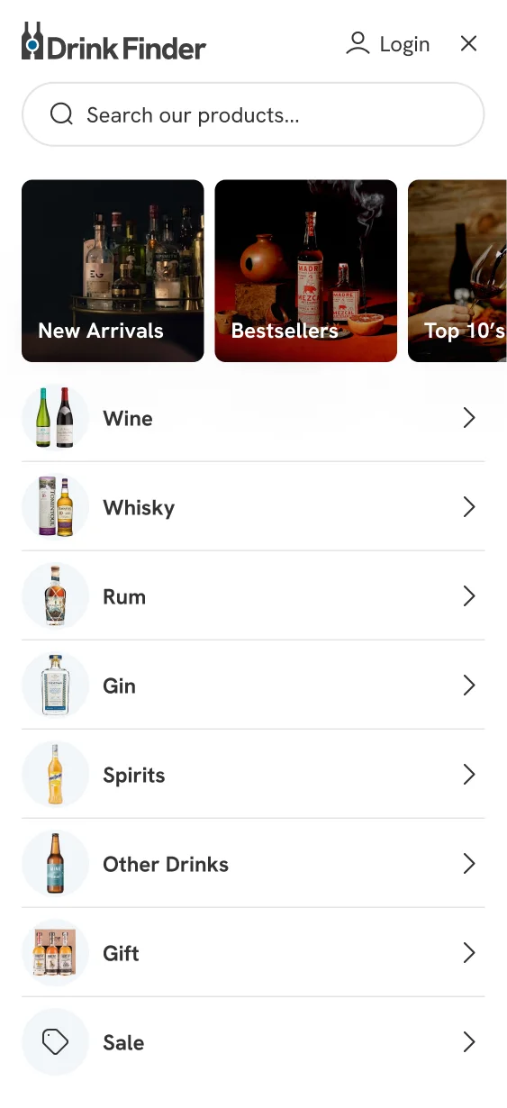
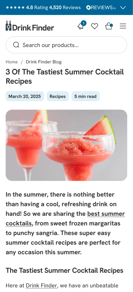
I introduced a dedicated navigation button that could promote sign-up offers (e.g. 10% off your first order) while also housing upcoming events. This freed up the announcement bar for trust-building messages such as reviews, delivery information, and guarantees.
Mobile user interface screens
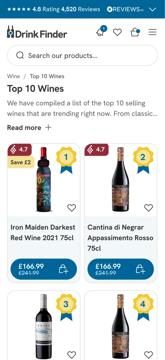
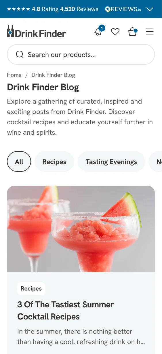
With more than half of traffic coming from mobile, I designed a fully bespoke design system with a mobile-first approach. Building clickable prototypes in Figma streamlined the development process, reduced costs, and ensured consistency across pages.
The result? A seamless shopping experience that feels modern, intuitive, and optimised for every device.
Redefined product pages
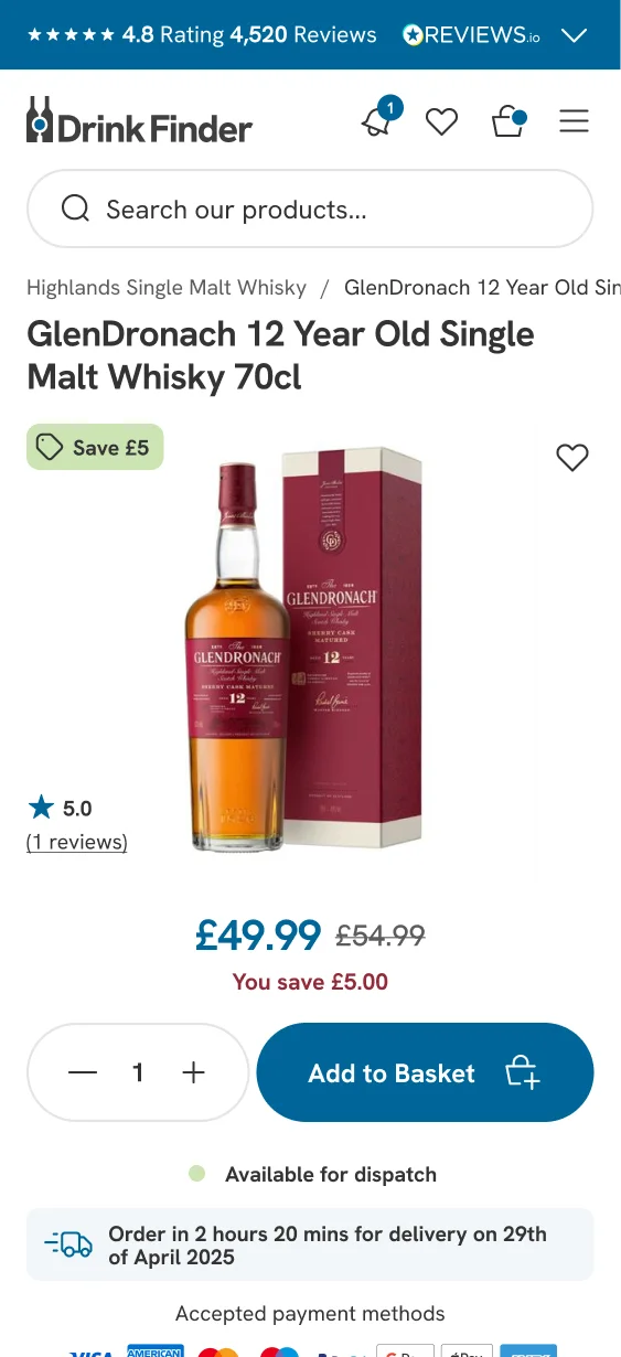
On mobile, we rebuilt product pages from the ground up based on our UX findings. Key improvements included:
-
Iconography to highlight ingredients and product attributes at a glance
-
Optimised layouts for scan readers and fast decision-making
-
Upsells and recommendations that feel natural, not pushy
Every element was carefully placed to remove friction and guide customers towards purchase.
Easy shopping journey
The new journey is streamlined, intuitive, and free from unnecessary distractions. From first click to final purchase, every step was optimised for speed, clarity, and trust.
Let’s create your Shopify success story
Shopify expert
Ready to elevate your store? Start your Shopify transformation today
Shopify expert who can help elevate your store to the next level
20 years of agency and direct client experience, without the high price tag
Network of the best developers, Klaviyo experts & SEO experts perfect for big projects
This site is protected by reCAPTCHA and the Google Privacy Policy and Terms of Service apply.
Get in touch
Registered in England & Wales No. 10575474. Based in Falmouth, Cornwall, UK.
