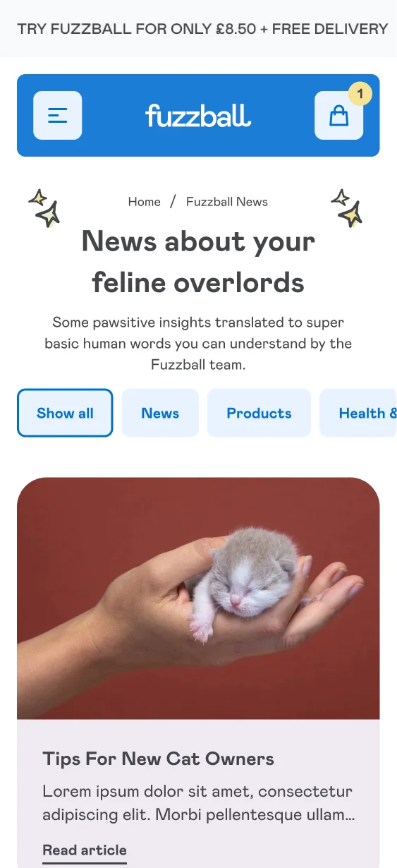
Fuzzball Shopify Website Design Case Study

Fuzzball is a premium, health-focused cat food company with a subscription-first model. Their playful brand identity — featuring an animated cat that interacts with the design — makes them stand out in a highly competitive market. My task was to translate that personality into a bespoke Shopify experience that was modern, intuitive, and conversion-driven. This involved building a full design system, redesigning key user flows, creating engaging product pages, and developing a custom interactive quiz that personalises each customer's subscription journey.
Client: FuzzballServices: UX & UI Design, ShopifyRole: Shopify Design Expert
Conversion Rate Highlights
+86%
Quiz summary page to checkout click
+62.5%
Overall site purchase conversion rate
UX and Heuristics review
Before diving into design, I carried out a full UX and heuristics review of Fuzzball’s existing journey. Analysing real user behaviour, we identified pain points in the purchase flow, particularly around the quiz and shopping bag stages. This was where customers were dropping off.
The review gave us a clear roadmap: simplify the process, highlight value at every step, and weave the brand’s fun personality into the user experience.

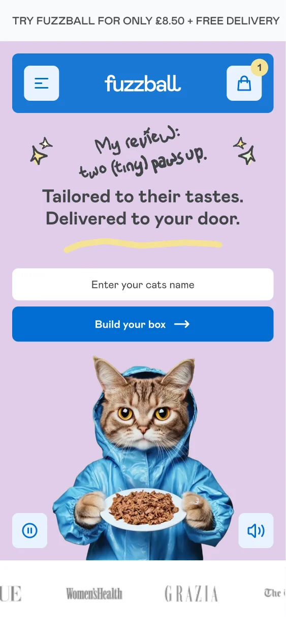
UI That Embodies the Brand
To bring Fuzzball’s playful tone to life, I crafted a UI system that felt more like a modern app than a traditional ecommerce store. Rounded corners, bold hover effects, and interactive touches gave the design warmth and energy, while keeping usability front and centre.
Every element was designed to feel premium yet approachable — perfectly aligning with Fuzzball’s mission of making healthy pet food fun.
Navigation That Guides and Builds Trust
In the cat food subscription space, clarity is everything. We designed a fully clickable Figma prototype for the new navigation, making it seamless to explore collections, dive into sub-categories, and access the quiz.
Beyond usability, the navigation also reinforced trust with key messaging about product quality, delivery, and how the subscription works. Every touchpoint was designed to reassure and convert.

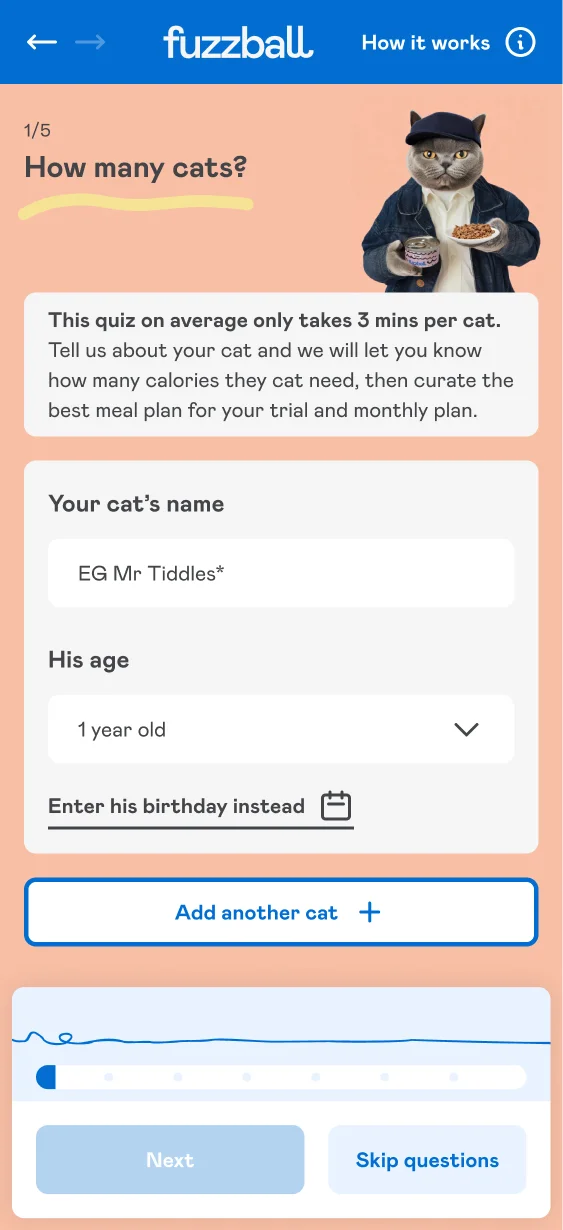
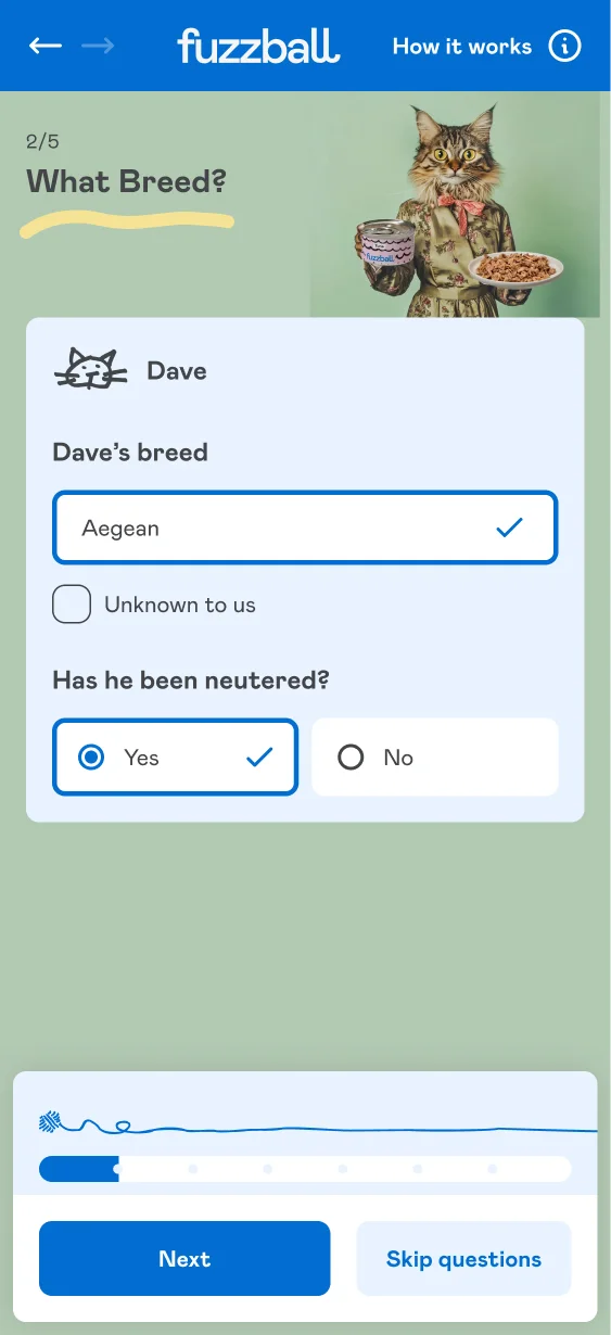
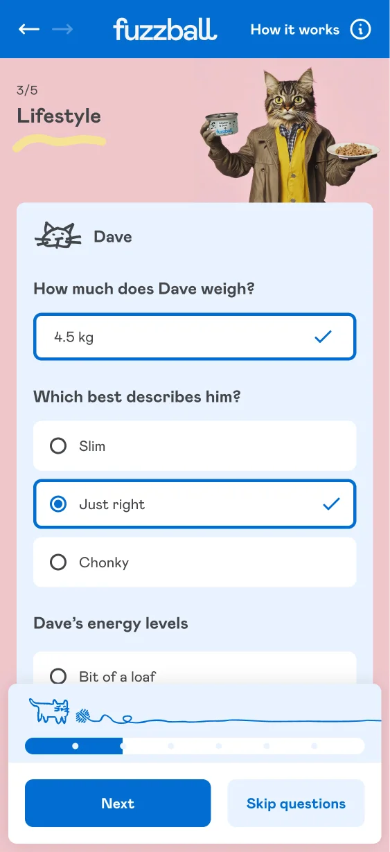
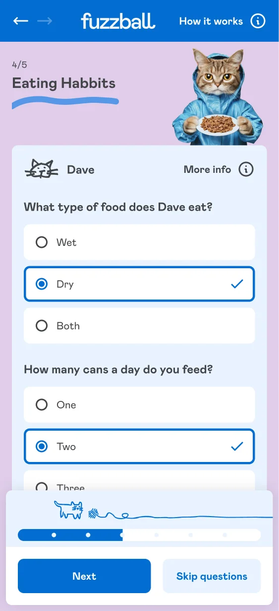
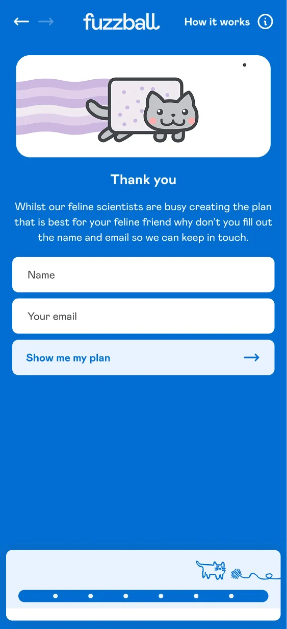
Bespoke Quiz: Fun, Personalised, and Clear
The quiz was at the heart of Fuzzball’s subscription model. I refined its UX and UI through multiple iterations, striking the right balance between gathering enough data for product personalisation and keeping the process enjoyable.
To reduce friction, we:
-
Simplified the number of steps and clicks
-
Added slide-up “more info” panels to explain details without overwhelming users
- Made the UI more engaging and each button and input state more obvious.
A playful progress bar featuring the Fuzzball cat chasing a ball added delight and reinforced the brand personality, turning the quiz into a fun interaction rather than a chore.


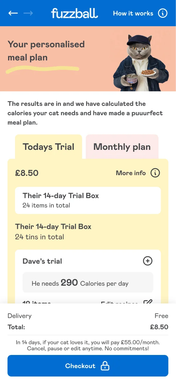
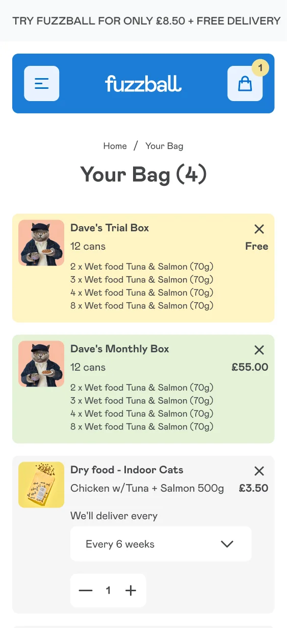
Quiz Cart Page: Reducing Drop-Offs
Our UX review flagged the cart stage as a major point of confusion. Customers weren’t sure which products were part of the trial and which were recurring subscriptions.
We redesigned this stage to make the split absolutely clear, improving transparency and trust. The result was fewer abandoned carts and smoother subscription sign-ups.
Micro-Interactions That Add Joy
From animated icons to subtle hover effects, we designed micro-interactions that made the experience feel alive. These small touches gave the site character, increased engagement, and nudged users toward completing their journey.

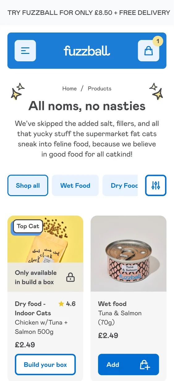
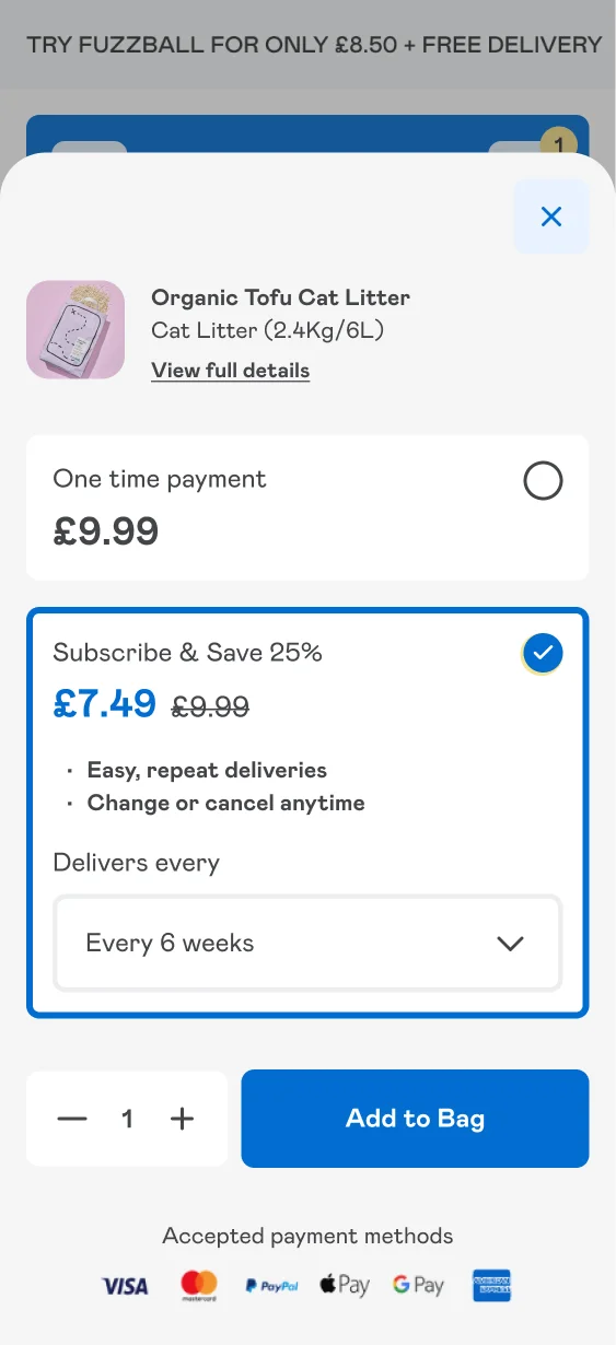
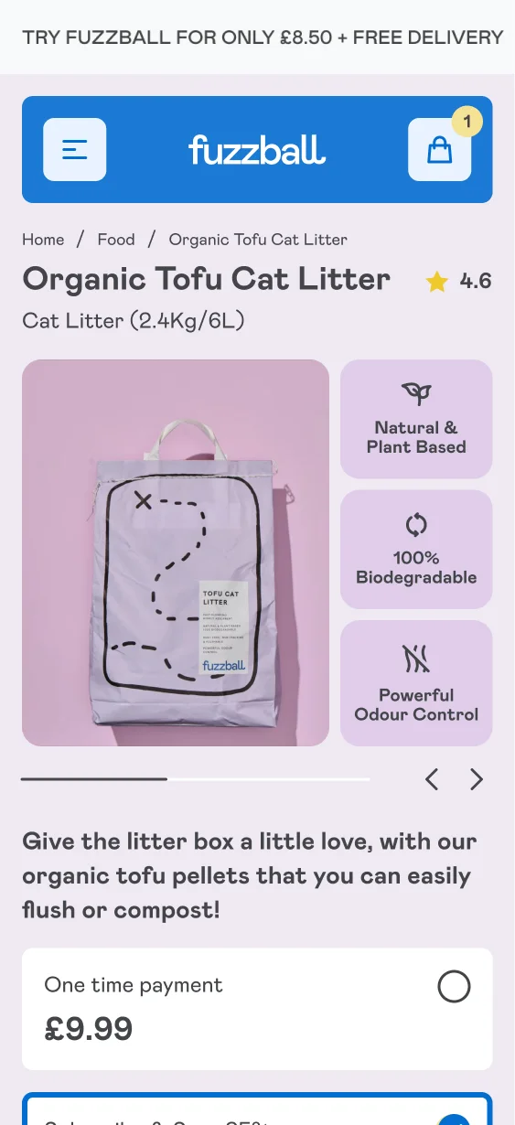
Product Pages That Inform and Convert
While some products were exclusive to the subscription quiz, we still created dedicated product pages to showcase ingredients, benefits, and key selling points.
These were built mobile-first, with clear callouts for scan readers, quick links to create a subscription box, and iconography to simplify information. The balance of clarity and playfulness ensured customers could make quick, confident decisions.
Mobile-First Journey
With subscriptions often managed on-the-go, we prioritised mobile in every decision. The new purchase flow was designed and tested on mobile devices first, ensuring a seamless subscription journey from quiz to checkout.
Scalable Design System
We developed an in-depth design system covering all Shopify 2.0 sections, ensuring the Fuzzball team had the flexibility to create new landing pages and campaigns in the future.
This foundation not only saved development time but also ensured design consistency across every touchpoint.

Let’s create your Shopify success story
More Shopify Success Stories

Shopify 2.0 Design System with Mobile-First UX & Key CRO
Whistlefish

Shopify Migration with Custom & Conversion focussed UX
Drink Finder

Elegant High-End Design with Customisable Product Pages
Hartnack & Co
Shopify expert
Ready to elevate your store? Start your Shopify transformation today
Shopify expert who can help elevate your store to the next level
20 years of agency and direct client experience, without the high price tag
Network of the best developers, Klaviyo experts & SEO experts perfect for big projects
This site is protected by reCAPTCHA and the Google Privacy Policy and Terms of Service apply.
Get in touch
Registered in England & Wales No. 10575474. Based in Falmouth, Cornwall, UK.